| Image |
Comment |
| 08/24/2005 09:24:41 AM |
|
 Photographer found comment helpful. Photographer found comment helpful. |
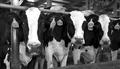
| 08/24/2005 09:24:23 AM |
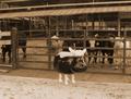
watchingby Hardcore PoserComment: I'd cut the cute and go for the cows in the background. They have such expressive faces and this would have been a great shot without the ceramic figurine. |
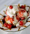
| 08/24/2005 09:23:36 AM |
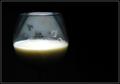
A toast, to good healthby hitendraComment: Nicely lit. Great use of negatifve space. I wonder if you'll get the same "bad aim" comment I got. LOL WOW - I like this very much in its simplicity. I might've put it in a glass with no patternh, but maybe it adds to it. At this point - I say 8 for sure. |
| Photographer found comment helpful. |
| 08/24/2005 09:21:58 AM |
|
| Photographer found comment helpful. |
| 08/24/2005 09:21:04 AM |
|
| Photographer found comment helpful. |
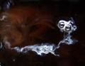
| 08/24/2005 09:20:26 AM |
Milk Creatureby mahobbesComment: COOL. Ghost in the coffee, eh???? Imaginative. Thank you for not putting a cookie in it. LOL. 8 |
| Photographer found comment helpful. |
| 08/24/2005 09:19:56 AM |
|
| Photographer found comment helpful. |
| 08/24/2005 09:18:24 AM |
|
| Photographer found comment helpful. |
| 08/24/2005 09:18:02 AM |
|
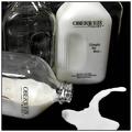
| 08/24/2005 09:17:40 AM |
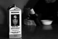
No tearsby saiphfireComment: Cute title. I like the three bottles. I think I'd have liked to see the two standing ones in their entirety instead of cropped. |
Home -
Challenges -
Community -
League -
Photos -
Cameras -
Lenses -
Learn -
Help -
Terms of Use -
Privacy -
Top ^
DPChallenge, and website content and design, Copyright © 2001-2026 Challenging Technologies, LLC.
All digital photo copyrights belong to the photographers and may not be used without permission.
Current Server Time: 05/16/2026 06:00:16 PM EDT.