| Image |
Comment |
| 09/11/2005 08:02:39 PM |
Drugs & Liquorby ajschelComment: Greetings from the Critique Club~ :~)
My first thought on this photo is that it has good composition and the title is certainly fitting of the challenge. I think that the main problem is the lighting which creates under exposure and quality of the shot. You could have even shown a spotlight on them from an angle and added to not only the ability to see them, but added another element of interest.
If the items were placed on a white or black surface, the grain of the wood of the table would have been less of a distraction. The varying heights are good and the fact that you have an odd number of items works better since they don't have a specific placement value. It would have served you better had there been more negative space on either the right or the left of the collection of items. I might've even had a bit more on top as well. It looks a bit tight, cropped as it is.
You could have possibly taken advantage of more post editing tools as this was an Advanced Editing challenge. The imagination is there, so maybe if it were tweaked, this might have a winning combination.
Hope you find this helpful! All the best, Judy |
 Photographer found comment helpful. Photographer found comment helpful. |
| 09/11/2005 05:46:20 PM |
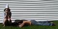
Dumb & Lazyby LadeeMComment: Greetings from the Critique Club.
Your photo has a funny title and idea which I mentioned in my first comments during the voting stage.
I think the perspective might have worked better had you been down on their level so that you aren't actually looking down on the subjects. The shadows work against you, so maybe shooting it at a different time of day might have eliminated that problem and showcased the coloration of their clothing a bit more. The focus is fine but undermined a little by the shadowing. It made the "dunce" face almost halfway eliminated and a very expressive face might've conveyed the dumb look I think you were going for. As for the lazy one, I think a different pose would work better so that you could see her face too, maybe with her eyes rolling up as if to say "me?" That might have added to the humor of it over just lying in the grass. I would have had the girls in front of a solid backdrop (maybe a sheet or something without pattern) which would help from the distraction of the clapboard of the side of the house.
You are most certainly onto something and I think with a little tweaking this idea could serve you well. All the best in your future challenges!!!
Judy |
| Photographer found comment helpful. |
| 09/11/2005 05:29:17 PM |
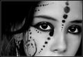
d o t s -&- l i n e sby annahComment: Greetings from the Critique Club.
As I had commented on this shot earlier, I'll elaborate on it at this time. I find the overall quality of this shot amazing. The original sense of it shines through. The focus is good and the lighting showcases the facial features as well as the jewelry she's wearing, without it being harsh or overdone. There seems to be a little bit of smudge on the right side of her nose, but not enough to truly detract from the overall image. I wonder what seeing her whole face, or part of her mouth would have done? I don't miss it, but it might have added to the effectiveness of the image. The clarity of the eyes is spot on and I find the contrast to be enough to really give this capture the POW factor. I look forward to seeing more of your photographs in the future. Best wishes, Judy |
| Photographer found comment helpful. |
| 09/11/2005 05:23:30 PM |
Departuretocollegefromhome and Landscapeby ZoomdakComment: Greetings from the Critique Club!
I had commented briefly on the photograph during the challenge, but I'll elaborate on it at this time. Overall, I find the image very pleasing to the eye. The colors are complimentary as blues and browns work well without being too contrasting, yet having enough variation in tonal quality to really work well together. My one criticism would be that there is possibly too much dark foreground. I think part of it could have been eliminated so that the brighter more interesting area in the back could be showcased a bit better. The sky and clouds are well captured along with the stillness of the water. The overall mood is serene and knowing that you will miss this area, a sense of forelorn is there as well. Best wishes at school and hopefully when you return here, you'll appreciate it all the more. Take care, Judy |
| Photographer found comment helpful. |
| 09/11/2005 05:17:32 PM |
sky.jpgby JPetraliaXComment: Did you notice that looks like the outline of a dove? WOW - pretty amazing. |
| 09/11/2005 05:11:51 PM |
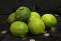
Dimes & Limesby cornettcagComment: Greetings from the Critique Club!! :~)
Overall, the idea of this is clever, especially with the rhyming title. But I think it stops short after that. It would have served you better had the fruit and coins had more of a deliberate placement. As it is, they just look kind of thrown in a sporadic fashion, with no intent. The focus could use some work as well. When doing a close up type shot, it is imperative that it be crisp and sharp to detail the subjects used. The black background serves as a perfect backdrop for the vivid green of the limes and the shiny silver of the coins, but both of them lack a little in the oomph category as far as I'm concerned. If it had been me, I think I might have taken three limes and put them in an interesting pattern, or maybe even three in a row with the dimes sticking directly into them, or stacked on top of each other in front of one, making it more of a geometric shot. From seeing some of your other images, I know you have a creative eye and your imagination is always working. Keep up the work and I hope find my suggestions helpful!! All the best, Judy |
| Photographer found comment helpful. |
| 09/11/2005 02:52:22 PM |
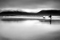
Warbeth Beachby TallblokeComment: This is great. I like the sense of nostalgia. It's wistful and has a nice feeling to it. It's simple yet says alot. I like the single person with the dog. Great use of black and white. Good negative space utilization. |
| Photographer found comment helpful. |
| 09/11/2005 02:50:24 PM |
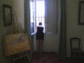
forbidden viewby messerschmittComment: Good for you!! I love this. Not only because you "broke the rules," but because of where it is as well as how you captured it. Great image. I like her shape in the window. Nicely done. |
| Photographer found comment helpful. |
| 09/11/2005 02:48:36 PM |
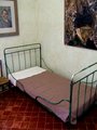
vanGoghby messerschmittComment: It's so weird that this is the title. Just at the glance, I thought of VanGogh's paintings of his bedroom when he was at the institution for several years. Then low and behold - it is his artwork on the wall. WOW This is really powerful to me. |
| Photographer found comment helpful. |
| 09/11/2005 02:47:18 PM |
Brainstormby Dax-Comment: Very nice. I like the brushes you used. Very interesting@ |
| Photographer found comment helpful. |
Home -
Challenges -
Community -
League -
Photos -
Cameras -
Lenses -
Learn -
Help -
Terms of Use -
Privacy -
Top ^
DPChallenge, and website content and design, Copyright © 2001-2026 Challenging Technologies, LLC.
All digital photo copyrights belong to the photographers and may not be used without permission.
Current Server Time: 06/20/2026 03:16:45 AM EDT.