| Image |
Comment |
| 09/12/2005 06:08:23 PM |
Friends (edited)by CalliopeKelComment: Now THAT's the ticket. That was my only critique of the earlier one. This is perfect now. !!!!! ;~D |
 Photographer found comment helpful. Photographer found comment helpful. |
| 09/12/2005 06:06:24 PM |
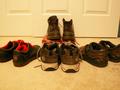
Hail to the Kings, babyby CrooxComment: Greetings from the Critique Club!
The initial thing that catches the eye is the blurry focus. There is an overabundance of shoes lay out like a starburst. The combination of the two is not a winning recipe. You need a clear shot as well as an interesting placement in order for several items in a shot to be interesting to the eye. What if you had them tumbling down a solid incline? What if you had one of the boots in a funning setting, paying homage to it's "kingliness?" Sitting in front of a door on carpet, it just has the appearance of quick slipshod snapshot taken in haste without alot of forethought. Once you get that basic shot, then the rest is working with curves, contrast and color, depending on whether you are using full color or black and white (or sepia, etc)to tweak all of the nuances of the photo. But it all starts with the basic image. The rest is just the difference between a good shot and a GREAT one.
As a member of DPC, you'll learn from comments such as these as well as viewing others' work. I still find it inspiring and strive for a better photograph every time! All the best, Judy
|
| 09/12/2005 05:46:00 PM |
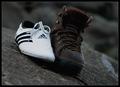
Do you need a hand?by eyjoComment: Greetings from the Critique Club!!!
My first reaction to the shot is the contrast between the white shoe and the boot not only in color but styling, texture, etc. Then the eye slides up and down on the diagonal rocky surface. My first suggestion would be to have them placed on a flatter surface, or maybe a stairstep as the slant appears rather unnatural. You could also place them in a more haphazard fashion, or even deliberately on a solid surface as the texture of the rocky surface competes too much with the shoes. The composition would work better if they weren't so dead centered in the shot. It's always more appealing to have negative space somewhere around the subject, usually to one side so that it isn't like the bullseye of a target. I find the lighting on the white shoe a bit too harsh. It might just be the reflective quality of the light color. Maybe shot in an indoor setting with the proper lighting, they would have had a whole different feel. Just my mind wandering with other possibilities.
Having looked at your other photographs, I know for sure that you have a wonderful sense of imagery. With some tweaking, I think this idea could really work well for you. Best regards for your entries in the future!
Judy |
| 09/12/2005 05:10:59 PM |
|
| Photographer found comment helpful. |
| 09/12/2005 04:16:40 PM |
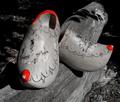
Red hot shoesby arminComment: Greetings from the Critique Club!!!
At first glance the eye is captured by the bright of the red. I think it is a tad too much for the lower contrasted black and white. It would be more effective in either a color shot, or with a higher contrasting black and white with no red at all as the texture of the wood on wood is an interesting detail. I like the shadowing behind the shoes, but I'm wondering if it wouldn't have better served you to remove the log altogether and place them on a solid surface background so that they would JUMP out at you instead of becoming part of the branch on the ground. It is more eye pleasing to have negative space to the right of the shoes instead of them being placed so dead center. The idea is a good one and I think with some tweaking, you could really make this work. Keep at it - you have a good eye and imaginative creativity to really have some excellent shots in the future. All the best, Judy |
| 09/12/2005 04:08:19 PM |
Has someone seen my right shoe????by SinisterComment: As I review the critique, I apologize for mentioning Advanced Editing as this was not the case for the shoe challenge. I was thinking of the Dark and Light and just wasn't using my head. :~( |
| Photographer found comment helpful. |
| 09/12/2005 04:07:03 PM |
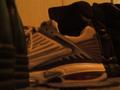
shoesby melodeeComment: Greetings from the Critique Club.
Overall, this shoe doesn't hold a whole lot of merit as it is blurred and the lighting is extremely low, which adds to the dim view and graininess of the shot. It has the sense of just taking a quick photo, instead of spending some time on it to really make a creative image. The shoes would work well against a solid background with either natural light or a single bright light source (not a lamp as it tends to yellow it too much). Maybe think out the shot and place them in a natural setting so that they don't look set up, yet do it so the viewer has a really appealing image to gaze upon.
As you gain experience and learn from viewing others' work, you will gain the confidence and insight to improve your skills in the future. Best of luck.
Judy |
| Photographer found comment helpful. |
| 09/12/2005 03:17:33 PM |
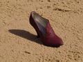
Has someone seen my right shoe????by SinisterComment: Greetings from the Critique Club! :~)
Upon first view of this, I like it very much. The simplicity of an old timey shoe in the sand really works here. You don't think of the two necessarily going together, so it makes for a nice variance. The lighting lends a nice shadow on the sand. The overall composition is simple yet effective. Normally a subject placed dead center isn't as appealing as one with more negative space around it, BUT due to the long shadow to the left, I think it works just fine in this setting. The sand is a nice textural difference with its warm tones of it working as a distinct contrast to the deep dark suede of the shoe. Perhaps a tighter crop could have given more focus on the shoe itself. As you had advanced editing available for the Shoe challenge, it might've been fun to play and see what creative areas you could have worked on to even enhance it further. Overall in my opinion, I think it stands on its own as a nice shot. Best wishes, Judy |
| Photographer found comment helpful. |
| 09/12/2005 12:12:19 PM |
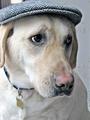
Those Eyesby NeilComment: Dog shots get me every time. He looks totally resigned to the fact that he has that hat on his head. "OK, go ahead, take my picture." hee hee My black chow/retriever mix, Tank does the same thing. I love the clarity of his eyes. Fun shot! |
| Photographer found comment helpful. |
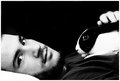
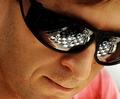
| 09/12/2005 09:16:04 AM |
Contemplationby CutterComment: Nice natural pose. I find that the reflection of the chess board is a bit distracting, but in another sense, it is interesting. It just detracts from his nice face a bit. The skin tones seem just a touch too yellow - maybe a little desat of yellow and an upping of a bit of red might help. Overall - nice. 7 |
| Photographer found comment helpful. |
Home -
Challenges -
Community -
League -
Photos -
Cameras -
Lenses -
Learn -
Help -
Terms of Use -
Privacy -
Top ^
DPChallenge, and website content and design, Copyright © 2001-2026 Challenging Technologies, LLC.
All digital photo copyrights belong to the photographers and may not be used without permission.
Current Server Time: 06/20/2026 03:07:43 PM EDT.