| Image |
Comment |
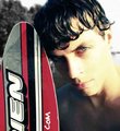
| 09/18/2005 10:23:34 PM |
Skierby ibkcComment: This is a nice shot. The light on the right of your face is a tad harsh, but the overall look is good. You have beautiful eyes. I'd rather see you than the surfboard though. I do like the angle of the shot ;~D |
 Photographer found comment helpful. Photographer found comment helpful. |
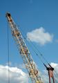
| 09/18/2005 01:15:24 PM |
Branching outby nialljallenComment: Greetings from the Critique Club@@
The first impression of this is a snapshot sense like it was just caught without much forthought as to the composition and the placement of objects in the shot. The sky is pretty - I might've upped the cyan a bit using the selective color adjustement. Maybe laying down on the ground on your back shooting from the bottom up, would have given more of an interesting perspective instead of the "chopped" sense that it has now. Another thought is to desaturate and really apply high contrast for some oomph.
I hope you find this helpful. All the best in the future. Judy |
| 09/18/2005 11:39:13 AM |
Mad Worldby bobdaveantComment: Oh this one is great. I'd swear you were on a rollercoaster or some type of amusement park ride. Great expression. Good work - fun and entertaining for the viewer as well. Glad you had fun and you were able to amuse your family while doing it. Guess I'll have to do some movement shots now. |
| Photographer found comment helpful. |
| 09/18/2005 11:38:15 AM |
Mad World, pic2by bobdaveantComment: DId you throw up afterward?? LOL Stuff like this is fun isn't it? I love to try and duplicate or get inspiration from another person's work. This is really fun. I'm amazed at how clear the shot is considering. Reminds me of some 2 a.m. nights in my 20's. ha ha ha ha |
| Photographer found comment helpful. |
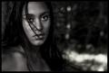
| 09/18/2005 11:36:45 AM |
Natural Womanby heidaComment: Oh pretty tones!~ I like the wisp of hair against the side and clinging to her lip gloss. The overall mood is mysterious and I like the darkness of it. Great DOF as well! |
| Photographer found comment helpful. |
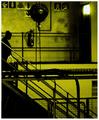
| 09/18/2005 12:52:58 AM |
Chemtrailsby whiteroomComment: Very cool. The green makes the shot. I like the diagonal line of the starcase and the silhouette of the person and the industrial metal of the interior of the building. |
| Photographer found comment helpful. |
| 09/18/2005 12:51:45 AM |
|
| Photographer found comment helpful. |
| 09/18/2005 12:50:35 AM |
|
| Photographer found comment helpful. |
| 09/18/2005 12:48:58 AM |
Paranoiaby glodaComment: ROFLMAO!!!! I can hear "we are DEVO" in the background.
This is really funny. Love the glasses and socks. |
| Photographer found comment helpful. |
| 09/18/2005 12:47:25 AM |
Over Easy?by soupComment: Oh so cool!!! This DOF is awesome. Great use of negative space and light. This is so clever. Great detail on the front egg. I'm amazed at the inginuity! 10 |
| Photographer found comment helpful. |
Home -
Challenges -
Community -
League -
Photos -
Cameras -
Lenses -
Learn -
Help -
Terms of Use -
Privacy -
Top ^
DPChallenge, and website content and design, Copyright © 2001-2026 Challenging Technologies, LLC.
All digital photo copyrights belong to the photographers and may not be used without permission.
Current Server Time: 06/21/2026 11:59:23 AM EDT.