| Image |
Comment |
| 09/19/2005 11:48:51 PM |
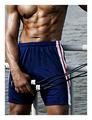
Destination -- Fitness!by ccaseyComment: You can't hardly go wrong with a guy with great pecs!!! I dont think it would be nearly as effective if you hadn't chosen to use the natural coloration either. I like the warm skin tones and the red, white and blue of the shorts. (don't put the challenge name in the title -ok, my only gripe) ;~p |
| 09/19/2005 11:47:08 PM |
The End of Workby dw_photoComment: I usually don't like the staged type shot, but for some reason, this one really works for me. It sounds weird, but I think it's the linear quality of the striped tie. I love the gray, blac and blue of it. And it's so detailed that the shine looks just like it's off of the shelf at the department store. You know how you look at something and think you see something else? I'm laughing, cause I thought at first it said "Welcome to the Supernatural Society Pension Plan! " LOL I was trying to figure that one out. I get it now. ha ha ha ha Fun and different capture. 8 |
 Photographer found comment helpful. Photographer found comment helpful. |
| 09/19/2005 11:44:51 PM |
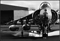
W A Rby egillbjarkiComment: I like your perspective and the way you cropped it. The water under the plane is a great reflective addition to the shot. Very detailed and the contrast is great. The choice of the black and white filter really breaks down the variations and tones of the shot. Good job. |
| Photographer found comment helpful. |
| 09/19/2005 11:43:53 PM |
Back to School!by peterishComment: I don't know why, but I really like this shot. The guy has an inquisitive expression like he is really wanting to learn. His placement in the shot is interesting with good use of the negative space on the lef and above his headt. The colors are realistic and not overblown. Overall -a nice shot for sure. 8 |
| 09/19/2005 11:42:24 PM |
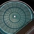
Destination: TOP!by davidus428Comment: This is an excellent architectural shot. I like the circular dome being "cut" by the horizontal piece in the bottom right corner. The brown and blue tones are perfectly matched contrastingly! This is going to sound totally nit picky, but I hate it when the name of the challenge is in the title. I'd rather it be named "TOP." Ok, slap me. I love this image ! 9 |
| Photographer found comment helpful. |
| 09/19/2005 11:37:25 PM |
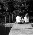
A Mother's Destination Fulfilledby cheegirlComment: Nice leading line. I like the younger sister leaning her head on the older sister's shoulder. Also, the braids are a nice texture. It would be perfect if there were nothing but water in front of the girls instead of shrubbery. |
| Photographer found comment helpful. |
| 09/19/2005 08:10:40 PM |
Sarenaby Joey LawrenceComment: Great portrait, Joey. I like the profile view. The tones are really cool - I can't explain what it is that's there. Lots of nice dark where it's appropriate and unexpected, yet her skintone is believable but not exactly the typical "flesh" color. Love the intensity of her eyes. |
| Photographer found comment helpful. |
| 09/19/2005 08:07:57 PM |
|
| Photographer found comment helpful. |
| 09/19/2005 08:07:19 PM |
|
| Photographer found comment helpful. |
| 09/19/2005 08:06:18 PM |
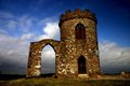
Old Johnby benhurComment: Wow - what a statement! Just love the warm tones of the stone against that rich blue. Your prespective of being down low on the ground really gives the building more of a majestic sense. It is beuatiful. |
| Photographer found comment helpful. |
Home -
Challenges -
Community -
League -
Photos -
Cameras -
Lenses -
Learn -
Help -
Terms of Use -
Privacy -
Top ^
DPChallenge, and website content and design, Copyright © 2001-2026 Challenging Technologies, LLC.
All digital photo copyrights belong to the photographers and may not be used without permission.
Current Server Time: 06/22/2026 02:53:27 AM EDT.