| Image |
Comment |
| 09/21/2005 11:55:27 AM |
My Nephewby donfanaticComment: This popped up on the screen and I immediatey smiled. It could use a bit of curves adjustment to really up the colors. Happy baby - he's having fun. I like that. The composition is well done. If he had on a red shirt, the contrast would really add some pinache to it. |
 Photographer found comment helpful. Photographer found comment helpful. |
| 09/21/2005 11:54:12 AM |
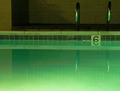
Night Swimby JeffryZComment: I wish there were a swimmer. That'd really give this shot more interest. I would straighten out the horizon so that it's level with the bottom of the picture. |
| 09/21/2005 11:53:31 AM |
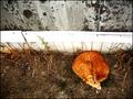
asleepby cheleComment: Great perspective. The wood is a tad distracting, but the bright of the cat's fur is a nice contrast to the otherwise drab tones. Anything with a critter gets an extra point. ;~D |
| Photographer found comment helpful. |
| 09/21/2005 11:52:42 AM |
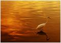
Leaving the day behind by arpitaComment: Love the rich coppery tones. I wish the bird were a bit better focused, but the placement and the reflection is spot on. |
| Photographer found comment helpful. |
| 09/21/2005 11:52:14 AM |
Duskby Steve___Comment: This is such a great idea, but lacks something. Hmmm - maybe the time of day. I like the bronze tones of the Eiffel tower but it needs some contrast to really give it pop. The overall dim blue of the sky and the brown/beige tones of the city just aren't enough to give it the backdrop it truly deserves. |
| 09/21/2005 11:48:25 AM |
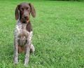
Okay I Satby neophyteComment: GOOD DOG!! Love the eyes matching the grass. I might even up the green sat a little. Composition is spot on.
Suites challenge: 2
Composition: 2
Colors: 1
Cute dog: 2
Cute dog that sat still: 1
8!!! |
| Photographer found comment helpful. |
| 09/21/2005 11:46:10 AM |
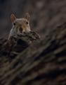
Nutsby ImagineerComment: HEE HEE Wish he were better lit. But anything with a cute animal gets an extra point. ;~D |
| Photographer found comment helpful. |
| 09/21/2005 11:45:47 AM |
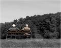
Old fartsby blue_dragonComment: ROFL. Cute!! I sort of miss the green of the shrubbery, but I know what you were going for. Hmmm - it needs a touch of red somewhere. Good composition and clarity. |
| Photographer found comment helpful. |
| 09/21/2005 11:44:25 AM |
Light and Shellby ElemmennopeComment: Really interesting. I love imaginative ideas such as these. Maybe a touch blurred though. I wonder if you could've gotten the shell tack sharp? I do like the use of negative space and it certainly meets the challenge. |
| Photographer found comment helpful. |
| 09/21/2005 11:43:14 AM |
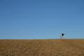
Hee Hawby HALOComment: HEE HEEEEEE!! I might up the tonality by adjusting curves. But I love the guy kicking up his heels. The black shirt helps draw your eye to him. The simplicity is very effective. |
Home -
Challenges -
Community -
League -
Photos -
Cameras -
Lenses -
Learn -
Help -
Terms of Use -
Privacy -
Top ^
DPChallenge, and website content and design, Copyright © 2001-2026 Challenging Technologies, LLC.
All digital photo copyrights belong to the photographers and may not be used without permission.
Current Server Time: 08/23/2026 02:43:06 PM EDT.