| Image |
Comment |
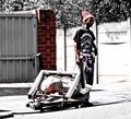
| 09/21/2005 03:26:15 PM |
Tasmanian Devilby GinaRothfelsComment: Great use of desat here. The red really pops out on the three items - the bricks, the hat/face and the bundle of things in his carrier. I love the urban sense of it. Striking and it has great contrast. |
 Photographer found comment helpful. Photographer found comment helpful. |
| 09/21/2005 03:24:49 PM |
Dark Walkby StrikeslipComment: Nice leading line to this. The blue, green, amber and citron yellow tones are very striking. I like the urban feel of it all. Well composed and executed. |
| Photographer found comment helpful. |
| 09/21/2005 03:23:34 PM |
Daisyby ladpupmoeComment: I like the linear quality of this. The vase needs to be more to the right to truly be within the rule of thirds grid. I'd straighten up the shot so that the lines of the shadow and light are perfectly perpendicular to the bottom line of the shot. They appear to be slightly off to the right. I like the lighting and the clarity of the glass vase's shine. |
| Photographer found comment helpful. |
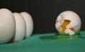
| 09/21/2005 03:21:12 PM |
Two Shellsby cornettcagComment: Pretty. The blue and brown turns work as nice contrast to each other. The lines on the table other than the shadow are a tad distracting but the clarity of the shells makes up for it. |
| Photographer found comment helpful. |
| 09/21/2005 03:20:31 PM |
Untitled Nudeby moviemanComment: I have to up the score just for the title and more for the pose. LOL Wish it weren't so blurred. You need to cropt out part of the left so that his eye is at the intersection of the perpendicular and horizontal third lines. |
| Photographer found comment helpful. |
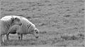
| 09/21/2005 03:14:41 PM |
My turn next !by kerrangComment: AWWWWWWW. Love those sheep. So cute. I might like this better in color though. Maybe you could clean up their white by using the single coloration tool and ridding most of the black - they might have a bit more punch with black and white that way. Overall, the composition is good and the rule of thirds is spot on. Makes me smile!! Good luck. |
| Photographer found comment helpful. |
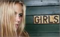
| 09/21/2005 03:13:05 PM |
Girlsby bucketComment: She looks like a young Heidi Klum. I like her hair obscuring part of her face. I like the slightly blurred "girls" sign as well. Has a natural sense of it without being like a snapshot. Good composition. |
| Photographer found comment helpful. |
| 09/21/2005 03:12:14 PM |
Lounging Aroundby Tommy 2 ToneComment: HEE HEE Great clear eye! I am not crazy about the carpet texture, but for a cute dog to be in the shot, I gotta up the score by one point. ;~D |
| Photographer found comment helpful. |
| 09/21/2005 03:10:49 PM |
Segregationby mandradeComment: ROFL Great title. I'd like to see the three on the left all on the same plain. Good perspective on this shot. Maybe a different colored surface would have been more appealing. Even solid black would work for more contrast!! |
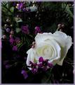
| 09/21/2005 03:09:39 PM |
Pureby smilebig4me1xComment: Very pretty with the soft feathered edge. The white stands out amidst the deep purple blossoms. I might do a single color selection and remove any yellow and/or black from the white flower for it to even be MORE bright!! Not the typical rose shot and I like it. |
| Photographer found comment helpful. |
Home -
Challenges -
Community -
League -
Photos -
Cameras -
Lenses -
Learn -
Help -
Terms of Use -
Privacy -
Top ^
DPChallenge, and website content and design, Copyright © 2001-2026 Challenging Technologies, LLC.
All digital photo copyrights belong to the photographers and may not be used without permission.
Current Server Time: 06/22/2026 10:34:18 AM EDT.