| Image |
Comment |
| 09/27/2005 08:49:20 AM |
Bon Voyageby joansuzyComment: Really perfect for the challenge. It gives that wanderlust sense of "let's go somewhere." I like the glistening water and the blue tones of the sky and the water. The end of the day sense helps create a peaceful mood. Nicely composed and naturally framed with the boughs of the trees. 8 |
 Photographer found comment helpful. Photographer found comment helpful. |
| 09/27/2005 08:48:20 AM |
Sympathyby sprite777Comment: I liked this the minute it popped up on my screen. The monochromatic theme is very effective with the petals blending slowly into the light. Perfect for the category you chose. There is enough detail for it to work, but it has a softness that I like. The DOF is good.The light to the left and upper area might be a tad bright, but no demerits for that as it could just be my monitor. With a light colored flower, you have to have a lighter level somewhere anyway. This would be pretty even if it weren't for a challenge as specific as this. |
| Photographer found comment helpful. |
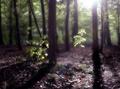
| 09/27/2005 08:40:01 AM |
Bereavementby TallblokeComment: This is lovely and perfect for the category. The dark muted colors are beautiful but do certainly denote the sad sense of the card. The long shadows help add to that as well. The misty/soft filter works with an ethereal "another world" sense. Quite striking. I'd love the photograph anyway, whethere this were the challenge or not. That blown out light in the upper right is a tad distracting, but overall quite nicely done. 8 |
| Photographer found comment helpful. |
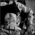
| 09/27/2005 08:36:20 AM |
Miss Youby annahComment: This is super imaginative and I like it VERY much. My main complaint would be all of the "props." The Green Day album, pen, portable phone, etc don't really add to the shot. I mean, they probably refer to the person specifically that you miss, but for the general buying public, I think no props at all, other than maybe something that denotes missing a person on a more generic level. Does that make sense? Since all of the words are kind of busy and your eye is reading them, maybe no belt on the jeans too. It might be kind of schmaltzy, but maybe holding an empty Valentine candy box, or a picture frame turned away from the viewer, so you just see the back of it. Just me rambling and thinking out loud here. The shadows and ligh tare excellent. The placement of the figure's torso to the far left works well too, Without all of the props, there would be more negative space, which would give it more of a lonely feeling in my opnion. Have her laying on grass instead of the rug too like she's outside day dreaming of the person she is missing. Hope all of this is helpful. You certainly have a great eye for detail and the composition is good - just maybe a few less things would work for me. GOOD LUCK 7 |
| Photographer found comment helpful. |
| 09/27/2005 08:29:28 AM |
Anniversaryby smilebig4me1xComment: I liked this the minute I saw it. It could also serve in the "Thinking of You," "Get Well," and even the "Sympathy" catetgory. My only complaint is the 2nd flower to the right. I think the pink of it's center is a tad distracting. I think if it were me, I'd clone it out so you are only looking at a single blossom. BUT having said that, to truly denote the duality of two people married, I would have liked to see two complete blossoms overlapping as the "two become one" type idea for marriage. The lighting is exquisite and the frame really works well with the color pallette of the shot. Well done. 8 |
| Photographer found comment helpful. |
| 09/26/2005 11:53:06 PM |
S I L E N C Eby pzig98Comment: This is a great studio set up. Love the soft nostalgic filter. Nice desaturation of color. The subdued lighting and subject matter are thought provoking. VERY NICE. Looks like a poster. I like the wide border too. |
| 09/26/2005 11:43:14 PM |
selfentry.jpgby utroComment: I like this very much. The bright orange of the sweater wouldn't work in all settings, but I love it here. It almost gives the skin tones a lavender sense because the orange is so warm and sunny. I like the pose. Not wild about the blanket the model is on, but the composition and positioning is really good@ |
| 09/26/2005 11:41:35 PM |
CRW_7178by NusbaumComment: Oh very pretty. Her skin tones are awesome. I like the stripe of the shirt leading up to her gorgeous face. I like her hand up behind her neck - not overposed, but nice and angular. |
| Photographer found comment helpful. |
| 09/26/2005 11:39:49 PM |
In Memory Of.....by sherComment: Oh I love this. Looks like a calendar cover or album sleeve. The warm neutral tones of brown and beige are so soothing. Great use of brushes here! |
| Photographer found comment helpful. |
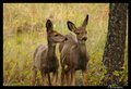
| 09/26/2005 11:36:29 PM |
Twinsby kendall6Comment: Lovely setting. The natural tones are wonderful. Tree adds a nice third aspect to the shot. So sweet. |
| Photographer found comment helpful. |
Home -
Challenges -
Community -
League -
Photos -
Cameras -
Lenses -
Learn -
Help -
Terms of Use -
Privacy -
Top ^
DPChallenge, and website content and design, Copyright © 2001-2026 Challenging Technologies, LLC.
All digital photo copyrights belong to the photographers and may not be used without permission.
Current Server Time: 06/22/2026 02:57:57 PM EDT.