| Image |
Comment |
| 09/27/2005 11:00:32 AM |
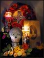
Día de los Muertosby RKTComment: This really does look like a greeting card set up. I'm glad you chose a different category as well. It is a bit busy, but considering the subject matter, it works. Nice composition and clarity. |
 Photographer found comment helpful. Photographer found comment helpful. |
| 09/27/2005 10:18:33 AM |
A Portraitby NelzieComment: Darling model. I love her freckles. The picture in the background is very distracting. I'd like to see a solid backdrop so you only focus on her face! |
| Photographer found comment helpful. |
| 09/27/2005 09:36:56 AM |
Birthday (40 and over...)by pawdrixComment: HEE HEE - nothing like candles in a Twinkie. ;~)
I like that the candles have started melting down and the flames are high. I think I'd remove the plastic fork in the foreground, as it's blurred and doesn't add anything to the shot. I'd like to see more negative space in front of the plate. The DOF is good and the idea is fun. |
| Photographer found comment helpful. |
| 09/27/2005 09:35:48 AM |
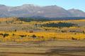
Fall Beginsby MWittComment: Lovely vista. The warm golds are soothing and certainly denote fall. I like the structure in the background - it helps give your eye a place to rest amidst the splendid panorama. I can see this as a postcard!! "Thinking of You" would work for this shot too!! |
| Photographer found comment helpful. |
| 09/27/2005 09:33:47 AM |
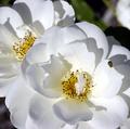
Sympathyby biggood53Comment: This seems a tad out of focus to me. I think a single blossom would denote the sense of a loss better than two. I'd clone out the bug as it doesn't realy lend itself to the category you chose. I like the idea of the fully opened blossom - like it's served it's time here on earth. |
| Photographer found comment helpful. |
| 09/27/2005 09:31:58 AM |
Friendshipby BudComment: Perfect for the category I love the sun's reflection coming right to the boat. Great silhouette. The golden tones are warm and friendly. Good choice. |
| Photographer found comment helpful. |
| 09/27/2005 09:30:52 AM |
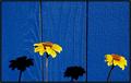
Condolencesby OzzieComment: I love the repeated shadows. The blue and yellow works great as they are contrasting colors on the color wheel. I think to denote a death (or to me at least) a single bloom would have worked better. The shadow lends a sense of both sides of it's BEING, but with two, I almost want to say this would work great for "Getting Married" or "Anniversary" as the duality makes me think of two instead of one. Does that makes sense. The photo itself is awesome. I love the linear quality of it and the details are spot on. Great focus. |
| Photographer found comment helpful. |
| 09/27/2005 09:22:39 AM |
Bon Voyage!by neophyteComment: HEE HEE HEE! This makes me smile. The focus is spot on. I don't like the line in the lower left, although that's showing that he is on the road. Maybe from a different angle with more of it showing would have worked for me. I am not crazy about the desat of green - maybe an entire shot done in black and white would've worked better for me. There is certainly enough contrast to do this effectively. Still a fun shot and good choice of category. 7 |
| Photographer found comment helpful. |
| 09/27/2005 09:21:20 AM |
Birthdayby karmatComment: I like the glass gems in the cupcake paper. Different and adds great sparkle to the shot. I would straighten it though, it's leaning slightly to the left - just make it parallel with the bottom line of the photo. The green and red are great contrasts as they are opposites on the color wheel. I like the shadow of the scalloped edge in the foreground. |
| Photographer found comment helpful. |
| 09/27/2005 09:19:30 AM |
Friendshipby BalkoComment: Very pretty. It seems almost a tad oversharp to me. Maybe it's my monitor. I like the contrast of the hot pink and the green. Maybe a bit more negative space would have worked. I might've cloned out the leaf in the lower right and that would have given that extra bit of background. The lighting is good and helps to detail all of the different areas of the blossom and highlight the variation in color of the petals. |
| Photographer found comment helpful. |
Home -
Challenges -
Community -
League -
Photos -
Cameras -
Lenses -
Learn -
Help -
Terms of Use -
Privacy -
Top ^
DPChallenge, and website content and design, Copyright © 2001-2026 Challenging Technologies, LLC.
All digital photo copyrights belong to the photographers and may not be used without permission.
Current Server Time: 06/22/2026 06:07:11 PM EDT.