| Image |
Comment |
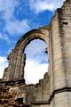
| 09/28/2005 08:54:41 AM |
Window to the Heavensby hookComment: I like the color contrast and the texture of the old stone arch, but I'm missing the tack sharp focus that would really make it a stand out. |
 Photographer found comment helpful. Photographer found comment helpful. |
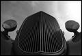
| 09/28/2005 08:46:33 AM |
Goodguys Classicby CoozComment: THis has great potential, but being in shadow, it loses something without the sharp contrast of black and white. THis is more gray feeling. I like the symmetry. It almost looks like a face. |
| 09/28/2005 08:44:55 AM |
Untitledby GermaineComment: I like the blown out sense of this. The symmetry really works as well. This is unusual and I like it. |
| Photographer found comment helpful. |
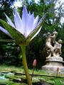
| 09/28/2005 08:44:00 AM |
Reaching for the Skyby amyrhComment: This has lovely coloration and great DOF, but I don't have the sense that you are shooting up. It seems more of a sideways shot from across the pond and not from the water toward the sky. |
| Photographer found comment helpful. |
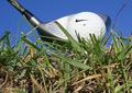
| 09/28/2005 08:42:31 AM |
Vantage of "The Golf Course Gopher"by NstiG8trComment: HEE HEE - I'm hearing "I'm alright, nobody worry 'bout me" by Kenny Loggins. "Here we are, at August - Cinderella story out of nowhere." Man, I love that movie.
This has great perspective and the composition is good. The grass is tack sharp. I think I'd like to see the ball and club more focused. Overall - good job. And thanks for reminding me of one of my favorite comedies! |
| Photographer found comment helpful. |
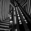
| 09/28/2005 08:34:29 AM |
Hotelby theflyComment: Great graphic sense to it. I like the architecture. Black and white is the perfect choice although there is alot of gray tones and not as much pure black and white. |
| Photographer found comment helpful. |
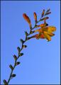
| 09/28/2005 08:25:00 AM |
Reaching to the skyby pallComment: Very pretty. I like the golden orange tones against the vivid blue. It loses some of the sense of being from the ground having been shot from this angle. I'd like the lens looking directly up at the flower, not to the side of it. |
| 09/28/2005 08:24:02 AM |
Your wish is my commandby pkarkareComment: LOL That guy is SO happy to be a viking. hee hee Thanks for the chuckle. Technically, not the best photo, but I do like the colors and the lattice grid. AND you did shoot from the ground up, unlike so many others that don't have near the perspective as this one. |
| Photographer found comment helpful. |
| 09/28/2005 08:20:18 AM |
Looking Towards Fallby jayrodComment: I love the idea of this with the yellow contrasting the blue but I feel as if I'm not on the ground but level with the higher part of the tree. I'd like to see part of the trunk as you shoot up to give more perspective. the clouds are wonderful. |
| Photographer found comment helpful. |
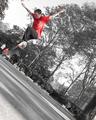
| 09/28/2005 08:16:09 AM |
Kick Flipby MPRPROComment: I like the diagonal sense of this in combination with the single color saturation. It adds an urban edge to it. |
| Photographer found comment helpful. |
Home -
Challenges -
Community -
League -
Photos -
Cameras -
Lenses -
Learn -
Help -
Terms of Use -
Privacy -
Top ^
DPChallenge, and website content and design, Copyright © 2001-2026 Challenging Technologies, LLC.
All digital photo copyrights belong to the photographers and may not be used without permission.
Current Server Time: 06/22/2026 06:07:24 PM EDT.