| Image |
Comment |
| 10/05/2005 12:28:25 AM |
my babyby wmewme2000Comment: This is a beautiful car. The vivid yellow is lovely, but I don't see the blue that would make it a complementary color usage. I think the crop is a bit tight. It would have worked so well had the balloons been blue or deep purple. |
 Photographer found comment helpful. Photographer found comment helpful. |
| 10/05/2005 12:26:29 AM |
Just because that Duffy's Eye...by lsmartComment: This is a beautiful high contrast image, but I don't see complimentary colors from any color wheel. I would need purple or blue or possibly green in order for that to be the case as orange of the beak and feet is the only true color. The contrast is great with the black and white. I love the lighting and the dark background, but the opposite color just isn't there. :~( |
| Photographer found comment helpful. |
| 10/05/2005 12:17:50 AM |
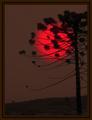
Unreal Sunsetby rodrigoComment: This is a beautiful photo, but the colors aren't complementary. There would need to be blue in this shot or even possibly a vivid green for that to be the case, depending on what color wheel you are basing it on. |
| Photographer found comment helpful. |
| 10/05/2005 12:04:39 AM |
Risenby CutterComment: Congrats. This got one of my two 10's. I think it should've ribboned for sure. |
| Photographer found comment helpful. |
| 10/05/2005 12:03:00 AM |
|
| 10/04/2005 11:59:22 PM |
|
| Photographer found comment helpful. |
| 10/04/2005 11:58:06 PM |
The Water Towerby Marc923Comment: Great symmetry. I like the one spot of light on the upper right of the tower. Good perspective. |
| Photographer found comment helpful. |
| 10/04/2005 11:57:40 PM |
C'mooon Give Us a Kiss...by Faye PekasComment: Great clarity. Those eyelashes. LOL So detailed. Great DOF. The lighting is really good with half of the face in shadow, yet perfectly visible. On 2nd review, I'm upping my score. |
| Photographer found comment helpful. |
| 10/04/2005 11:55:34 PM |
|
| Photographer found comment helpful. |
| 10/04/2005 11:54:12 PM |
Rising Sunsetby pardsbaneComment: What a truly beautiful reflection. I don't see the perspective as much from the ground up, but it is still a stellar capture. Lovely coloration and clarity. 7 |
Home -
Challenges -
Community -
League -
Photos -
Cameras -
Lenses -
Learn -
Help -
Terms of Use -
Privacy -
Top ^
DPChallenge, and website content and design, Copyright © 2001-2026 Challenging Technologies, LLC.
All digital photo copyrights belong to the photographers and may not be used without permission.
Current Server Time: 06/24/2026 03:11:49 AM EDT.