| Image |
Comment |
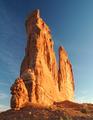
| 10/05/2005 08:34:17 AM |
Courthouse Towersby jrtoddComment: I like this and the colors work. With an adjustement of curves, I think the richness of the sky and rock tones could really have even more POP. |
 Photographer found comment helpful. Photographer found comment helpful. |
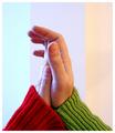
| 10/05/2005 08:31:28 AM |
We complement each otherby TimyComment: I love the idea of this. Something is lacking and I can't put my finger on it. Maybe it's the background. Hmmm. The lighting is good and the diagonal sense of the ribs on the sweaters draws your eyes to the hands. If this weren't a complementary photo challenge, I think it would be awesome in black and white. I'd like to see more negative space on one side - I think the centered placement kind of depletes the impact of it. |
| Photographer found comment helpful. |
| 10/05/2005 08:27:11 AM |
Two Roomsby basia03Comment: Interesting. I wish the drapes were a deeper tone, but I guess the beigy peach offsets the pale blue of the right wall. The composition is good and I usually hate toy type props, but the doll with the long dangly legs works here. Is that a heat register on the floor between the crapes? Hmm - the shadow under it creates a tiny bit of distraction. If that's a rug on the floor (and not fully layed carpet), I'd roll it back - it appears that there is hardwood, but I can't gell for sure. I love your imaginative approach, if nothing else. 7 |
| Photographer found comment helpful. |
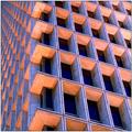
| 10/05/2005 08:25:05 AM |
Windowsby rightsaidfredComment: Nice geometry. The up shot works well and creates some interesting angles. The colors are certainly fitting for the challenge. |
| Photographer found comment helpful. |
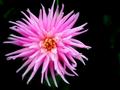
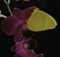
| 10/05/2005 08:23:35 AM |
black and pink how cool!!!!by gtp1164Comment: I love the contrast, but this isn't complementary. A minty or lime green would be the complementary color to pink. The crop is nice and the composition is good, but without more of the stem color, it kind of loses something, not visually, but as the proper entry for this challenge. |
| 10/05/2005 08:21:36 AM |
Upon Her Purple Throneby CNovackComment: Nice close up. The lighting seems a bit off - I'd like the colors to be more vibrant. Possibly a looser crop with more black area would have worked a bit better. |
| Photographer found comment helpful. |
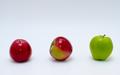
| 10/05/2005 08:18:29 AM |
Full Circleby alfrescoComment: HEE HEE The three muskateers. I like the simplicity of this. Like the red turned into the green - clever. Maybe do a selective color (white) adjustment, and get rid of the gray and blue tinge to the background. The focus is good and the lighting is nice. 8 |
| Photographer found comment helpful. |
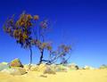
| 10/05/2005 08:15:58 AM |
Colours Of The Landby JudiComment: The colors work well, but it seems out of focus to me. The rule of thirds is achieved but without the tack sharp focus on the dying bush, it kind of loses something. I'd like to see less of the rocky foreground ame possibly more sky to really give this photo some snap. |
| Photographer found comment helpful. |
| 10/05/2005 08:12:50 AM |
Morning After - The Rose Budby aukipaComment: I like the idea of this. The lighting is spot on. My only complaint is the crop. I'd like to see the tip of the fern and the whole blossom of the rose. |
| Photographer found comment helpful. |
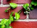
| 10/05/2005 08:10:51 AM |
The vine creepsby dpcollinsComment: I'm a huge fan of berries and vines. I like the close up and detail of the brick and mortar. The diagonal line of the vine is a nice touch. |
| Photographer found comment helpful. |
Home -
Challenges -
Community -
League -
Photos -
Cameras -
Lenses -
Learn -
Help -
Terms of Use -
Privacy -
Top ^
DPChallenge, and website content and design, Copyright © 2001-2026 Challenging Technologies, LLC.
All digital photo copyrights belong to the photographers and may not be used without permission.
Current Server Time: 06/24/2026 05:54:41 AM EDT.