| Image |
Comment |
| 10/14/2005 09:16:50 AM |
First Aceby jimmspComment: This has noe sense of depth. I'd like to see this card lying by the hold with the pin sticking up - to make it more 3 dimensional. |
 Photographer found comment helpful. Photographer found comment helpful. |
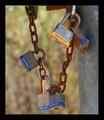
| 10/14/2005 09:16:14 AM |
Lockby mahesh3566Comment: This is an interesting study. The DOF is good. I think the black of the frame is distracting. Maybe a bit too wide for my taste. I think I'd crop just above that top lock and leave out that rectangular metal shape at the top. More negative space to the left would have worked a bit better as it has too much of a "centered" sense to it. I think the focus would use a bit of tweaking as well. |
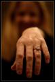
| 10/14/2005 09:14:37 AM |
Two Carats!by ElemmennopeComment: I'd like to just see the hand with a single light source, as if it's reaching out of the darkness. This is too centered and could use more negative space. IT's also not focused like it should be to get any sense of POW from the diamond. |
| Photographer found comment helpful. |
| 10/14/2005 09:13:43 AM |
The Family Prideby TwylaComment: This has an interesting sense to it. The crop seems to tight. Maybe pull out a bit and show more of the pendant. The focus is good and the use of negative space is ok, but I'd like to see a bit more of it. |
| 10/14/2005 09:12:49 AM |
"The Proud Executioner"by keithborgComment: I can't tell if this is a wax figure, or a real person. The light is a bit too harsh. It would be fun to have darker light and shadow play - to create a more deep and forboding sense of it. His hand is blown out and there is a hot spot down to the right of the stockade that's distracting. |
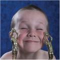
| 10/14/2005 09:11:05 AM |
Trophy Boy!by MakkaComment: Cute kid. The skin tones seem a tad too pink. The crop is too tight and he has that "bulls eye" sense - being dead center in the shot. I think it would be more effective if you saw him full figure, with negative space exagerated on one side of him, as he's holding the statues up - one in each hand as if to say "TA DA!!" I'd like to see this adorable boy in a regular portrait, with eyes open, showing a toothy grin. |
| Photographer found comment helpful. |
| 10/14/2005 09:03:37 AM |
Proud Of My Skillsby Nikolai1024Comment: THis would be much more effective if he were in tennis wear and on a court with a ball coming at him. As it is, it just looks like he grabbed the raquet for a quick snapshot. He has an almost angry expression. The focus is clear and the DOF is good. Just put it in a different locale (with him wearing different clothing). |
| Photographer found comment helpful. |
| 10/14/2005 09:02:24 AM |
On my own!by p2jvrComment: Cute little tike, but this has a very snapshot feel to it. The focus is good and the detail of the rocks is well done. I'd like to see light illuminating his face and maybe a tighter zoom on him. Maybe crop out everything to the left of him, including the huge rock and grassy area, and then put it in black and white, upping the contrst. He has that almost "bullseye" feel, being so close to the center of the image. |
| Photographer found comment helpful. |
| 10/14/2005 09:00:26 AM |
Mountains Majestyby 4forfunComment: The crop is too tight. This would work so much better as a landscape lay out with lost of space around the red building. The colors could be enriched - maybe it's the light and time of day. |
| Photographer found comment helpful. |
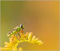
| 10/14/2005 08:59:22 AM |
Nature's Proudestby elsapoComment: The macro is good and thedetail is ok, but it just doesn't wow me for some reason. The blurred plant being in the foreground is distracting. Maybe a darker background would have showcased his green body better. As it is, he sort of blends into the greenish yellow. |
| Photographer found comment helpful. |
Home -
Challenges -
Community -
League -
Photos -
Cameras -
Lenses -
Learn -
Help -
Terms of Use -
Privacy -
Top ^
DPChallenge, and website content and design, Copyright © 2001-2026 Challenging Technologies, LLC.
All digital photo copyrights belong to the photographers and may not be used without permission.
Current Server Time: 06/26/2026 03:12:42 PM EDT.