| Image |
Comment |
| 10/14/2005 09:45:07 AM |
All Mine! - Sleeping Beautiesby hubbardr1Comment: This is sweet, but has more of a snapshot sense to it. The subjects need to be tack sharp for this to work well. There isn't alot of contrast. Id maybe shoot from a different angle. The arms in the foreground are a bit distracting as well. Also, utilize your maximum 640 pixelation, for a larger image. |
 Photographer found comment helpful. Photographer found comment helpful. |
| 10/14/2005 09:43:15 AM |
Parental Prideby NaldComment: This is way to overexposed with the late day light bathing the entire shot in yellow light. The subject is fine and the pumpkins in the background is ok, but for it to work, he needs to have tack sharp focus and maybe have the pumpkins blurred, to create an interesting DOF. His placement in the shot is good but that light just kills it for me. |
| Photographer found comment helpful. |
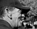
| 10/14/2005 09:38:56 AM |
The Face of Prideby phinbobComment: I don't see anything prideful about his face. The DOF is good and the focus is ok, but it just doesn't have any punch for me somehow. Maybe if I could see more of his face. As it is, the shadow kind of hides too much of it for me. |
| 10/14/2005 09:35:47 AM |
|
| Photographer found comment helpful. |
| 10/14/2005 09:27:41 AM |
German Pride @ the Octoberfestby rebelgirlComment: HEE HEE - that guy is having fun. He must be a judge of some kind? The overall shot has a snap shot sense to it. It's not tack sharp either, which hurts it. Considering the setting, there is going to be lots going on behind him, but if the background were blurred more, it would make him more the center of attention. |
| Photographer found comment helpful. |
| 10/14/2005 09:26:30 AM |
My pride and joyby BrooklynsbridgeComment: He has a nice pleasant expression. I'd crop just below his shoulders and make it more of a true portrait, with more concentration on his face. I'd have more negative space to the left of the shot if left in this pose, or do a tight close up and have him fill up the entire shot. THE DOF is good but thebackground lighting is a tad harsh. Maybe tone down the white area behind him. The lighting on his face is nicely done. I'd have him take off the sunglasses too - they detract from his handsome face. |
| Photographer found comment helpful. |
| 10/14/2005 09:24:03 AM |
Proud to be a Bucket Headby trobergeComment: HEE HEE. I like the glint in the eye, but the focus isn't tack sharp. I'd crop out the blanket. The pillow behind the head with the design on it is a tad distracting. I'd show the entire bucket too seeing as that's the focus of the title. |
| Photographer found comment helpful. |
| 10/14/2005 09:22:15 AM |
A proud womanby iluvlifeComment: Her skin tones are a bit too yellow. I'd like to see her with more negative space to the left. The focus isn't tack sharp either. I'd like a crop just below the best, with a closer view of her face. The lipstick is too harsh for the shot. I do like the windows and column as the setting. They add a nice architectural sense to it. |
| Photographer found comment helpful. |
| 10/14/2005 09:19:41 AM |
Native Prideby flip89Comment: The crop is too tight. I'd like to see better lighting and a glint in his eye. |
| 10/14/2005 09:19:18 AM |
I won ...by kari1Comment: The negative space is good. The placement of the shoes is as if you just took them off, threw the ribbon on the ground and went to grab a Gator Aid. The lighting off of the medal is a bit harsh. I think the yellow of the frame, although it ties into the other coloration, is a bit too much. Maybe a creamy off white like the stripe of the shoe would have worked better. The focus doesn't seem quite as tack sharp as I'd like to see. 6 |
| Photographer found comment helpful. |
Home -
Challenges -
Community -
League -
Photos -
Cameras -
Lenses -
Learn -
Help -
Terms of Use -
Privacy -
Top ^
DPChallenge, and website content and design, Copyright © 2001-2026 Challenging Technologies, LLC.
All digital photo copyrights belong to the photographers and may not be used without permission.
Current Server Time: 06/26/2026 04:59:07 PM EDT.