| Image |
Comment |
| 10/26/2005 01:55:27 AM |
|
| 10/26/2005 01:54:57 AM |
|
 Photographer found comment helpful. Photographer found comment helpful. |
| 10/26/2005 01:53:51 AM |
|
| Photographer found comment helpful. |
| 10/26/2005 01:52:39 AM |
|
| 10/26/2005 01:52:25 AM |
Baby Girlby rd_325Comment: Love the crop. Those eyes are something else. The reflection and sparkle is awesome. |
| Photographer found comment helpful. |
| 10/26/2005 01:48:50 AM |
Wolfby Joey LawrenceComment: WOW. I missed this one. The intense green against his white coat is beautiful!! The sense of movement is great. |
| Photographer found comment helpful. |
| 10/26/2005 01:44:57 AM |
|
| Photographer found comment helpful. |
| 10/26/2005 01:43:51 AM |
|
| Photographer found comment helpful. |
| 10/26/2005 01:20:10 AM |
Whelkby dragonladyComment: Very pretty. I like the tonality of the shell. Maybe just a smidge too "hot" but just ever so slightly. |
| Photographer found comment helpful. |
| 10/26/2005 01:19:04 AM |
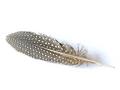
Feather Lightby redtigerComment: Feathers are wonderful. This one in particular. The detail is nice. It seems just slightly off though - not as tack sharp as I'd like to see. |
| Photographer found comment helpful. |
Home -
Challenges -
Community -
League -
Photos -
Cameras -
Lenses -
Learn -
Help -
Terms of Use -
Privacy -
Top ^
DPChallenge, and website content and design, Copyright © 2001-2026 Challenging Technologies, LLC.
All digital photo copyrights belong to the photographers and may not be used without permission.
Current Server Time: 07/20/2026 03:54:19 AM EDT.