| Image |
Comment |
| 10/26/2005 10:39:00 AM |
White Pumpkinby Postgate1Comment: I love this idea.. Actually thought of doing it myself. I wish it didn't have such a blown out sense below. Maybe have the squash/pumpkin way to one side or up in one corner with lots of negative space, instead of dead centered. |
 Photographer found comment helpful. Photographer found comment helpful. |
| 10/26/2005 10:36:13 AM |
panel tilesby AntoninoComment: THis is simple and suits the challenge perfectly. One of the few that truly does. Not overly interesting, but quite artful and different. |
| 10/26/2005 10:34:17 AM |
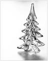
White Christmasby CalliopeKelComment: I think this is pretty. If it were not basic, I'd clone out the shadow. The placement is good - I like the frame as well. Makes us start thinking about the holidays. Lighting is well executed as well. HO HO HO |
| Photographer found comment helpful. |
| 10/26/2005 10:32:22 AM |
I've Always Been A Big Fanby SwagComment: HA HA HA THE title is funny. BUT it's white on white, not light on white. Hmmmmmm
Clear, good use of negatige space. I wish the fan were pale pink. LOL |
| Photographer found comment helpful. |
| 10/26/2005 10:26:07 AM |
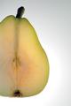
Pear liteby cabaComment: Nice. Very interesting. It appears slightly out of focus to me though. BUMMER. |
| Photographer found comment helpful. |
| 10/26/2005 10:24:09 AM |
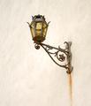
Lit Light on Whiteby GermaineComment: Interesting. I'd crop almost to the metal bracket on the righ and up above, and use the rule of thirds a bit better for a more interesting visual.. I'd whiten up the background a tad too, using selective color adjustment. The angle is good. It's artful and unexpected. I love the rusty drip. |
| Photographer found comment helpful. |
| 10/26/2005 10:21:39 AM |
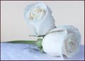
a hugby barndogComment: Nice title. Pretty. I like the water droplets. Iwish the roses were a tad more sharply focused. The crop is a bit too tight for my liking. NOt a huge fan of the border - I think it would serve you better if it weren't so dark. Maybe the shadow color within the rosebud or the palest green of the stem/leaf.. |
| Photographer found comment helpful. |
| 10/26/2005 10:19:48 AM |
Once, she saw the sea!by KaDiComment: Just the shell alone would hae worked so much better. The handkerchief just clutters it up as far as I'm concerned. |
| Photographer found comment helpful. |
| 10/26/2005 10:19:11 AM |
My little escapist by nico_blueComment: Clever and interesting. I'd like more negative space to one side, so that the glass and fish aren't bullseye target centered. Great execution of an action shot. The background has pale pink and blue striations - maybe it's my monitor. |
| Photographer found comment helpful. |
| 10/26/2005 10:17:54 AM |
Whiter Shades of Paleby secondglantzComment: I like the sense of portraiture. The pale seems a tad forced, like you reduced some of the contrast. She's beautiful. I wish she weren't squinting. Her eyes are lovely and I like that her hair is falling in wisps, not all perfectly brushed and groomed. 7 |
| Photographer found comment helpful. |
Home -
Challenges -
Community -
League -
Photos -
Cameras -
Lenses -
Learn -
Help -
Terms of Use -
Privacy -
Top ^
DPChallenge, and website content and design, Copyright © 2001-2026 Challenging Technologies, LLC.
All digital photo copyrights belong to the photographers and may not be used without permission.
Current Server Time: 07/23/2026 07:01:08 AM EDT.