| Image |
Comment |
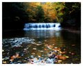
| 10/28/2005 08:44:26 AM |
Fallsby NeuferlandComment: Great use of the glow filter (my favorite). The richness it gives to the colors is awesome. I love the softness it creates in the waterfall as well. SO peaceful and serene. |
 Photographer found comment helpful. Photographer found comment helpful. |
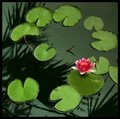
| 10/28/2005 08:41:42 AM |
Reflection's Surpriseby SandyPComment: This one is almost surreal. The reflection and smoothness to it all is perfect. I like how the water lilies look like little pacman faces HEE HEE That one single flower in vivid pinks and red really is the WOW factor. Lovely shot, Sandy. |
| Photographer found comment helpful. |
| 10/28/2005 08:37:16 AM |
Duck pond IIby sz1_Comment: This is beautiful. Check out bear_music's portfolio - reminds me of his excellent work.
Beautiful vivid colors. The clarity is spot on. I love the grass and single duck as an added bonus! Nicely done. |
| Photographer found comment helpful. |
| 10/28/2005 08:35:54 AM |
Somewhere in Timeby CalliopeKelComment: I love the "Caught in the act" sense of it. Like "caught me." HEE HEE
You do so well with people, whether it be posed or candid like this. The grain does add to the shot as well. Even though grain makes an aged sense, this could happen anywhere, any time - thus the title is perfectly fitting. ;~D |
| Photographer found comment helpful. |
| 10/26/2005 11:13:41 PM |
|
| Photographer found comment helpful. |
| 10/26/2005 11:12:39 PM |
|
| Photographer found comment helpful. |
| 10/26/2005 11:12:08 PM |
pict2341.jpgby alien2thisworldComment: WOW - now THAT's a pet portrait!!! Great clarity and detail. Spot on sharp!!! Maybe give a tad more space below the chin. |
| Photographer found comment helpful. |
| 10/26/2005 11:08:36 PM |
Childrenby bruskiComment: Great close up. No distortion at all. I might desat the yellow just a smidge. Beautiful eyes and I love the slightly open mouth. |
| Photographer found comment helpful. |
| 10/26/2005 11:02:09 PM |
Tender by jaxedComment: Beautiful. Interesting use of color. Hmmmmm How'd you do that with basic? HEE HEE Can't wait to find out. This is nicely composed too. |
| Photographer found comment helpful. |
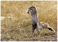
| 10/26/2005 10:58:33 PM |
Ground Squirrelby microComment: That is so cute! I love how he's upright like a human. I'd adjust curves to enrich the colors a little. Nice capture. |
| Photographer found comment helpful. |
Home -
Challenges -
Community -
League -
Photos -
Cameras -
Lenses -
Learn -
Help -
Terms of Use -
Privacy -
Top ^
DPChallenge, and website content and design, Copyright © 2001-2026 Challenging Technologies, LLC.
All digital photo copyrights belong to the photographers and may not be used without permission.
Current Server Time: 07/21/2026 05:16:04 PM EDT.