| Image |
Comment |
| 10/29/2005 09:33:01 AM |
Light Crucibleby NullixComment: Great shadow. The focus seems a touch soft. Good use of negative space. Would make a nice stock photo. |
 Photographer found comment helpful. Photographer found comment helpful. |
| 10/29/2005 09:31:42 AM |
Very light... and whiteby MonimixComment: Great focus and detail. I like the shadowing below the feather. It seems a bit too centered to my eye. I am a big fan of more negative space on one side, utilizing the rule of thirds.. |
| 10/29/2005 09:30:39 AM |
Wedding day!by letuananhComment: This is very pretty and "soft." It's like she just collapsed on the bed in pure joy. It has a casual sense to it which I like. The bouquet and the petals around her add a nice bit of eye candy. Some may say that it's too much darker color to truly be light, but with her dress and the lace on her wrists, I think it still works. |
| Photographer found comment helpful. |
| 10/29/2005 09:29:01 AM |
Ghosts don't come out in the lightby wbb117Comment: I like that I have to study it but it's so faint (I'm sure that was your point) that it loses impact. It has a pink tinge to it on my monitor. It could have worked with a bit more contrast. |
| 10/29/2005 09:28:06 AM |
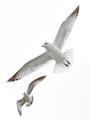
flight by tateComment: Nice duplicity with the two birds. I like the floating sense it gives the viewer. Well detailed. Great detail and focus on the larger bird's head. |
| Photographer found comment helpful. |
| 10/29/2005 09:26:59 AM |
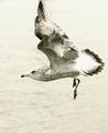
Flyerby BKerrComment: There are several bird shots and I like this one. I wish his bodye were perfectly focused. The close up sense is great, like you are flying with him. The action of the wing is well done. |
| Photographer found comment helpful. |
| 10/29/2005 09:25:51 AM |
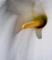
Past it's prime.by jimsappComment: Pretty and nice detailing. I'd like the bloom to be less centered, utilizing more negative space above, below, or to one side, using the rule of thirds. |
| 10/29/2005 09:24:41 AM |
Christinaby ajgardnerComment: I like that you didn't "un contrast" this like so many of the shots I'm seeing. The harshness of the light doesn't even bother me. Great eyes. I like her pose and her hair falling over her face. It has an ethereal quality to it. 8 |
| Photographer found comment helpful. |
| 10/29/2005 09:23:00 AM |
Natureby SteveinnzComment: Great macro. The shadowing is well done due to the nice lighting. Good detail on the stamen. Almost seems phalic. Perhaps this type shot is a bit overdone, but it is effective and works for the challenge. 8 |
| Photographer found comment helpful. |
| 10/29/2005 09:21:21 AM |
Tender Confessionsby shabbychicComment: I like this but it seems almost too faint. Like you did a contrast adjustment and faded it away. I think the idea is good and the placement of the torso in the shot is well done. The harlequin design on the panties is a tad distracting. Maybe crop above them, or have them a solid color since there's enough going on with the folds and wrinkles of the shirt and the lace of the bra. Overall - original and imaginative. 7 |
| Photographer found comment helpful. |
Home -
Challenges -
Community -
League -
Photos -
Cameras -
Lenses -
Learn -
Help -
Terms of Use -
Privacy -
Top ^
DPChallenge, and website content and design, Copyright © 2001-2026 Challenging Technologies, LLC.
All digital photo copyrights belong to the photographers and may not be used without permission.
Current Server Time: 07/21/2026 07:40:47 PM EDT.