| Image |
Comment |
| 11/23/2005 09:43:55 AM |
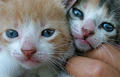
Catsby KristalComment: AWWW those little faces. I think, even though those blue eyes are really cute, this might be a fun study in black and white. I wish the fingers weren't there. Adorable little kitties. |
 Photographer found comment helpful. Photographer found comment helpful. |
| 11/23/2005 09:42:07 AM |
symmetryby imagesloyolaComment: WOW - that's what I call ripped.
The angle of the body's curvature is great. Nice detail and black and white is perfect. I wonder if eliminating the face might've had more effect. Maybe that's just me. Nico, is that you????? |
| 11/23/2005 09:40:27 AM |
Snake Eyesby racwComment: There is nothing artistic about this shot. It doesn't seem esthetically thought out. It has a blurred snapshot sense to it. Send some time. Place the objects strategically and make sure your focus is tack sharp. I'd like a scene similar to this in black and white with lots of negative space. Hope this helps. |
| 11/23/2005 09:39:19 AM |
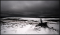
Sky versus earthby sz1_Comment: WOW. This is fabulous. The texture in the foreground against the smooth sky I love the contrast of the black and white. LOVELY |
| Photographer found comment helpful. |
| 11/23/2005 09:38:19 AM |
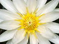
Symmetricalby catnComment: Pretty. I think this could use a tad of curve adjusting. Maybe pan back and not have it so much like a target - yeah, I know, that was probably your intent. Maybe not cut out the edges of the petals though. |
| Photographer found comment helpful. |
| 11/23/2005 09:37:25 AM |
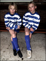
10-10by messerschmittComment: Beautiful girls. I'd love to see more formal portraiture of them. This doesn't do them justice. WOW - their skin is gorgeous. |
| Photographer found comment helpful. |
| 11/23/2005 09:36:33 AM |
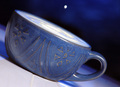
Ful-Filledby sarrobiComment: This is interesting and cool. Love the texture on the cup - it's geometric and almost has a heiroglyphic sense. The tilt works and adds a diagonal line. That dot in the background - is that the moon??? Great focus. 8 |
| Photographer found comment helpful. |
| 11/23/2005 09:34:41 AM |
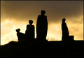
Stone Age famelyby StructorComment: Spelling police here: FAMILY
That aside, this is interesting. It would work much better if it didn't have such a centered approach. Maybe have the "family" off to one side. It also seems out of focus. Bummer, cause I like the idea. |
| Photographer found comment helpful. |
| 11/23/2005 09:33:00 AM |
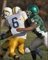
Six Meets Sixby coolharComment: WOW Great action shot. And it's well focused. What if you upped the saturation just a smidge? Nice one. 7 |
| Photographer found comment helpful. |
| 11/23/2005 09:32:18 AM |
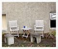
Two Of Usby gsalComment: I think this is screaming for black and white. It would have so much more PUNCH. I like all of the angular qualities. Maybe one round thing sitting on the table or a ball on the ground would have helped break that up. |
| Photographer found comment helpful. |
Home -
Challenges -
Community -
League -
Photos -
Cameras -
Lenses -
Learn -
Help -
Terms of Use -
Privacy -
Top ^
DPChallenge, and website content and design, Copyright © 2001-2026 Challenging Technologies, LLC.
All digital photo copyrights belong to the photographers and may not be used without permission.
Current Server Time: 07/27/2026 05:55:34 PM EDT.