| Image |
Comment |
| 12/12/2005 12:49:14 AM |
Naughty or Nice! by SonifoComment: Excellent. I love the simplicity of this. Great detail and lighting. The string of twinkly lights is wonderful with the colors and the way you captured them. I wonder if the background were solid black if it wouldn't have been a bit less distracting. Hmmmm |
 Photographer found comment helpful. Photographer found comment helpful. |
| 12/12/2005 12:46:11 AM |
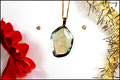
Opal Dreamsby OdysseyF22Comment: I think the placement of the bow and tinsel is too matchy matchy. I think it'd be more artful if the pendant wasn't so centered. I'd lay it lazily, and maybe have the earrings together with a tight macro. The bow looks kind of bent and old. I don't think it even adds to the shot. I'd remove it, crop it out, so that would help the target center issue of the pendant. The gold of the tinsel mimics the gold chain and the bezel of the earrings. This has definite potential. |
| Photographer found comment helpful. |
| 12/12/2005 12:42:25 AM |
A Feeling Of Christmasby TUBORGComment: Nice with the blurred lights in the background. Simple, vivid and I like the black background. If it were perfect, the flames would be straight up but that's just nit picking. |
| Photographer found comment helpful. |
| 12/12/2005 12:41:06 AM |
|
| Photographer found comment helpful. |
| 12/12/2005 12:39:41 AM |
Snow Angelby smartypantsComment: Cute idea. I like the long shadow. I think the crop is a tad too tight above the actual angel and right at the end of the shadow. |
| Photographer found comment helpful. |
| 12/12/2005 12:38:45 AM |
Just Picked from the Treeby industrealityComment: Beautiful, elegant and stunning. All it needs is Nieman Marcus 2005 at the top!! What a gorgeous ornament! I love it's shadow. Great use of negative space. My single critique would be to possibly not have it centered quite so much. |
| Photographer found comment helpful. |
| 12/12/2005 12:37:06 AM |
Happy Holidaysby tcmartinComment: Very pretty. I love the blurred lights. I can see this on a cover of a catalog for sure. |
| Photographer found comment helpful. |
| 12/12/2005 12:34:50 AM |
iWish for a ... by frogletComment: AWESOME! Looks like a Sharper Image or similar catalog page or cover. Great detail and I love the perspective up the styrofoam snow. Well done!!! |
| Photographer found comment helpful. |
| 12/12/2005 12:31:19 AM |
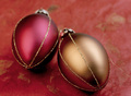
Red Hueby mia67Comment: Very pretty. I can see this on the cover of a specialty catalog. I like that the ornaments are satin and not real shiny. The lighting is good and the DOF is nicely done. |
| Photographer found comment helpful. |
| 12/12/2005 12:30:08 AM |
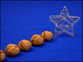
Your Choice ...by tonyvComment: I can see this on the cover with Holiday 2005 in the negative space area at the top and bottom. I love the gold and red against the white. Beautiful detail. Nicely done. |
| Photographer found comment helpful. |
Home -
Challenges -
Community -
League -
Photos -
Cameras -
Lenses -
Learn -
Help -
Terms of Use -
Privacy -
Top ^
DPChallenge, and website content and design, Copyright © 2001-2026 Challenging Technologies, LLC.
All digital photo copyrights belong to the photographers and may not be used without permission.
Current Server Time: 08/04/2026 06:13:17 PM EDT.