DPChallenge: A Digital Photography Contest You are not logged in. (log in or register
 
Browse Settings
Currently viewing:
Registered UserJakeKurdsjuk

Show comments:

Per page:

Order:

Comments:


Comments Made by JakeKurdsjuk
Pages:   ... [181] [182] [183] [184] [185] [186] [187] ... [233]
Showing 1831 - 1840 of ~2328
Image Comment
That is no country for old men
09/12/2014 01:25:33 PM
That is no country for old men
by gmink

Comment:
Critique Club Comment:

Very interesting capture in the face of impending, um, dust!! Given your description there was obviously some sense of urgency to capture this, and ultimately avoid it, so realize that I am aware of that as a factor within my critique.

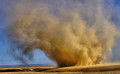
I really like the tonality of the photo and how the gold plays off the blue. While one of the previous comments states that they love how it fills the frame, I actually would prefer a bit more space around it so I could see the full extent of the storm. I'd also would have loved something there to give me a sense of scale. Having never seen one personally I have trouble deciding if this is truly as massive as it looks if I consider the dark area to the left is foothills of some type, or if what I'm looking at is just a bunch of dry earth kicking up in a 2 acre field. I'm also troubled by what I'm interpreting as noise. Obviously, in a dust storm like this what appears to be noise could be REAL noise within the cloud, but it reminds me of artifacts that come from boosting structure and clarity. Across the top of the cloud I'm also seeing what appears to be repeated lines that typically show when something has been cloned out, like a power line may have run across the image originally. I'm not convinced that's what I'm seeing as it could possibly be white clouds beyond the dust storm, but regardless it gives that illusion.

Given that the crop is flatter than the 3:2 ratio you'd get straight out of camera you have obviously eliminated some of the original image, and if in fact this is a severe crop that would also explain why I'm perceiving this level of noise in an image shot at ISO 250.

All that said it is still a very fine capture. That said, I will admit to giving you a 5, primarily because I felt that the image did not fit the poem, at least not the line you chose for it. Perhaps more fitting for the movie/book whose title was taken from the line, but not as it exists in the poem. Not quite DNMC area, but close for me, as were a lot in this challenge. Now, had you gone with "perne in a gyre" I would have likely given you a 7 as did most others.
An aged man is but a paltry thing, a tattered coat upon a stick
09/12/2014 12:54:53 PM
An aged man is but a paltry thing, a tattered coat upon a stick
by JakeKurdsjuk

Comment:
Originally posted by mitalapo:

the entering face gives this great depth in more than one way.


A fortunate coincidence for sure. More times than not this would have become a throw away or I would have cropped differently. This time I was thankful.
blurry kitty for a scratch your eyes
09/12/2014 09:26:18 AM
blurry kitty for a scratch your eyes
by skewsme

Comment:
Funny. Not a fan of the 3D text with the blurred kitty.
Photographer found comment helpful.
Save Water Save Lives
09/12/2014 09:23:10 AM
Save Water Save Lives
by illini75

Comment:
Nice treatment but I really don't like the mixed text orientations. Top would be better centered like the bottom or spaced so that it squares on both sides, not just on the left.
What could you possibly have to protect?
09/12/2014 09:21:56 AM
What could you possibly have to protect?
by nygold

Comment:
Over-saturated. In all sorts of ways.
Photographer found comment helpful.
Fahrenheit 9/11
09/12/2014 09:21:07 AM
Fahrenheit 9/11
by PennyStreet

Comment:
If you've got something to say it needs to be readable, even when your point is that stuff is hidden.
Photographer found comment helpful.
Cherish the Earth!
09/12/2014 09:17:14 AM
Cherish the Earth!
by Bear_Music

Comment:
Just because textures are allowed it doesn't mean you have to use them. I assume you're trying to use them as evidence of earth-abuse but to me they're just distracting.
Photographer found comment helpful.
Health Care For People, Not Profit!
09/12/2014 09:15:21 AM
Health Care For People, Not Profit!
by GeneralE

Comment:
Would like to see a little more contrast in the photo. Need to be mindful of font sizes at 800px - we like to read fine print.
Photographer found comment helpful.
Support Your Local Historic Site
09/12/2014 09:14:06 AM
Support Your Local Historic Site
by bobnospum

Comment:
A different font (and uncurved) in the middle and this would have looked rather professional.
Photographer found comment helpful.
Join DPC NOW
09/12/2014 09:12:45 AM
Join DPC NOW3rd Place
by GeorgesBogaert

Comment:
Head seems too small for the helmet. Otherwise nicely done, though I think you have one too many fonts on the bottom line.
Photographer found comment helpful.
Pages:   ... [181] [182] [183] [184] [185] [186] [187] ... [233]
Showing 1831 - 1840 of ~2328


Home - Challenges - Community - League - Photos - Cameras - Lenses - Learn - Help - Terms of Use - Privacy - Top ^
DPChallenge, and website content and design, Copyright © 2001-2025 Challenging Technologies, LLC.
All digital photo copyrights belong to the photographers and may not be used without permission.
Current Server Time: 09/05/2025 12:05:04 AM EDT.