| Image |
Comment |
| 11/12/2014 05:39:29 AM |
|
 Photographer found comment helpful. Photographer found comment helpful. |
| 11/12/2014 05:38:18 AM |
Midtown Ferry Terminal - Going Up?! by JakeKurdsjukComment: Originally posted by PennyClick:
Great image. Well seen. Love the tones, and the splash of red. Did you consider a horizontal flip? I know I would have done just to see if I preferred a left to right flow within the image rather than the right to left one we see here. Ties with one other image for my highest score and I hope to see it ribbon. |
Penny, yes indeed, I did try it flipped horizontally. In fact, my initial edit was done this way because I did a 180 degree rotation of the original image. I liked it just fine, but then decided to try it the other way, because it is the same basic angle that I saw the room from in the first place. When I did I found that I preferred this one. Why? Perhaps because it reminded me of the original, unflipped view, and maybe because I felt the left-to-right leading line was a little more traditional, where the right-to-left felt "off" in a good way and might help with the disorienting of the viewer and delay the discovery that this was actually upside down. |
| 11/12/2014 05:28:50 AM |
A Study In Yellowby JakeKurdsjukComment: Thanks for the comments, all. This is actually a tight crop shot with a 70-200mm and not technically a close-up. The details in the center of this flower caught my eye and I wanted to capture it, and as I processed it I realized that they eye was distracted by more and more of the background objects so I cropped in to this. I'm glad it was as appreciated as it was - I don't have a lot of backlog to pick from for these deep challenges.
I agree that the dark spot can be distracting, but I didn't want to crop it out because I liked the parallel look in the bokeh, and it helped you realize the size of the flower since it is more obviously a sunflower. In retrospect I should have dodged it a bit to make it less obviously dark.
|
| 11/08/2014 07:25:58 AM |
|
| Photographer found comment helpful. |
| 11/06/2014 07:02:18 AM |
|
| Photographer found comment helpful. |
| 11/06/2014 07:01:47 AM |
Symmetryby LN13Comment: Not quite - but pretty darn close. Upper left corner needs pulling up just a touch to square the horizontal on that roof window. If it wasn't so close to the edge I might not notice (OK, I probably would). Still, well seen and taken. 8 |
| Photographer found comment helpful. |
| 11/06/2014 06:58:04 AM |
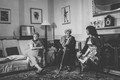
The Conversationby rooumComment: This is so wonderful, but the skewed verticals on the walls are so distracting. So easily fixable too. I'm still giving it a begrudging 8 because I love the ladies so much, but it could have been higher. |
| Photographer found comment helpful. |
| 11/06/2014 06:43:37 AM |
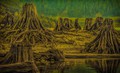
Stumpsby LawtonComment: Really lovely. Perhaps a little more blur (i.e. less definition/structure) in the background to better accentuate these great old tree remnants. |
| Photographer found comment helpful. |
| 11/06/2014 06:40:23 AM |
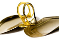
Golden ringsby hajekaComment: Interesting subject and composition. Nice use of Pringles lids(?) |
| Photographer found comment helpful. |
| 11/06/2014 06:39:19 AM |
Viperby theluissalesComment: I got this immediately after the Emu shot and it made me chuckle. You're just a hair too far too the right on an otherwise well done shot. |
| Photographer found comment helpful. |
Home -
Challenges -
Community -
League -
Photos -
Cameras -
Lenses -
Learn -
Help -
Terms of Use -
Privacy -
Top ^
DPChallenge, and website content and design, Copyright © 2001-2026 Challenging Technologies, LLC.
All digital photo copyrights belong to the photographers and may not be used without permission.
Current Server Time: 06/24/2026 12:46:44 PM EDT.