| Image |
Comment |
| 12/04/2008 11:38:49 PM |
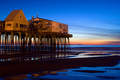
Ebb Tide - And the Sea is Very Still Once Moreby DJWoodwardComment: What a great location and scene. I really like the light comming through from behind the stilts. The contrasting red and blue work very well and the still water makes for great reflections. However, I dont think you used the reflectios of the water to their potential. I would like to see more of the structure reflected instead of just a little bit of the top. Everything else is great though. |
 Photographer found comment helpful. Photographer found comment helpful. |
| 12/04/2008 11:35:18 PM |
end of summerby GordonComment: hmmm... Was this on purpose? Brown ribbon? Well if you arent going for the brown ribbon, I can only assume that you are trying to infer that the summer is fading away. If this was your intention, then it works well enough but it could use a lot of work. 3 |
| Photographer found comment helpful. |
| 12/04/2008 11:33:39 PM |
Simplicityby IvoComment: Great use of negative space in this photo. I really like the lighting and the gradual color change. If i were to offer criticism it would be two things: 1. Get rid of the watch and 2. Somehow dont show what i guess is the ground and rock under the water. Great idea, and great execution. 7 |
| Photographer found comment helpful. |
| 12/04/2008 11:29:43 PM |
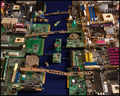
Circuit Cityby scarbrdComment: Haha! a 10 for creativity and originality for sure. However I would not concider this a breathtaking photograph, and think it would do better in a specific challenge as opposed to a free study. My suggestion would have been to line up a lot more motherboards and such and take the picture at a lower angle to got closer to the action. This way you could take advantage of a shallow DOF for effect. Great idea though, and well executed! 5 |
| Photographer found comment helpful. |
| 12/04/2008 11:24:53 PM |
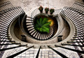
Flowby jdannelsComment: Oh fun image! I love the patterns in the tile work and the curves of the railings. The asemmetry works great with this image, and the splashes of color from the plants are great. Did you have to add lighting on the bottom floor by the plant? My only issue is the framing of the closest bars, i would like to have seen it centered on the middle bar or centered in the middle of the bars. 6 |
| Photographer found comment helpful. |
| 12/04/2008 09:14:16 PM |
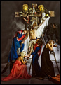
Descent from the Cross by De SousaComment: WOW! Took me a few minutes to even look at everything that is going on with this. This is my favorite idea of all of them so far, just because of the originality to it. The modern theme is just so well executed. Every detail is there: The parametics have all their gear, as do the firefighters. The smoke adds great drama to the scene, and the women in dresses show so much emotion! I also like how we cant see the firefighters' faces, and how the girl in the paramedic is calling on the radio. If I had to search through and pick out a little detail i dont like its this: It would look better outside, but i know that would be close to impossible to keep the same lighting. Great job! 9 |
| Photographer found comment helpful. |
| 12/04/2008 09:05:54 PM |
The Masterby FocusPointComment: You must have a great zoo, or a connection there to get this shot! I like how you went about with the lighting, but I really wish we could see the other eye! So maybe a bit too harsh on the shadowing. The fur, however, has great detail, and i like how it fills the frame. 6 |
| Photographer found comment helpful. |
| 12/04/2008 09:03:45 PM |
Self Portrait Studyby shamerComment: Usually the "self portrait" challenges makes people cringe, but you did one in a free study; impressive! The B&W works well this this shot, it makes it look very crisp. The lighting is great with no harsh shadows or uneven lighting and the glint off the earing is a plus. If i had to give criticism, I would say that its not the most "original" shot. 6 |
| Photographer found comment helpful. |
| 12/04/2008 08:59:34 PM |
Fallen Autumn Leavesby arpitaComment: Nice Shallow DOF on this shot, and it works well with the subject. My main dislike with this shot is the centerd framing, and the leaf in the foreground. I think a SDOF image should have the subject be in the foreground to avoid having blurry stuff in front being a distraction. 4 |
| Photographer found comment helpful. |
| 12/04/2008 08:56:16 PM |
Bonded in Poverty : Sagkahan Slum, Philippinesby hotpastaComment: Amazing dichotomy shot! I love the sharp black and white detail in this image, and the children in this shot just sell it. I also like how you were able to keep the reflections in the eyes under control. Nothing bad to say about this image. 8 |
| Photographer found comment helpful. |
Home -
Challenges -
Community -
League -
Photos -
Cameras -
Lenses -
Learn -
Help -
Terms of Use -
Privacy -
Top ^
DPChallenge, and website content and design, Copyright © 2001-2026 Challenging Technologies, LLC.
All digital photo copyrights belong to the photographers and may not be used without permission.
Current Server Time: 06/21/2026 03:22:28 PM EDT.