| Image |
Comment |
| 06/19/2007 04:26:09 PM |
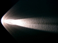
Comet on the wallby dudeman13Comment: Hi Dan,
I don't mean to be harsh here but this is what happens when we just shoot something for the sake of getting something, anything for the challange. The idea was nice but thats where it ended. The comp & framing are awful, the toneal rangers are way off & the image is over exposed. |
 Photographer found comment helpful. Photographer found comment helpful. |
| 06/19/2007 04:11:36 PM |
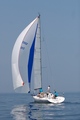
Why Sail On A Day Without Wind?by acoppolaComment: Hi Adam,
Nice image, Your composition and framing are excellent and the image is nice and crisp. I like the fact that you were able to catch the reflection of the sail on the water, the colors blend in nicely not over done. I think trying a polarizing or warming polar would have been nice here adding a little zip to a rather bland sky. Also as we can see they are sailing but I just don't get the feel of motion here. I know there wasn't much wind there but getting this same shot with the boat in it's yore would give us that feel of motion & make the image complete. Finally the title here falls a little short, obviously we have some wind present. |
| 06/19/2007 03:20:22 PM |
- - emanating illumination - -by ManicComment: Hi Manic,
Neat image, all tho centered it works really well here. The color scheme also works real well here. The bulb part of image is nice and crisp.What I do see here is some possible camara shake which seems more apparent on the right side squares. Also and this was a killer, may eye was immediately caught by the upper left & right corners of the image. There are two sets of squares one in each corner that are completely out of place, they just seem to jump out of the image and keep pulling the eye to them. |
| Photographer found comment helpful. |
| 06/19/2007 02:56:39 PM |
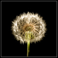
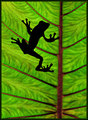
Haloby leafComment: Hi Tyler,
Wonderful image of a delicate hard to shoot subject. Your comp & framing are just fine. I really like that we get to see the entire structure of the subject without losing any quality. I think the image could have been a bit more crisp, but again this subject is not as easy to shot as people beleave even under controlled conditions. The only thing that was a bit of a distraction was your choice of border. I think going with just the black background would have been a better choice, the white just seems to take away from the image. |
| 06/19/2007 02:07:35 PM |
The WHY period !by mathixphotoComment: Hi Mat,
Nice image, Your composition & framing are fine and I like the fade to black it works well here.There are A few things that are bothersome. As I looked at the boys face (right side) it seems there are spots that looked a little blotchy to me so I stepped back a bit and the more i did the more pronounced the blotches became.The other thing here is around the lip & tooth area, they may be teeth but they sure look like pixels as if your "highlight alert" custom function was on. One other thing,I am not to crazy about catch light in portraiture. |
| 06/05/2007 04:03:01 PM |
|
| 06/05/2007 03:59:27 PM |
Rainforest by yakatmeComment: Hello Robert,
Two things here that really need addressing and I am sorry to be so harsh here but.
(1) The faking of any wildlife or nature is totally unacceptable !!!!
(2) Disturbing or removing any living element from it's natural setting is also unacceptable !!!!.
Enough said. |
| 06/05/2007 03:45:52 PM |
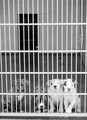
dogpoundby electrolostComment: Hi Robert,
A few things here that need to be addressed.
(1) The tonality of the image seems to be a bit off here.
(2) The loss of detail in the white areas of three dogs to the right seem to be slightly blown out.
(3) Looks like either this was hand held or your tripod was not square the image seems to be ever so slightly tilted.
(4) Image for some reason just looks flat or drabe if you will has no pop. |
| Photographer found comment helpful. |
| 06/05/2007 03:10:26 PM |
"Shudderbug" leaving the Forumby d56rangerComment: Hi Allan,
Nice image, there are a few things here that are distractions.
(1) The upper left hand corner (brown spot)
(2) The upper right hand corner (table edge)
both are distractions, cropping them out would have been a simple matter.
(3) Using either a warming polarizer or just a standard one would have reduced or eliminated the glear from the left wing & back of your subject. |
| 06/05/2007 02:56:08 PM |
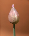
Chiveby CoinCounterComment: Hello Alessio,
Two things stick out here, fill flash to eleminate the shadows & a darker background. The darker BG would have helped make your subject more pronounced. Also some saturation of your colors (stem) would have helped. |
| Photographer found comment helpful. |
Home -
Challenges -
Community -
League -
Photos -
Cameras -
Lenses -
Learn -
Help -
Terms of Use -
Privacy -
Top ^
DPChallenge, and website content and design, Copyright © 2001-2026 Challenging Technologies, LLC.
All digital photo copyrights belong to the photographers and may not be used without permission.
Current Server Time: 07/17/2026 11:42:12 AM EDT.