| Image |
Comment |
| 06/22/2007 02:32:36 PM |
fly overby krnodilComment: Hi Karen,
Neat image, love the capture of the bird.
Composition - Well done, I like the way you used the bench here as a leading line bringing us to the gentleman sitting on the bench.
Framing - Again well done, we seeing just enough of the bench any more would have been to much. I also like the placement of the bird here you gave it just enough room so we can see it flying off, any less here would have given us the illusion of it smashing into a wall or something, well done.
Exposure - The bottom half looks pretty good the top half however is way out of wack, I think what may have happened here is the view finder was not covered. What can happen is light passing though the view finder plays with your metering causing place's in the image to under expose....try blocking it next time esp if the sun is over head or behind you it can make a huge difference.
Over all this is a really nice image catching the sence of motion in the bird was really well done. Keep up the good work. |
 Photographer found comment helpful. Photographer found comment helpful. |
| 06/22/2007 01:51:24 PM |
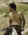
Hey!by Rino63Comment: Hi Gennaro,
Have mixed feelings on this image can't seem to get a feel for what you were trying to do here.
Composition - Your main subject here is well placed the background however is to busy for my taste and whatever that is top right of the image is very distracting.
Framing - Again well done for your main subject but the background is just to distracting.
Focus - Just seems to me that all the noise here makes the image seem out of focus.
Exposure - Have a few hot spots here most noteably on the shoulders & the shadow coming down his chest just seems out of place. The overall image to me just seems flat.
|
| Photographer found comment helpful. |
| 06/22/2007 01:15:21 PM |
Love connectionby danielvComment: Hi Nick,
Wonderful warm image.
Composition - nice, simple and to the point.
Framing - Very well done like the fact the you filled the frame with your subjects leaving little if any dead space.
Focus - I realize your attention was focused on the heart and hand of the child but I would have liked to have seen the childs face a bit clearer here seems a bit soft. Don't get me wrong I think works well here more of a personal preference.
Exposure - There are some hot spots most noticeable on the childs forearm and in the backgroud between mom & child, and again behind childs left shoulder.
Overall - Well done, simple warm image that makes it point.
|
| Photographer found comment helpful. |
| 06/22/2007 12:32:21 PM |
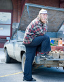
Nike Manby QuigleyComment: Hi Max,
I think the composition and Framing are a bit off here. With the main subject being the farmer and his shoe the extra info in the image (side of truck to wall) take away from your overall point (farmer & shoe) cropping out the window and the front end of the truck would helped this image greatly. The image seems to be a 1/2stop or so overexposed and the colors washed out. Color washout is often the effect of over exposure a high sun say around noon or a combination of the two. |
| Photographer found comment helpful. |
| 06/22/2007 10:47:11 AM |
Please let it stop rainingby SheryllComment: Hi,
Oh that rain, Nice image your composition & framing are good. Colors are nice and crisp. Nice capture of her facial expression. Your focus is nice and crisp also. The one thing I see here is the loss of detail in the emblem on the cap it seems to be just a bit hot, not sure if it is the angle you are at or a wee bit over exposed. Over all a very nice image well done. |
| Photographer found comment helpful. |
| 06/20/2007 05:56:25 PM |
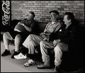
Passing Timeby JawnyRicoComment: Hi Sean,
Nice image, Hope we have more to look forward to in are old age :). I like your compo & framing here, although I think your toneal range is a bit off. You are correct in the concreate coming out in an odd color, and the are a few spots that are hot mainly the gent far lefts watch, the middle gents sneaker, and third gents paper or hanky in the shirt pocket. Also the gent far right we seem to have lost all detail and can not really see what he is resting his arm on. I did enjoy the viewing image seems to fit right in with th song this is our country...nice effort. |
| Photographer found comment helpful. |
| 06/20/2007 05:20:52 PM |
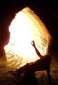
Vision of pure lightby purpleflutterby13Comment: Hi,
Don't know what to think about this. You entered this in a challange but in your comment box you indicate not once, but twice that you did not take this image. How this did not get DQ"ed is what I would like to know ? |
| 06/19/2007 06:51:51 PM |
WHY... Did I Agree to Jump?by hookComment: Hi Martin,
Nice idea, I just don't see it here. I don't agree with the compo or framing here, way to much dead space to the right hand side and the background just doesn't seem to work for me. The title really doesn't do much for the image either. Seeing his facal expression might have tied the image to the title but even here we lose this aspect of the image because most of his head is chopped off. |
| 06/19/2007 06:32:20 PM |
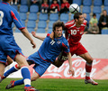
Why can't we get the ball?by zdanielrComment: Hi Dan,
Absolutly love this image. Great job on the compostion & framing. The colors are breath taking, and the details are marvelous right down to the flying grass. Your dof is dead on. Theres not much you can say for perfection, should have at the very least come up with a ribbon in my book, well done !!!!!!!!! |
| 06/19/2007 06:11:41 PM |
Why can't every day be like this?by SEMComment: Hi Scott,
This has the making of a wonderful image I hope you still have the image on file. I think you just got caught in photographers no mans land. What I mean is the cloud cover is nice and whispy great formation but not being very thick allows to much sun to get through. A polarizeing filter used correctly here may have helped to reduce the glear, or cropping out the sun all together and useing a warming filter would have helped. There is a nice warm golden glow to the image and bringing more of that out replacing the sun would have helped you greatly here. Like I said if you still have the image try cropping out the sun and try a plug-in to enhance that golden glow, I think you will be very pleased with the outcome. |
Home -
Challenges -
Community -
League -
Photos -
Cameras -
Lenses -
Learn -
Help -
Terms of Use -
Privacy -
Top ^
DPChallenge, and website content and design, Copyright © 2001-2026 Challenging Technologies, LLC.
All digital photo copyrights belong to the photographers and may not be used without permission.
Current Server Time: 07/17/2026 07:58:50 AM EDT.