| Image |
Comment |
| 10/08/2005 11:40:14 PM |
81/18by TranquilComment: Way cool. This technique, even without the number, would make an interesting shot. |
 Photographer found comment helpful. Photographer found comment helpful. |
| 10/08/2005 11:38:32 PM |
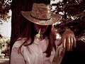
Walk and a Smokeby TranquilComment: I like the mood of this shot. Nice emphasis on the subject and good framing I think. I do wish we could see a bit more of the left arm to balance it out just a bit and make him not look armless. You have a knack at catching the "moment" and sharing it with the viewer. |
| Photographer found comment helpful. |
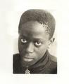
| 10/08/2005 11:36:26 PM |
Kojo...by TranquilComment: This face grabbed me right away when pulling up your portfolio. I really like the expression you've captured here, and I think the sepia is a good choice. I'm not sure the big white border accomplishes anything, but that's really such a personal preference. I think your lighting in the shot is excellent. The only thing (besides the border) I would change about the actual photo is maybe see how it looks a little sharper. This one looks a little soft to me, but it might look best that way. I'd play around with it. Very good job. |
| Photographer found comment helpful. |
| 10/08/2005 11:23:00 PM |
rainwalking70-33.jpgby redpandaComment: I will have to try this. I even like the subjects...I think the taller with the shorter works to add interest. It also helps to have the child positioned with that white door behind. It sets him off a bit more, which I think is helpful. Neat effects. I really like the feel of this one. Thanks for sharing! Return comments always welcome! |
| Photographer found comment helpful. |
| 10/08/2005 11:18:34 PM |
Running Wildby maxjComment: Great colors and subject! I don't know if this is cropped much, and I'm sure it was difficult to compose quickly with these horses...but I wish the horses on the right weren't cut off. Beautiful animals and a nice shot. |
| Photographer found comment helpful. |
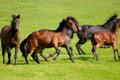
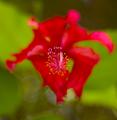
| 10/08/2005 11:15:27 PM |
Stand Upby maxjComment: Again, wonderful use of dof, but I agree with many of the comments that composition change could make a bigger impact. I would really crop in closer and lose most of the green. I'd work with a little bit of dodging and burning to highlight the center of the flower even more, and sharpen it up as much as you can without losing quality. A great bloom to work with, and even as is, I think it's above average. |
| Photographer found comment helpful. |
| 10/08/2005 11:05:41 PM |
Graves at Arlingtonby maxjComment: The top part is a little dark for my tastes (would like to see a bit more detail of the trees), however the overall effect is wonderful. The horizontal crop and the angel bring impact on the headstones nicely. I'd like to go back there sometime (without a 9yr. old!) for some more photos. |
| Photographer found comment helpful. |
| 10/08/2005 11:03:34 PM |
Bang!by maxjComment: This looks like some awesome other-world plant. :) Really great fireworks shot. The "design" really makes it unique and you did a good job with the colors and clarity. |
| Photographer found comment helpful. |
| 10/08/2005 10:56:26 PM |
Stand Outby maxjComment: I think this is lovely! I would bump the whites and/or contrast a bit to brighten it up just a little. I also wish the focused flower wasn't quite so far off to the left...it's too close to the edge for my tastes. The idea and the dof though, is excellent. I think you should try something like this again and tweak those few things. |
| Photographer found comment helpful. |
| 10/08/2005 10:54:41 PM |
bubblesbrighter.jpgby maxjComment: Fun shot and I think an improvement over the entry. I would have cropped out the left side past the tree, as it is overly bright and really doesn't add anything. It would also make your subject less centered. |
| Photographer found comment helpful. |
Home -
Challenges -
Community -
League -
Photos -
Cameras -
Lenses -
Learn -
Help -
Terms of Use -
Privacy -
Top ^
DPChallenge, and website content and design, Copyright © 2001-2026 Challenging Technologies, LLC.
All digital photo copyrights belong to the photographers and may not be used without permission.
Current Server Time: 07/24/2026 02:48:50 AM EDT.