| Image |
Comment |
| 10/30/2008 06:21:10 PM |
|
| 10/29/2008 01:04:23 AM |
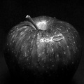
Sexby mindbottlingComment: Wow...incredibly beautiful and very well photographed. Love the lighting and shading. Going into my fav's |
 Photographer found comment helpful. Photographer found comment helpful. |
| 10/21/2008 09:57:36 PM |
|
| Photographer found comment helpful. |
| 10/02/2008 03:22:21 PM |
|
| Photographer found comment helpful. |
| 09/23/2008 10:01:39 AM |
She's No Angelby citymarsComment: Perfect timing! The shot is good even without the addition of the halo, but is wonderful with it. |
| Photographer found comment helpful. |
| 09/04/2008 02:34:17 PM |
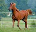
Kadillac Kashby karenkComment: Hello from the Critique Club!
I do not check the score or other comments prior to writing my critique.
One of the first things I do is try and figure out on my own which recent challenge the photo is from. No problem with this one!
My first reaction is that it is a good sharp photo of the horse with some movement to it. My second reaction is that I wish it was a little different setting and lighting.
The lines criss-crossing in the background from the fencing are distracting to me and take away from the horse. Your focus on the horse is spot on and your colors are nice. Unfortunately, the lighting that day is very flat. It gives a nice even exposure, but no dynamics to the shot of a dynamic animal. I hope that makes sense.
Overall, for this setting and light it appears you did a very nice job. The photo on its own, however, just lacks those special touches of good lighting and nice background.
I would have given this a high 6 for the challenge.
Hope this helps! |
| Photographer found comment helpful. |
| 09/04/2008 02:25:57 PM |
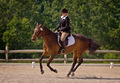
Canterby docurrieComment: Hello from the Critique Club!
I do not check your score or the other comments prior to writing my critique.
First thing I do in a critique is try to figure out on my own which recent challenge it was submitted for. No problem figuring this one out :)
I think this is a very nice shot. I like the stance of the horse, the turn of the rider's head, the swish of the horse's tail and the kicked up dirt. The lighting is not bad, and the colors and clarity are nice and rich.
About the only thing I might change or play with in this shot is to crop in just a bit more for this format. I would like to be able to see a few more of the details better. Maybe even have made this a bit more square format. That's minor though, and really a matter of taste.
You have caught a nice moment here with this shot and I would have given it a 6 during the challenge.
Hope this helps!
Judy
|
| 09/04/2008 02:17:31 PM |
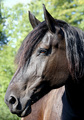
its a horse of courseby MaverComment: Hello from the Critique Club!
I do not check the score or the other comments before writing my critique.
Well - it's easy to see which challenge this was for (part of my critiquing is to try and place the photo in the recent challenge without checking first.)
I did go back up and read your description and the photo matches your comments. It has the feel of someone who just put the camera up and snapped a shot without prior planning to create much more than a snapshot.
The composition needs major improvement. The ears are cut off, the nostrils have become the prominent feature of the horse (although out of focus) and the bottom of the nose is cut off. Pulled back just a bit and even just a little to the side would have made a big difference here...as opposed to the straight on out of focus shot.
The focus and the composition are the two main elements I would work on here. It appears that you need to step back and/or close up the aperture to give you better depth of field and more of your subject in focus. Also, not sure what size file you have but it appears a bit pixelated. The lighting isn't too bad, although a bit bright and washed out. The horse also has blue hair :) Not sure what camera you have used, but be aware of that blue fringing in high contrast areas.
I would have scored this a 4 in the challenge.
I hope this helps!
Judy |
| 09/04/2008 02:07:06 PM |
...and a cherry tree, woo-hooby snafflesComment: Hello from the Critique Club,
I do not read the other comments or see the score before I write my critique.
Aw...lovely horsey. :) Obviously shot for the horse challenge, so easily fits the challenge.
I love how close up you got and the turn of the horse's head. However, the whole photo has a very washed out feel to it for me because of the bright sun. This was advanced editing and I think you could have played more with your options (or in-camera when taking the shot) for bringing out the greens in the background and reducing the glare of the sun on the horse's face. To me, that is its biggest drawback.
It also appears to have been over sharpened. I know that also sometimes happens with the resizing, but the overall effect is similar.
I would have scored this horsey portrait a mid-5 in the challenge.
I hope this helps!
Judy |
| Photographer found comment helpful. |
| 09/04/2008 01:59:06 PM |
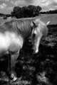
Wildfireby posthumousComment: Hello from the Critique Club!
I do not check scores or other comments prior to writing up my critique.
I knew instantly which challenge this was shot for, so obviously it fits the challenge well and also stands on its own quite well.
I like the dynamics of the black and white, however the hot spot on the side of the horse draws my attention. However, the contrast does add to the rest of the shot. Since it was advanced editing, I think you could have balanced out the best of both worlds a little better and reduced that hot spot some. It's not too bad, but it's the very edge of the area that distracts.
The setting is nice and I like the movement of the mane. I think the mane is my favorite part of the shot. I would have liked a more creative angle for this photo. Perhaps down a little lower? For some reason, the clump of trees in the background tend to steal the thunder from the subject of the horse. I think a lower angle might have helped alleviate that problem.
Overall, not a bad shot. I would have liked to have seen the original as this does appear to have had quite a bit of PP. I would have scored it a high five in the challenge.
Hope this is helpful!
Judy |
| Photographer found comment helpful. |
Home -
Challenges -
Community -
League -
Photos -
Cameras -
Lenses -
Learn -
Help -
Terms of Use -
Privacy -
Top ^
DPChallenge, and website content and design, Copyright © 2001-2026 Challenging Technologies, LLC.
All digital photo copyrights belong to the photographers and may not be used without permission.
Current Server Time: 07/16/2026 12:49:24 PM EDT.