| Image |
Comment |
| 06/13/2004 11:22:39 PM |
|
 Photographer found comment helpful. Photographer found comment helpful. |
| 06/13/2004 11:20:56 PM |
Lyssby ValleyDollsXComment: This is an interesting angle. I keep lookig at it. The head seems to be disproportional to the body...it looks too large. Yet, overall, I like the "look" you've got here. It almost has a late 50's early 60's feel to it. |
| 06/13/2004 11:18:12 PM |
|
| Photographer found comment helpful. |
| 06/13/2004 10:49:31 PM |
capitol-fountain.jpgby richComment: I love the colors and clarity of this shot. I also like the combination of the fountain and capitol dome in a lesser seen angle. |
| Photographer found comment helpful. |
| 06/09/2004 01:46:04 PM |
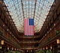
The Flag in the 'Old Arcade'by bobdaveantComment: Just going back to leave comments on some challenges I voted on, but didn't have time to comment.
I wanted to comment on this because I felt it was better than your score showed. I gave it an 8. The centering is what gives this photo it's strength, and I thought it was perfect for the challenge. Interesting lines, nice jolt of color with the flag and the exposure was good too. With that skylight, I'm glad you were able to not overexpose the window area, but still pick up the details of the inside area. Nicely done! |
| Photographer found comment helpful. |
| 06/04/2004 01:54:41 AM |
|
| Photographer found comment helpful. |
| 06/04/2004 01:51:41 AM |
|
| Photographer found comment helpful. |
| 05/16/2004 07:33:02 PM |
Right Anglesby JoviComment: Hi from the Critique Club
I really love the feel of this abstract. Turning the photo is what made it work so well, I think. The colors are very modern and clean looking, which accents the lines perfectly. I even like the angle and the white space in the upper left. They all work together to make the viewer want to keep looking at the shot.
I think post processing does it's job here as well....maximizing the potential of the shot while maintaining the basics of the photo. It's a great shot for this challenge.
I don't really see anything I would change about the way you've done this one. Congratulations on a great shot!
Judy |
| Photographer found comment helpful. |
| 05/15/2004 09:34:14 PM |
|
| Photographer found comment helpful. |
| 05/13/2004 09:12:48 AM |
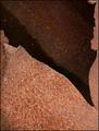
Tornby gandersComment: Hello from the critique club.
Lighting and clarity of this shot is fine, but for some reason I just don't find it very appealing.
I've even been holding up papers, trying to view various crops of the image, and just can't find one that I really like. I don't really dislike the photo, as much as it just doesn't hold my interest.
I think for the abstracts challenge the lines, colors, and/or shapes have to be appealing enough to draw interest and bring the eye to the design of the photo. To me the color here is uninteresting and the shapes and lines don't draw me in. Of course, what one sees in an abstract is very subjective, so you and others may very well like the photo a lot.
I hope you find this helpful.
Judy |
| Photographer found comment helpful. |
Home -
Challenges -
Community -
League -
Photos -
Cameras -
Lenses -
Learn -
Help -
Terms of Use -
Privacy -
Top ^
DPChallenge, and website content and design, Copyright © 2001-2026 Challenging Technologies, LLC.
All digital photo copyrights belong to the photographers and may not be used without permission.
Current Server Time: 07/27/2026 03:53:55 PM EDT.