| Image |
Comment |
| 06/08/2006 10:47:18 PM |
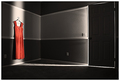
She LEFT by edmengComment: One of my favorites of the challenge. It's very simple, but the way it's processed and the use of light makes it very powerful. 9 from me. :) |
 Photographer found comment helpful. Photographer found comment helpful. |
| 06/08/2006 06:12:07 PM |
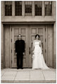
Canadian Gothicby PedroComment: She has a great stance, really gives off an air of elegance and confidence and juxtaposes nicely with her partner.
Loving this one, may we have another? :-) |
| Photographer found comment helpful. |
| 06/07/2006 11:56:14 PM |
|
| Photographer found comment helpful. |
| 06/07/2006 04:18:01 PM |
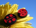
Super Glue Was Usedby Tap10Comment: Lovely improvement on what I'm pretty sure is the original. :) Lighting is good and the flower and background work much better than the plant did. |
| Photographer found comment helpful. |
| 06/07/2006 02:12:33 PM |
The Ultimate Silence (Take 2)by Prof_FateComment: The composition and tonal range are much improved in this one. I do like the child looking down in the first one, to me it adds to the feel of him being secluded, if you will, by his implied impairment. But I know how children can be difficult at times. :-) Well done overall. |
| Photographer found comment helpful. |
| 06/07/2006 01:43:53 PM |
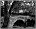
Burnside Bridge at Antietam Creekby novaComment: Very nice job in making the bridge more of the focus in this photo. I enjoy the compositional changes you made (especially getting rid of the distracting wall in the forground) having the bridge lead you more throught the photo. Better lighting in this one and the change in seasons also adds to the photo (not that you could have done anything about that in your original) :-) Very nice job. |
| Photographer found comment helpful. |
| 06/07/2006 01:32:49 PM |
The dying of the lightby oOWonderBreadOoComment: Back to comment, lovely and you're right, neatimage and freckles don't mix. I've learned that mistake myself. :-) Wonderful improvement from the first, no lens flare, closer crop on the subject and light and sharpness are greatly improved. Well done and bumping to an 8 |
| Photographer found comment helpful. |
| 06/07/2006 01:08:16 PM |
Still Inseparableby DefyTimeComment: I like this one, but I have to say, I think I liked your original better. I liked how the metal and wood worked off eachother giving a warm, natural feeling (which also worked well with the title). The background you chose here really changes that, making it cold and industrial. Maybe that's what you were going for. Also, there is a loss of texture on the ring in this one (I'm assuming it's the same ring). It's seems much smoother and I think the texture was a good element in the original. So by making the changes you did, you've changed the feeling of the photograph. Nothing wrong with that, it's just different. |
| Photographer found comment helpful. |
| 06/07/2006 09:58:46 AM |
She Loves You by MayaMComment: Congratulations!! You're on a roll! :-) This is a lovely, lovely image. |
| Photographer found comment helpful. |
| 06/07/2006 09:56:30 AM |
Dance of the Dandelionby alfrescoComment: Yay JP, Congrats on your first and well deserved ribbon!! (it feels good doesn't it!?) This is quite a beautiful photo. |
| Photographer found comment helpful. |
Home -
Challenges -
Community -
League -
Photos -
Cameras -
Lenses -
Learn -
Help -
Terms of Use -
Privacy -
Top ^
DPChallenge, and website content and design, Copyright © 2001-2026 Challenging Technologies, LLC.
All digital photo copyrights belong to the photographers and may not be used without permission.
Current Server Time: 07/26/2026 07:19:14 PM EDT.