| Image |
Comment |
| 11/05/2006 10:52:31 AM |
Unable to Withstand...by smellyfish1002Comment: A bit of a stretch (still smoke, no flame) but very well done with the colors, clarity, and composition -- one of my favorites this challenge |
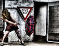
| 11/05/2006 10:51:29 AM |
Give Way To The Windby xXxscarletxXxComment: gritty feel(a bit much on the model but great on the rest), like the punch of red throughout, like the face full of hair as it adds to the wind, sign is an added element that make this a full story -- one of my favorites this challenge |
 Photographer found comment helpful. Photographer found comment helpful. |
| 11/04/2006 08:48:45 PM |
|
| Photographer found comment helpful. |
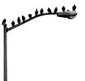
| 11/04/2006 06:38:38 PM |
The Usual Suspectsby tmhallingComment: great graphic quality - stark composition and negative space (the bird goo is a bit gross -- real life but ikky) One of my ribbon picks |
| Photographer found comment helpful. |
| 11/04/2006 06:37:12 PM |
ubiquitousby ursulaComment: wonderful tones, frame and composition == all works together for me. One of my ribbon picks |
| Photographer found comment helpful. |
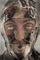
| 11/04/2006 06:32:17 PM |
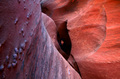
Peek a Booby chefsamComment: the colors on the right are amazing -- you work with the dark area (by adding a face that appears out of nowhere) give the photo interest. I find the laft half takes away from the compositional interest you created elsewhere. |
| Photographer found comment helpful. |
| 11/04/2006 06:30:00 PM |
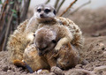
Affectionby ladyhawk22Comment: Good timing on the capture and the tie to the title works well. I'm distracted from the "models" by the background and the oof foreground (lower right) and that takes away from the impact of the image for me. The light didn't help you bring out the subjects any as the tones are similar in both the subjects and the surrounding area. |
| Photographer found comment helpful. |
| 11/04/2006 06:26:16 PM |
Forlornby spartacus9Comment: You have chosen the perfect match of title and emotion shown by your model. The light colors (hair, shirt, backgroud) work well together (and set off the blue eyes). I like how there are no blown out spots (tough to do with so much light). Suggestions? A bit more light on the left side of her face would work a bit better for me (perhaps accomplished by shifting her hair?) |
| 11/04/2006 06:18:05 PM |
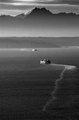
Round tripby cabaComment: like the leading lines via the wake as it pulls my eye to the other boad and makes your title really work. The mountain in the distance gives something great to see in the final 1/3 of your image. The B&W work well and the overall misty feel works for the distance portion. To move it up a level? I'd like a wider tonal range go give the light toned boats more of a pop and the distant mountains more of a presence. |
| Photographer found comment helpful. |
| 11/04/2006 06:13:09 PM |
getting older...by littlegettComment: a very sweet face -- such a great model. I get the connection between the two of you for sure. On the technical side -- there seem to be some red dots on your white background that could have been dodged out. Also the oof right eye distracts me a bit. I like the black and white choice as it highlights your title in the tones on the "gray" muzzle. In all, one of my higher scorers. |
| Photographer found comment helpful. |
Home -
Challenges -
Community -
League -
Photos -
Cameras -
Lenses -
Learn -
Help -
Terms of Use -
Privacy -
Top ^
DPChallenge, and website content and design, Copyright © 2001-2026 Challenging Technologies, LLC.
All digital photo copyrights belong to the photographers and may not be used without permission.
Current Server Time: 07/18/2026 11:13:19 AM EDT.