|
|
|
Showing 7251 - 7260 of ~8912 |
| Image |
Comment |
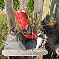
| 09/13/2005 09:10:54 PM | Red Bootby painthorseComment: Greetings from the Critique Club:
Congratulations on getting through your first Challenge.
Composition: Your subject is the red boot(s). I think while you tried to set a scene that would include the boots, your scene isso full of other items it makes it difficult to find that main focal point. Even though each of the items is interesting in its own way, (or perhaps because they are each interesting) the boots get lost and the viewer loses interest. As an experiment, you might remove one or two items at a time, photograph the result, until you find a pleasing composition that sends your eye straight to the red boots. You might also consider a black backdrop to isolate the boots or your new more spare composition. I say all this because you have an interesting idea here and it's well worth pursuing.
Then, ISO 400 is a very fast number to use in bright daylight. The image is a bit 'hot'. Try 100 (if your camera will take it) and work up. And try f5.6 or 6.3 along with the 100 or 200ISO. Finally, you might try bracketing your images and note the results.
It's good to see you experiment with a themed set-up, Looks as if you're going to have fun at this game. Welcome aboard. |
| 09/13/2005 07:19:11 PM | 8 Sandals in a rowby DvosdonComment: Greetings from the Critique Club:
First, our literal-minded members do check the title when voting. It's tough to see 8 sandals, and they noticed.
I wonder how this image would look in landscape mode, and cropped thus filling the frame with the subjet. (Even though the shadows are interesting, they don't add much impact to the image.) I also wonder how this image would look in color, with, say, a bright red sandal front and center.
Finally, just a touch more lighting on the forward sandal would be helpful and a tiny bit more depth of field would make this image pop.
You have a good and sensitive eye. Keep up the good work. |  Photographer found comment helpful. Photographer found comment helpful. |
| 09/13/2005 07:02:26 PM | The Streakerby TabbyCatComment: Greetings from the Critique Club:
This very good image made me look for more! That nice clean, sharp streak sent me looking for a sharp, clean pair of shoes. The shoes aren't quite fuzzy enough to give the illusion of speed, and not quite sharp enough to match the very excellent rendition of a streak.
The flashlight lighting technique is versatile, fun to use, and except for a hot spot or two on the forward shoe, worked quite well on this image.
I expect you learned a lot with this good image and I'll look forward to seeing more of your work. |
| 09/13/2005 06:38:43 PM | Timberland: Go Anywhereby cools98Comment: Greetings from the Critique Club:
A great idea quite well executed. Certainly fits the challenge beautifully.
Frequently center-oriented composition doesn't work well, but I think this does. It would work even better if the shoe, especially, was dead-on sharp. If you had been able to make any part of the splash sharp, it would have been very helpful.
I don't know how you did this, but a tripod, longish lens, time-release and patience could give you a terrific outcome. I see you used a 4.5 aperture at 1/30th. It could be that a deeper depth of field, 5.6 or 6.3 would be helpful. But then you'd have to find a puddle in better light, which may not have been available.
Still, it's a great idea, and you scored fairly well for this very good image.
| | Photographer found comment helpful. |
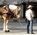
| 09/13/2005 12:57:36 PM | Why can't I take mine off???by TejComment: Greetings from the Critique Club
This image tells a good story. A few changes would make it a great story.
Composition: The horse and man work quite well as placed in this urban environment. There is extraneous material that, with careful positioning of the camera, might have been avoided. The planter, in the center of the frame comes to mind. The bit of car bumper is a distraction and (I know, picky, picky) there is a twig in the right hand corner that, again with a bit of positioning, might have been eliminated. (In my camera club, we call this "Border Patrol".)
Technically, it's a bit "hot". A Circular Polarizer on a sunny day is often helpful; another way to achieve the best exposure for the situation is bracketing.
You have a good eye for story telling. Keep it up!
SFAlice | | Photographer found comment helpful. |
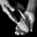
| 09/13/2005 12:18:01 PM | If the shoe fits...by AnandComment: Greetings from the Critique Club:
Overall, this well thought out image is very successful. The lighting is good, accentuating the shoe that is the center of interest but still delineating the mate to the pair in the background.
Composition: You've used the classic Triangle with a slightly stronger leading line from the left taking the viewer to the center of interest. This works well. You keep the viewer in the picture by providing interest in the workman's hands cradling the shoe.
The small scar/blemish on the workman's arm to the right of the image could be considered distracting, but in this instance, it's just part of the story. (and you could do nothing about it anyway.)
Color vs. Black and White. This is a powerful image in black and white. In this case, I think color would be a distraction and would provide more information than needed to tell the simple story.
All in all, a sensitive image that fulfills the Challenge well. | | Photographer found comment helpful. |
| 09/07/2005 12:23:02 PM | | | Photographer found comment helpful. |
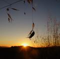
| 09/07/2005 12:22:37 PM | Poiseby hlpme123Comment: Lovely and moody. If it was mine, I'd probably experiment with cropping the right 1/3 out of the image. It would concentrate interest in that nice cmposition of leaves falling from the top. | | Photographer found comment helpful. |
| 09/07/2005 12:17:31 PM | | | Photographer found comment helpful. |
| 09/07/2005 11:51:42 AM | |
|
Showing 7251 - 7260 of ~8912 |
Home -
Challenges -
Community -
League -
Photos -
Cameras -
Lenses -
Learn -
Help -
Terms of Use -
Privacy -
Top ^
DPChallenge, and website content and design, Copyright © 2001-2026 Challenging Technologies, LLC.
All digital photo copyrights belong to the photographers and may not be used without permission.
Current Server Time: 06/21/2026 10:05:29 PM EDT.
|