|
|
|
Showing 6841 - 6850 of ~8912 |
| Image |
Comment |
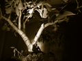
| 03/20/2006 04:35:54 PM | Thinkerby deepfrog17Comment: Greetings from the Critique Club
You did well with this interesting Thinker image of yours in the Master of Disquise Challenge. Perhaps the biggest thing you pulled off was the disquise of that Jade Plant as a "real tree!" That added the bit of surrealism that put the image in the "Wow" category.
Good seeing and good execution.
Your lighting fit the mood well, and of course, the tiny human that you posed so well, worked wonders for the overall effect.
So, congratulations on a good one, and keep up the good work.
Alice |  Photographer found comment helpful. Photographer found comment helpful. |
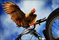
| 03/19/2006 11:48:42 AM | Why ride when I can fly? by banditComment: First, take one chicken...
Seriously, excellent photography here and a well developed, original idea.
Congratulations on a spectacular win. | | Photographer found comment helpful. |
| 03/19/2006 11:40:06 AM | Exaustorby Vanessa 72Comment: Greetings from the Critique Club
What an interesting idea for the Square Crop Challenge; Circles within a Square.
While the idea was a really good one, I'm afraid you had a little problem with execution. First, as your commentors mentioned, your image should be square. That is, all the pixels on all sides should be "640" or some other equal number. Because voters didn't think you met the Challenge, this doomed your image at the start. Then, it's important to have at least some of your image very, very sharp. This gives the viewer's eye a place to rest. If he doesn't have this place, he just keeps going on to the next image, never taking the time to enjoy the idea you have presented.
Finally, when you request a comment from the Critique Club, it is important to include your camera settings, and also write something about your thoughts in the Photographer's COmments section. This helps us understand what you were going for, and in addition, helps you to understand your camera.
I wish you good luck in your future DPC entries.
Alice |
| 03/18/2006 06:08:24 PM | Burning the Midnight Oilby cliffjComment: I think a tripod would have made a world of difference in this very interestingly conceived shot. Very good idea. | | Photographer found comment helpful. |
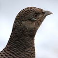
| 03/18/2006 06:03:33 PM | Pheasant in the Snowby riotComment: Greetings from the Critique Club
Oh, my! I know a good bird photo when I see one, and this is a good bird photo. I am so lucky to get to examine it closely in the line of duty. Every feather is crisp and in good order; the highlight in the eye is there, the contrast with the not-white background is just fine. Yes, I see a tiny bit of haloing on the back of this beauty from sharpening; but because all else is so good, that can be overlooked.
So, congratulations on a great score, which I certainly think you deserved. I'll look forward to your next wildlife entry.
Alice | | Photographer found comment helpful. |
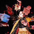
| 03/18/2006 05:55:15 PM | Kanganaby jpetersComment: Greetings from the Critique Club
What an interesting image you have presented here. You managed to work around what could have been a difficult problem with depth of field on that forward hand and the face & body of the dancer. By blurring out the background you made it all come together.
As your commentors suggested, the lighting is uneven; perhaps it is possible on your Nikon to change the intensity of the on-board fill flash? If so, that might help some in a similar situation. I would also suggest that you use even more blur on the background since it competes mightily with the dancer and her colorful clothing. But I don't know how much you could do and still be "legal." (Of course now that it is for your personal portfolio, the sky's the limit should you wish to try that idea)
As it is, you achieved a respectable score for this nice image, and undoubtedly you learned from it.
Good luck in future challenges.
Alice
| | Photographer found comment helpful. |
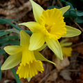
| 03/17/2006 01:55:49 AM | Early Bloomby amsterComment: Greetings from the Critique Club
Hello, amster! You're seeing is wonderful, and your ideas are great. In just a little while when you get the technical stuff down, the rest of DPC better watch out. You're gonna be coming through!
This one was within an "ace" of being on target. You filled the frame nicely (with one tiny caveat - you lost the tip of one flower petal at the top of the frame; a photographic mistake. Ooops.)
Your commentors mentioned your focusing problems.
I'll suggest a solution - well two of them. First, it's fairly easy to bracket your shots. You shot at 3.2, maybe 4.5 or 5.6 would have been better to give you stronger control of depth of field in the blossoms while still leaving the background blurred. Worth a try. The second suggestion is to be sure to use a tripod - or at least balance your camera on something steady. Once you get used to a tripod (or equivalent) you'll get controlled depth of field images far more often.
One final idea. If the flowers weren't yours - so you couldn't pick 'em, try laying a black bit of cloth behind them as a background; the yellow against black would be stunning. Since this was Advanced Editing, you could insure a black background (starting with the black fabric) through the judicious use of "curves" in Photoshop, if that's the program you use.
Okay, I've run off at the mouth long enough. Hope I've given you some ideas.
Good luck in future challenges.
Alice | | Photographer found comment helpful. |
| 03/16/2006 02:04:55 PM | Lucky Leaf in 7 Boxesby ronnytComment: Greetings from the Critique Club
Your first entry, and you scored so very well. Congratulations. Well done.
Now, you're new so I'll explain that the Critique Club is supposed to examine your image and give you suggestions on how to 'make it better.' There is a distinct problem with this objective when considering your image. I can't find anything to critique! You've presented a unique idea in an imaginative way and have received a very respectable score.
So, about all I can say is keep up the good work. I'll look forward to seeing your name and images in the front page before long.
Alice | | Photographer found comment helpful. |
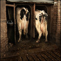
| 03/16/2006 01:53:36 PM | Moments for Yourselfby messerschmittComment: Greetings from the Critique Club
Yes, once you found this set up, you just had to take the picture. (But I don't want any milk right now, thanks anyhow...)
Okay, seriously, you had a great opportunity, you made the most of it and have a fine image to show for your efforts. You met the Challenge - and you scored very well. What's not to like!
Your composition is excellent and your use of darks and lights perfect for the situation.
About all I can wish you at this point is continued success at DPC.
Alice | | Photographer found comment helpful. |
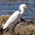
| 03/16/2006 01:46:23 AM | Oh, Yummy Breakfast!!by jorrComment: Greentings from the Critique Club
Yippee! Another bird person. I very much enjoyed going through your portfolio. You have some good bird pics there. I hope y ou don't mind if I try to give you some tips.
As with people, please don't cut off the feet of your subject. It's okay, if it's a head & shoulders shot, but not if most of the bird (except for the feet)is there. Then, especially with a white bird, bracket your shots. It's fairly easy to do with a Canon and I suspect a f6.3 would have given you good definition of those feathers.
Only because I really like what you are doing here am I going to get picky here, and go in depth with this one. You have a splendid capture of this bird, handling its prey. Think about giving it a bit more room (not much but some) to toss its head to swallow the meal. The egret is boxed in pretty tight in all directions. Uncomfortable for the egret and unsettling for the viewer (who doesn't know why he's unsettled, so he just votes lower)
I'm really pleased you used the 300mm lens on this, you can get some good wildlife with that lens, especially if you can use at least a monopod (or equivalent).
I'll look forward to seeing some top images from you. | | Photographer found comment helpful. |
|
Showing 6841 - 6850 of ~8912 |
Home -
Challenges -
Community -
League -
Photos -
Cameras -
Lenses -
Learn -
Help -
Terms of Use -
Privacy -
Top ^
DPChallenge, and website content and design, Copyright © 2001-2026 Challenging Technologies, LLC.
All digital photo copyrights belong to the photographers and may not be used without permission.
Current Server Time: 06/23/2026 07:30:59 AM EDT.
|