|
|
|
Showing 6721 - 6730 of ~8912 |
| Image |
Comment |
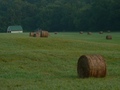
| 07/14/2006 07:59:02 PM | Country Morn'by rayg544Comment: Greetings from the Critique Club
Straight from the Camera. Dark. Um.
You have an excellent composition here and lovely colors as well. (And I'm a sucker for those rolled haybales that seem to flow so nicely into the countryside)
A Critique Club member is supposed to suggest ways to improve your image, and yes, I caught that note that you work 12-hour shifts.
But still, it's the lighting that needs to be improved for this image to work perfectly. Many photographers wait hours for that perfect moment that will make their image The Perfect One. So without post-processing and without the ability to wait for the perfect moment, well, you did pretty darn well with this very nice image.
I'd love to see you revisit this image someday in the right light. You'll have a winner, for sure. (And hey, it's right across the street!)
.>) |  Photographer found comment helpful. Photographer found comment helpful. |
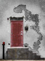
| 07/14/2006 06:15:01 PM | Red Doorby otisXmikeComment: Great capture. NIce change with the red door. Wonder what it would looklike with a nice bright yellow ochre paint on the wall... Hmmm, or a genie's lamp at the bottom of that great wall thingee (and then colors in the thingee) Oh, heck, I'd better stop now...
IN any case, good job.
Alice | | Photographer found comment helpful. |
| 07/14/2006 01:43:03 PM | DPC Psyche Wardby idnicComment: Fantastic!
And, yes, the typos (tpsychos?) add to the originality of the piece.
Do some more!
Alice | | Photographer found comment helpful. |
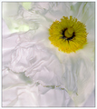
| 07/14/2006 10:32:39 AM | Sunburstby GoodBeyeComment: Greetings from the Critique Club
Welcome to DPC! I see this is your 2nd challenge and that you are doing very well.
You have a lovely image here and thje voters quite rightly liked it. There really isn't too much to 'critique' here. Placement in the frame is fine, the foil of the oof flower in the background works well and the colors are nicely photographed.
The only thing that might be considered missing is that little something extra, that pizzazz, that puts an image on the front page. Perhaps lighting? Bouncing light from a gold reflector? or even a tiny flashlight? I don't really know. Just tossing an idea out ...
In any event you have a good image here, one you can be proud of.
Best of luck in future Challenges.
Alice |
| 07/13/2006 05:24:09 PM | Wildby AlainComment: Greetings from the Critique Club
What a nice bright orange bloom you found. You chose just enough depth of field to capture the entire wildfower and still leave plenty of 'bokeh' background.
While you scored comparatively well with this image, I have a feeling that the bright green background may have been a negative factor. Sometimes, it helps to have a black cloth (or some neutral color) to use for background in garden shots. This concentrates the viewer's focus on the flower and eliminates competition from distractions. Just a thought, of course. But a bit of cloth doesn't take up much room in the ol' camera bag, and it does come in handy sometimes...
Glad you had so much fun with your flower photography on your trip.
Keep up the good work.
Alice | | Photographer found comment helpful. |
| 07/13/2006 05:05:43 PM | Under The Bridgeby taljComment: Greetings from the Critique Club
Gee whiz! I like both of your entries, but this one came to me to be Critiqued so I won't dwell on your flower one except to say it's handsome and I wish I'd thought of the idea.
Okay, the commentors seemed to be divided between symmetry and not so.
My vote goes for the way you have it. That tree (bush) on the right absolutely makes the image. (Well, so do the strong lines and still water, but they don't make my point.) Besides the obvious attractions this image has going for it, it does have that little edginess that comes from asymmetry and it looks good.
BTW, in judging horizons, just take a look at the water. That water is absolutely straight across and that fact insists the image is correct. Optical illusions are fun, and in this case, perhaps tricked a few viewers.
Keep up the good work. YOu've figured out how to present images well and I really, really look foward to seeing more of your work.
Alice | | Photographer found comment helpful. |
| 07/13/2006 01:43:57 PM | Simplicityby freakin_hilariousComment: Greetings from the Critique Club
Well, here is a nice little softspoken entry that seems to have received 'average' votes.
I like the lighting on this. It tames the plate which could have become dominant and intrusive. Perhaps just a little more lighting on the pink flower to give a bit more depth...
The one thought that stands out is a point that is made in my art classes once in a while. And that is composition. The "rule" (and yes, they are made to be broken) is that we chose one, three or five items in a composition. The reason being, especially for the two items, is that the viewer bounces back and forth between the two objects never knowing where to concentrate his energy, and, confused, simply moves on.
Anyhow, a little more pizzazz and maybe one more flower might make this extra special.
Continued good luck in future challenges. You have some nice work.
Alice | | Photographer found comment helpful. |
| 07/13/2006 01:30:49 PM | Exquisiteby swallaceComment: Greetings from the critique club
WOW! If I had taken my watercolors and splashed around, I'd be proud if I got this result.
Incandescent was the way to go to both make a nice image and please the voters. Congratulations on a nice placement in the Challenge.
One of our missions in the Critique Club is to offer suggestions on how to make your image better. Can't do that with this image, so just take this note as another appreciative look, and continue to bask in the incandescent sunlight. Nice one.
Alice | | Photographer found comment helpful. |
| 07/11/2006 08:22:35 PM | Diabloby JohnnyflashComment: Greetings form the Critique Club
Love it!
YOu have an original take on the Challenge that was quite well rewarded by our voters. Composition is excellent; technique, as far as I can tell, is just fine. My first impression on seeing the shot - and this is important, I suppose for our fast voters - was that the shot was a little hot.
But then, I stopped to think, "well, yeah! It's likely to be a little hot isn't it! How many degrees is that furnace, anyhow?"
So, the only offering I have to make is one you probably have already thought of: Bracket those shots. Try different ISOs, try different apertures, etc. etc. Experiment.
Oh, heck. You're doing fine. Keep up the good work.
Alice | | Photographer found comment helpful. |
| 07/10/2006 07:42:32 PM | White Poppyby pointandshootComment: I did the best I could with this image in the scoring. It is excellent, with fine placement on the page, superior lighting and excellent subject matter. You had strong competition which must have been the only reason this isn't in the top three.
Keep up the good work.
Alice | | Photographer found comment helpful. |
|
Showing 6721 - 6730 of ~8912 |
Home -
Challenges -
Community -
League -
Photos -
Cameras -
Lenses -
Learn -
Help -
Terms of Use -
Privacy -
Top ^
DPChallenge, and website content and design, Copyright © 2001-2026 Challenging Technologies, LLC.
All digital photo copyrights belong to the photographers and may not be used without permission.
Current Server Time: 06/24/2026 03:08:55 AM EDT.
|