|
|
|
Showing 2421 - 2430 of ~2440 |
| Image |
Comment |
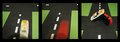
| 01/02/2012 01:29:04 PM | T_Boneby GeneralEComment: I like the "story". Perhaps one of the cars could have be shown to come from "the side", since the accident seems to have taken place on the intersection. As it is now, they both drive in the same direction "at different times" and the accident doesn't make much sense as it is shown.
In the first 2 pictures the lense and/or your head is throwing a shadow which you avoided in the 3rd and probably should have addressed in the first 2. Also the light in the 3rd picture is somewhat "off". the cars look very "flat" in this light and the underside is a solid black without detail.
I do like the way you presented your story on the 3 panels and I like the colour combination. IMO with a bit more attention to the technical detail this would have been a very striking entry. |  Photographer found comment helpful. Photographer found comment helpful. |
| 12/29/2011 01:01:08 PM | Going out for a walkby mr_simmiComment: I apologise, I am new to this and you are "stuck" with my comments. Pls. realise that this is *my* learning curve more than yours!
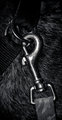
OK, so I have to say I am very critical about "interpretation of theme". I like your photograph for this challenge, but I don't like your title. What exactly are you showing? - "dog + leash", "collar + leash"? Both would work for me, so why use a title that doesn't fit the challenge?
I do like the b&W and I do like the composition and tight crop of your picture, as well as the lighting. I also think the smooth hair of the dog as a background, even though it is perfectly in focus works very well and does not distract from the main subjects. In fact I really like this photograph :-). |
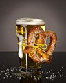
| 12/29/2011 12:16:05 PM | Beer and pretzelsby MikeComment: I apologise, I am new to this and you are "stuck" with my comments. Pls. realise that this is *my* learning curve more than yours!
This image to me is "perfect" for this challenge. You worked within the theme and the photograph is beautifully composed. Both the background and dark reflective surface help to show off the main subject, which is in focus and for this particularl image important, very "apetizing" (and I don't drink beer as a rule :-)). Although I am not sure what made you choose a yellow nylon string to attach the pretzel, IMO it does not harm or distract from the picture. My only slight negative comment is the "look" of the pretzel. I have no idea where you come from, to me it looks "plastiky", but I am probably just used to ther types :-). One other minor thing which you may want to consider in future "beer shots" is to use a very cold glass that has some condensation. But that is also a personal preference of how I would like my beer :-). For the picture the clear yellow liquid in the glass (without condensation) works well. |
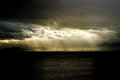
| 12/29/2011 11:54:29 AM | Corporate responsibility & employement , Petrolchemical plants & leukemiaby mcaldoComment: I apologise, I am new to this and you are "stuck" with my comments. Pls. realise that this is *my* learning curve more than yours!
I love this picture, its bautiful. However, I don't think it really does your title justice (or should that be your title doesn't do the picture justice?). Yes, I can see the, I assume, petrochemical plant if I look carefully, but for this assignment I would have brought this much more into the viewer's eye (i.e either different lense and/or different crop). I am not sure how this picture depicts "leucemia" in any stretch of the imagination, nor employment. I understand that you are trying to make a socio-ecological statement, I just don't think this image is able to pull all these things together. Again, as a "photograph" I love it -as it is, especially the monochromatic, but I don't think you really worked the challenge with this image. | | Photographer found comment helpful. |
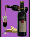
| 12/29/2011 09:33:14 AM | Wine And Cheeseby BrianRComment: I apologise, I am new to this and you are "stuck" with my comments. Pls. realise that this is *my* learning curve more than yours!
I like your choice of items and the stylised way you chose to portray them. I llike your color combination. However, I feel the "wine" aspect is overpowering and the cheese looks almost like an afterthought.
The fact that you put together different objects taken with different lighting makes the entire image somewhat unsettled to me. It also sems that you photoshopped the same bottle, just smaller at an angle for the pouring one and edited the "pouring" part in. That in itself is fine, but for me it should be less obvious and with more finess so that an observer does not pick it up that easily. | | Photographer found comment helpful. |
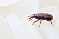
| 12/29/2011 09:25:36 AM | Grains Weevilby alexlkyComment: I apologise, I am new to this and you are "stuck" with my comments. Pls. realise that this is *my* learning curve more than yours!
Fun interpretation (unless you have to put up with them that is :-)). I would have perhaps just cropped a little more off the height of the image resultin in the weevil being more on the 3rd rather than the centre. Although IMO the wevil is very well lit, the rice grains are not and they are in fact hard to make out, which is a shame. Although the image works for me because it really shows off the weevil, for the sake of the challenge, IMO, both items should have been prominent | | Photographer found comment helpful. |
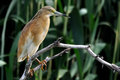
| 12/29/2011 09:16:53 AM | Bird & Branch by HarveyGComment: I apologise, I am new to this and you are "stuck" with my comments. Pls. realise that this is *my* learning curve more than yours!
a nice take on the theme. What a great photograph - when i grow up I want to take pictures like this :-). I like the colour combination - both subjects (branch and bird) really stand out from te background. Nice composition. Only negative I can find is that the left side of the branch is slightly out of focus | | Photographer found comment helpful. |
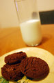
| 12/29/2011 09:12:29 AM | Santa's Favorite.by indiejojobaComment: I apologise, I am new to this and you are "stuck" with my comments. Pls. realise that this is *my* learning curve more than yours!
Nice interpretation of the theme. I feel the whole picture is a little lopsided. I want to grab the glass to stop it from sliding off the table :-). Since the main subject of the photo are the cookies AND the milk, perhaps the focus should have been on both, or maybe have the milk prominently as the backdrop without having the black chair there as well. Maybe a different colour table top would have made this composition more intersting and the green decor on the plate is unnecessary as it doesn't add anything to the picture |
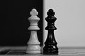
| 12/29/2011 08:50:20 AM | The dark sideby DarkpixelComment: I apologise, I am new to this and you are "stuck" with my comments. Pls. realise that this is *my* learning curve more than yours!
I like your choice of subject, I don't understand why you used that title for the image in this challenge. I would have thought "black & white" ... or is that too obvious? :-).
I like the backdrop but I am not convinced of the surface the 2 knights stand on and how it blends into the backdrop. I feel the lighting on the white king is good, but I don't think it's right on the black king. I do like the placemnet of your subject for this image. | | Photographer found comment helpful. |
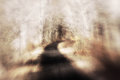
| 12/29/2011 08:44:45 AM | path and woodby posthumousComment: I apologise, I am new to this and you are "stuck" with my comments. Pls. realise that this is *my* learning curve more than yours!
I have no idea how you took the picture or what you did to it to make it look the way it does, but I love it :-).
Perhaps if the left and right edges could be a bit darker (like the right front corner), putting more focus on the centre and giving a little more contrast. and I am not sure if you could just level it a little? It seems to be tilting to the left, but that may be a trick of the eye due to the coloring as well. | | Photographer found comment helpful. |
|
Showing 2421 - 2430 of ~2440 |
Home -
Challenges -
Community -
League -
Photos -
Cameras -
Lenses -
Learn -
Help -
Terms of Use -
Privacy -
Top ^
DPChallenge, and website content and design, Copyright © 2001-2026 Challenging Technologies, LLC.
All digital photo copyrights belong to the photographers and may not be used without permission.
Current Server Time: 07/23/2026 10:53:18 PM EDT.
|