| Image |
Comment |
| 01/02/2012 03:31:49 PM |
|
 Photographer found comment helpful. Photographer found comment helpful. |
| 01/02/2012 03:27:51 PM |
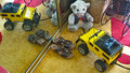
Toys Are Us Tooby casdsrComment: I am new to photography and have no idea how you produced this image. I would still like to say that I think it is stunning. |
| Photographer found comment helpful. |
| 01/02/2012 03:24:03 PM |
RACE!!!by lukep96Comment: I like the idea for this photograph. I think the blur came out really well. However, even though I understand that toys are often (usually?) used indoors, I would have liked a different setting (background) for this image. I understand that the clean wall shows off the blur really well, but I would think other bg would have done this photograph more justice. |
| Photographer found comment helpful. |
| 01/02/2012 03:10:02 PM |
They learned not to interrupt Dolly’s beauty sleepby markwileyComment: Gosh - hope you don't tell too many bed time stories! ;-). This image is definitely telling a story! I love the setting with the dark floor and the dark background and I really like the lighting on the doll. Also your choice of doll. Although the big doll is your main focus, I am wondering if you shouldn't have brought the little figures to the front a bit more to increase their size a little. The little house is only just recogniseable as a house. Again, perhaps a bit bigger or slightly angled (depending what it was made of) may have just brought it out a bit more. You also just got the fire and exposure right. Perhaps just a tiny bit too much? Still IMO, overall definitely a very good photograph |
| Photographer found comment helpful. |
| 01/02/2012 03:03:34 PM |
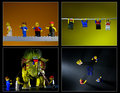
In search of the lost Blue Ribbon (what a dangerous task!)by Alex_PetriniComment: I like your sense of humor :-) and I like the way you presented the story. For me the top 2 and bottom 2 images don't seem to belong together because of the different background. The 3rd image with the green dinosaur still links to image 2 with the green background. But I feel you should have used a coloured bg for image 4 to tie things together better. I also think, since the blue ribbon was the point of the whole story, your lighting should have been on the ribbon. It seems to highlight an area to the left for no apparent reason. To remain with the 4th image, bacuse of your change of perspective, the toys actually look smaller than in the other photos, which to me again makes the 4th picture just not part of the others. I tried to zoom in on my monitor, perhaps that was the problem, but to me it looked like the toys are not 100% in focus. I think for this type of photograph they should be crisper. Your lighting in image 3 is very dramatic, I like. I also like the simple, crisp framing of the 4 images. that worked really well. |
| Photographer found comment helpful. |
| 01/02/2012 02:54:24 PM |
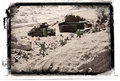
June 6,1944by CaptUnderpantsComment: WOW! looked like you had fun on the beach :-). Very creative "set" and very good use of frame. IMO the figurines should have been a different colour to stand out more. I know they are *supposed* to blend into the sand, but this is about photography and not about realism :-). I like the composition of your image though with the "action" parts on the centre-diagonal and realively quiet areas in front and behind. Also think your exposure and lighting are good. |
| Photographer found comment helpful. |
| 01/02/2012 02:42:13 PM |
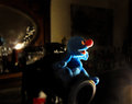
"... and then, I shot !"by mariucaComment: What a fun photograph :-). I like the lighting you used. It works really well on this little blue toy. Perhaps you could have done something to make the eye a bit brighter in post editing. I find the light cast in the bottom right corner spoils the image, as well as that bright red and white area under the camera. I suppose the reflection of your light sourse in the mirror (?) could have also been adressed, but somehow it doesn't worry me as much as the other 2 areas. Still, overall a nice image with composition and idea as well as DOF being really good IMO. |
| Photographer found comment helpful. |
| 01/02/2012 01:44:54 PM |
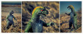
The Search for Art Roflmao Continuesby Bear_MusicComment: I really like your 3 images. The way you make the dinosaur stand out against the background with DOF as well as colour contrast, very neat (especially image 2, but I do like all of them). I also liked your choice of the 3 images, the way you cropped them and how you put them together - very effective. I *don't* get "the story" though. |
| Photographer found comment helpful. |
| 01/02/2012 01:39:24 PM |
No Age Restrictionsby dahlinComment: Nice idea :-). I like the lighting, especially the way it highlights the doll, very clever. I can't make out the thing in the man's hand though :-( shame, I assume it adds to the "story". I feel that perhaps the background is too busy and/or too much in focus. If the photograph were about the man you would probably get away with it because of the relative size, but the doll has to "work hard" to stand out against it. |
| Photographer found comment helpful. |
| 01/02/2012 01:34:35 PM |
When New Meets Oldby BrianRComment: This image for me is a bit too busy. Perhaps too many items and then the red blotch on the carpet which really draws my eye. The shoes could have perhps been typical children's shoes, if used at all?
I like the idea with the mirror though, but again, those 2 red flecks on the left are distracting I think. |
| Photographer found comment helpful. |
Home -
Challenges -
Community -
League -
Photos -
Cameras -
Lenses -
Learn -
Help -
Terms of Use -
Privacy -
Top ^
DPChallenge, and website content and design, Copyright © 2001-2026 Challenging Technologies, LLC.
All digital photo copyrights belong to the photographers and may not be used without permission.
Current Server Time: 07/23/2026 06:00:04 PM EDT.