| Image |
Comment |
| 12/29/2011 09:16:53 AM |
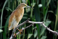
Bird & Branch by HarveyGComment: I apologise, I am new to this and you are "stuck" with my comments. Pls. realise that this is *my* learning curve more than yours!
a nice take on the theme. What a great photograph - when i grow up I want to take pictures like this :-). I like the colour combination - both subjects (branch and bird) really stand out from te background. Nice composition. Only negative I can find is that the left side of the branch is slightly out of focus |
 Photographer found comment helpful. Photographer found comment helpful. |
| 12/29/2011 09:12:29 AM |
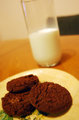
Santa's Favorite.by indiejojobaComment: I apologise, I am new to this and you are "stuck" with my comments. Pls. realise that this is *my* learning curve more than yours!
Nice interpretation of the theme. I feel the whole picture is a little lopsided. I want to grab the glass to stop it from sliding off the table :-). Since the main subject of the photo are the cookies AND the milk, perhaps the focus should have been on both, or maybe have the milk prominently as the backdrop without having the black chair there as well. Maybe a different colour table top would have made this composition more intersting and the green decor on the plate is unnecessary as it doesn't add anything to the picture |
| 12/29/2011 08:50:20 AM |
The dark sideby DarkpixelComment: I apologise, I am new to this and you are "stuck" with my comments. Pls. realise that this is *my* learning curve more than yours!
I like your choice of subject, I don't understand why you used that title for the image in this challenge. I would have thought "black & white" ... or is that too obvious? :-).
I like the backdrop but I am not convinced of the surface the 2 knights stand on and how it blends into the backdrop. I feel the lighting on the white king is good, but I don't think it's right on the black king. I do like the placemnet of your subject for this image. |
| Photographer found comment helpful. |
| 12/29/2011 08:44:45 AM |
path and woodby posthumousComment: I apologise, I am new to this and you are "stuck" with my comments. Pls. realise that this is *my* learning curve more than yours!
I have no idea how you took the picture or what you did to it to make it look the way it does, but I love it :-).
Perhaps if the left and right edges could be a bit darker (like the right front corner), putting more focus on the centre and giving a little more contrast. and I am not sure if you could just level it a little? It seems to be tilting to the left, but that may be a trick of the eye due to the coloring as well. |
| Photographer found comment helpful. |
| 12/29/2011 08:39:32 AM |
joey and kristinaby FourPointXComment: I apologise, I am new to this and you are "stuck" with my comments. Pls. realise that this is *my* learning curve more than yours!
I like the way you used the "V" in the sky to frame/draw attention to the 2 people's faces. I love the colour composition with the sky and the human skin.
I would have cropped the picture a little more to get rid of the girl's stomach - not because I have an issue with short tops, but because the stomach as well as the man's arm keep drawing the eye away from the faces (at least it does for me :-)). mabe you could have edited the few reflecting spots out of the background to tidy up the image and also darkened the car on the left a bit more. I think the lighting on the people is good and the soft focus flatters their youthful faces. |
| Photographer found comment helpful. |
| 12/29/2011 08:27:57 AM |
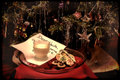
Cookies & Milk for Santaby KelliComment: I apologise, I am new to this and you are "stuck" with my comments. Pls. realise that this is *my* learning curve more than yours!
I like your theme interpretation and I very much like your composition - looks really like a Christmas Card. Personally I have a problem with your choice of focus. It seems the tree is in perfect focus, but the little table with the note, milk etc is just out of focus. Considering the milk etc. is your main theme, I would have done this the other way round, or have everything in focus, which IMO in this image would have worked well, because the tree is fairly dark and your forground would draw the eye anyway. I like the way you made the note and red tablecloth almost look surreal, but I feel you overdid the brightness/highlight of the milk glass, loosing definition on the top of teh glass. |
| Photographer found comment helpful. |
| 12/29/2011 08:19:55 AM |
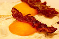
Bacon and Eggby mrbig65Comment: I apologise, I am new to this and you are "stuck" with my comments. Pls. realise that this is *my* learning curve more than yours!
Clever interpretation of the theme :-). I like your composition with 2 of the same, but one in and one out of focus and the main bacon on the photo's diagonal.
Your color balance is not right for me. The egg white is yellow, it should be, well, white. The bacon too shows little contrast and I think there is too much reflection on the bacon ? It has somehow lost its 3D aspect, which is a shame. I know food photography is very hard - the professionals use paint and laquer to make the food look the way it does on pics! |
| Photographer found comment helpful. |
| 12/29/2011 08:12:45 AM |
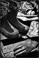
Waterman's Boots and Glovesby jenicklasonComment: I apologise, I am new to this and you are "stuck" with my comments. Pls. realise that this is *my* learning curve more than yours!
I must admit, I had to read up what a waterman is/does - thanks for some education :-). So, I like your interpretation of the theme. I like the way you use the slightly out of focus boat tarpaulin as your backdrop. By the same token, I would have prefered to have the glove, as one of the main items in this image, to be completely in focus and/or more prominent in color and/or placement. I like the mud pattern on the boots, as it prevents them from being a "big black blotch" as well as adding interest and a little more "background" to your theme. I think your lighting is good and the wet surface all over again emphasis the picture's story. |
| Photographer found comment helpful. |
| 12/29/2011 08:01:33 AM |
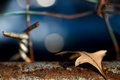
Vegetable & Mineral - Leaf & Rustby tvsometimeComment: I apologise, I am new to this and you are "stuck" with my comments. Pls. realise that this is *my* learning curve more than yours!
I like your interpretation of the theme. I LOVE the bottom part of your photograph - the leaf and the rusty surface. IMO, all you needed was to add a little blue of the background and you could have left it. I find the additional rusty barb wire, which is out of focus and "oversized" compared to the leaf distracting. the oversize, IMO really draws attention to the barb wire and I don't think that is where the viewers attention should be going. The same for the light reflections. Especially the bright one in the middle catches the eye. I like the colour combination you used and the DOF on the leaf and rusty sheet as well as the lighting on the leaf, making the shadow go "under" the leaf and hence not obscuring any of the rust it is lying on - very nicely done. |
| Photographer found comment helpful. |
| 12/29/2011 07:42:20 AM |
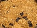
Raisin Branby GeneralEComment: I apologise, I am new to this and you are "stuck" with my comments. Pls. realise that this is *my* learning curve more than yours!
You are obviously NOT my brother - he thinks NOTHING goes with raisins ;-). Different take on the theme, I like it.
the raisins came out well in the picture I think and the placement of them is good (grouped together in one spot rather than all over). I do feel the picture is "flat" though and the "flakes" don't really stand out. This could be the top of a pie crust as well. I don't know if different lighting and/or higher contrast in post editing would have solved this.
Although it is well within the theme, I am not "captivated" by this photograph. |
| Photographer found comment helpful. |
Home -
Challenges -
Community -
League -
Photos -
Cameras -
Lenses -
Learn -
Help -
Terms of Use -
Privacy -
Top ^
DPChallenge, and website content and design, Copyright © 2001-2026 Challenging Technologies, LLC.
All digital photo copyrights belong to the photographers and may not be used without permission.
Current Server Time: 07/17/2026 03:19:10 AM EDT.