|
|
|
Showing 2371 - 2380 of ~2394 |
| Image |
Comment |
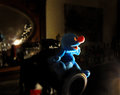
| 01/02/2012 02:42:13 PM | "... and then, I shot !"by mariucaComment: What a fun photograph :-). I like the lighting you used. It works really well on this little blue toy. Perhaps you could have done something to make the eye a bit brighter in post editing. I find the light cast in the bottom right corner spoils the image, as well as that bright red and white area under the camera. I suppose the reflection of your light sourse in the mirror (?) could have also been adressed, but somehow it doesn't worry me as much as the other 2 areas. Still, overall a nice image with composition and idea as well as DOF being really good IMO. |  Photographer found comment helpful. Photographer found comment helpful. |
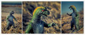
| 01/02/2012 01:44:54 PM | The Search for Art Roflmao Continuesby Bear_MusicComment: I really like your 3 images. The way you make the dinosaur stand out against the background with DOF as well as colour contrast, very neat (especially image 2, but I do like all of them). I also liked your choice of the 3 images, the way you cropped them and how you put them together - very effective. I *don't* get "the story" though. | | Photographer found comment helpful. |
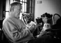
| 01/02/2012 01:39:24 PM | No Age Restrictionsby dahlinComment: Nice idea :-). I like the lighting, especially the way it highlights the doll, very clever. I can't make out the thing in the man's hand though :-( shame, I assume it adds to the "story". I feel that perhaps the background is too busy and/or too much in focus. If the photograph were about the man you would probably get away with it because of the relative size, but the doll has to "work hard" to stand out against it. | | Photographer found comment helpful. |
| 01/02/2012 01:34:35 PM | When New Meets Oldby BrianRComment: This image for me is a bit too busy. Perhaps too many items and then the red blotch on the carpet which really draws my eye. The shoes could have perhps been typical children's shoes, if used at all?
I like the idea with the mirror though, but again, those 2 red flecks on the left are distracting I think. | | Photographer found comment helpful. |
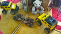
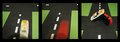
| 01/02/2012 01:29:04 PM | T_Boneby GeneralEComment: I like the "story". Perhaps one of the cars could have be shown to come from "the side", since the accident seems to have taken place on the intersection. As it is now, they both drive in the same direction "at different times" and the accident doesn't make much sense as it is shown.
In the first 2 pictures the lense and/or your head is throwing a shadow which you avoided in the 3rd and probably should have addressed in the first 2. Also the light in the 3rd picture is somewhat "off". the cars look very "flat" in this light and the underside is a solid black without detail.
I do like the way you presented your story on the 3 panels and I like the colour combination. IMO with a bit more attention to the technical detail this would have been a very striking entry. | | Photographer found comment helpful. |
| 12/29/2011 01:01:08 PM | Going out for a walkby mr_simmiComment: I apologise, I am new to this and you are "stuck" with my comments. Pls. realise that this is *my* learning curve more than yours!
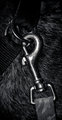
OK, so I have to say I am very critical about "interpretation of theme". I like your photograph for this challenge, but I don't like your title. What exactly are you showing? - "dog + leash", "collar + leash"? Both would work for me, so why use a title that doesn't fit the challenge?
I do like the b&W and I do like the composition and tight crop of your picture, as well as the lighting. I also think the smooth hair of the dog as a background, even though it is perfectly in focus works very well and does not distract from the main subjects. In fact I really like this photograph :-). |
| 12/29/2011 12:16:05 PM | Beer and pretzelsby MikeComment: I apologise, I am new to this and you are "stuck" with my comments. Pls. realise that this is *my* learning curve more than yours!
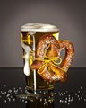
This image to me is "perfect" for this challenge. You worked within the theme and the photograph is beautifully composed. Both the background and dark reflective surface help to show off the main subject, which is in focus and for this particularl image important, very "apetizing" (and I don't drink beer as a rule :-)). Although I am not sure what made you choose a yellow nylon string to attach the pretzel, IMO it does not harm or distract from the picture. My only slight negative comment is the "look" of the pretzel. I have no idea where you come from, to me it looks "plastiky", but I am probably just used to ther types :-). One other minor thing which you may want to consider in future "beer shots" is to use a very cold glass that has some condensation. But that is also a personal preference of how I would like my beer :-). For the picture the clear yellow liquid in the glass (without condensation) works well. |
| 12/29/2011 11:54:29 AM | Corporate responsibility & employement , Petrolchemical plants & leukemiaby mcaldoComment: I apologise, I am new to this and you are "stuck" with my comments. Pls. realise that this is *my* learning curve more than yours!
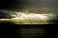
I love this picture, its bautiful. However, I don't think it really does your title justice (or should that be your title doesn't do the picture justice?). Yes, I can see the, I assume, petrochemical plant if I look carefully, but for this assignment I would have brought this much more into the viewer's eye (i.e either different lense and/or different crop). I am not sure how this picture depicts "leucemia" in any stretch of the imagination, nor employment. I understand that you are trying to make a socio-ecological statement, I just don't think this image is able to pull all these things together. Again, as a "photograph" I love it -as it is, especially the monochromatic, but I don't think you really worked the challenge with this image. | | Photographer found comment helpful. |
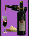
| 12/29/2011 09:33:14 AM | Wine And Cheeseby BrianRComment: I apologise, I am new to this and you are "stuck" with my comments. Pls. realise that this is *my* learning curve more than yours!
I like your choice of items and the stylised way you chose to portray them. I llike your color combination. However, I feel the "wine" aspect is overpowering and the cheese looks almost like an afterthought.
The fact that you put together different objects taken with different lighting makes the entire image somewhat unsettled to me. It also sems that you photoshopped the same bottle, just smaller at an angle for the pouring one and edited the "pouring" part in. That in itself is fine, but for me it should be less obvious and with more finess so that an observer does not pick it up that easily. | | Photographer found comment helpful. |
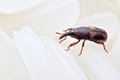
| 12/29/2011 09:25:36 AM | Grains Weevilby alexlkyComment: I apologise, I am new to this and you are "stuck" with my comments. Pls. realise that this is *my* learning curve more than yours!
Fun interpretation (unless you have to put up with them that is :-)). I would have perhaps just cropped a little more off the height of the image resultin in the weevil being more on the 3rd rather than the centre. Although IMO the wevil is very well lit, the rice grains are not and they are in fact hard to make out, which is a shame. Although the image works for me because it really shows off the weevil, for the sake of the challenge, IMO, both items should have been prominent | | Photographer found comment helpful. |
|
Showing 2371 - 2380 of ~2394 |
Home -
Challenges -
Community -
League -
Photos -
Cameras -
Lenses -
Learn -
Help -
Terms of Use -
Privacy -
Top ^
DPChallenge, and website content and design, Copyright © 2001-2026 Challenging Technologies, LLC.
All digital photo copyrights belong to the photographers and may not be used without permission.
Current Server Time: 07/17/2026 01:55:21 AM EDT.
|