| Image |
Comment |
| 06/14/2013 11:58:50 AM |
|
 Photographer found comment helpful. Photographer found comment helpful. |
| 06/14/2013 11:56:25 AM |
|
| Photographer found comment helpful. |
| 06/14/2013 11:55:54 AM |
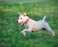
I'm thereeeeby aslezakComment: Love the expression on this happy dog's face - one of my favorite perspectives for a dog capture and very well done. Congratulations on the top ten. |
| 06/14/2013 11:55:06 AM |
|
| 06/14/2013 11:53:43 AM |
|
| Photographer found comment helpful. |
| 06/14/2013 11:51:46 AM |
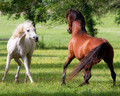
The Challengeby karenkComment: I love their concentration on one another and the alert barely contained energy in the capture, Karen. Congratulations on the HM. |
| Photographer found comment helpful. |
| 06/14/2013 11:50:31 AM |
Dreams of Flight by vawendyComment: Like he's hovering - that wing motion is perfectly beautiful. Congratulations on the ribbon, Wendy. |
| Photographer found comment helpful. |
| 06/14/2013 11:48:45 AM |
An old dog's idea of motion by markwileyComment: Wonderful idea, perfectly captured. Great feeling here that we can all identify with - even if we are not personally crazy about sticking our heads out the window of a moving car LOL Congratulations on the ribbon, Mark. |
| Photographer found comment helpful. |
| 06/14/2013 11:43:46 AM |
Dancing With Light by SandyPComment: Stunning light both on the hummer and in the bokeh background and I love the "pose" - like he's winging his way to heaven. Congratulations on the blue for this beautiful capture, Sandy. |
| Photographer found comment helpful. |
| 06/13/2013 11:32:11 PM |
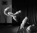
inch by inchby PennyStreetComment: 8 from me - I thought and think this very artistic. I love the airy feel and dancing light |
| Photographer found comment helpful. |
Home -
Challenges -
Community -
League -
Photos -
Cameras -
Lenses -
Learn -
Help -
Terms of Use -
Privacy -
Top ^
DPChallenge, and website content and design, Copyright © 2001-2026 Challenging Technologies, LLC.
All digital photo copyrights belong to the photographers and may not be used without permission.
Current Server Time: 07/28/2026 09:44:19 AM EDT.