| Image |
Comment |
| 05/11/2012 03:03:12 PM |
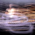
Cacophonyby goinskiingComment: wow, there's a LOT going on here. Not sure if the ghost is supposed to be the girl, the lights or the smoky trail, or if this is even supposed to have any sort of relevance. |
 Photographer found comment helpful. Photographer found comment helpful. |
| 05/11/2012 03:01:50 PM |
the flying dutchman by mrbig65Comment: if you had kept some clean lines on the land in behind and bled the overexposure into some coloured land/sea i'd appreciate this more, as is, it just looks overexposed and washed out. |
| Photographer found comment helpful. |
| 05/11/2012 02:58:55 PM |
Haunted Dreamsby hesitantComment: honestly looks a bit too 'photoshopped/cartoony' for my taste given some of the other entries here.
looks more like a cutscene from a 64-bit gaming platform, like the original silent hill or resident evil games.
5/10 due to what i'm considering overprocessing of the image. |
| Photographer found comment helpful. |
| 05/11/2012 02:55:59 PM |
Floating Spectreby stphqComment: nice transition - the texture on this makes it feel older.
model is a bit too corporeal - she obscures too much of the background, would've preferred a bit 'less' of her. |
| Photographer found comment helpful. |
| 05/11/2012 02:54:47 PM |
|
| Photographer found comment helpful. |
| 05/11/2012 02:54:12 PM |
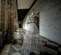
Til Death Do Us Part by Mark-AComment: Great image - love the antique looking gown on the model. fits the surrounding impeccably. one of my favorites in the challenge so far |
| Photographer found comment helpful. |
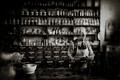
| 05/11/2012 02:52:32 PM |
The Old Apothecary  by PaulComment: Great image for this challenge, but upper left/lower right corners get a bit too dark IMO, and lower left corner object is too ghosted. Would've been great if the counter-top items were as crisp as the botles/shelves, and if the corners weren't as dark that far in. (some is good, but i find this to be too much. upper right corner got it correct)
6/10 as is |
| Photographer found comment helpful. |
| 05/11/2012 02:49:22 PM |
Vision at the window on a stormy nightby BenstedComment: loses a lot without being able to see the thumbnail, and that will lose points from me in this. it's a great concept, but thumbnail viewing should not be required to get the effect of your image. otherwise make your image smaller for the submission.
3/10 because you need the thumbnail to get the proper proportionate detail. |
| 05/11/2012 02:47:17 PM |
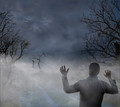
Invisibleby illini75Comment: My favorite thing about this image is the had - it makes it looks like some odd one-eyed, red-metal-mouthed head. aside from that, good job on keeping the objects in good shape and not blurring them in the layering |
| 05/11/2012 02:45:57 PM |
Wilhelmby rooumComment: overall image is too blurred/noisy. if doing ghost via layers, try to keep the environment crisp as much as you can (obviously not possible 100%, but static objects should not be blurring like this) and give the blur to the ghost, otherwise it loses a lot of the punch |
| Photographer found comment helpful. |
Home -
Challenges -
Community -
League -
Photos -
Cameras -
Lenses -
Learn -
Help -
Terms of Use -
Privacy -
Top ^
DPChallenge, and website content and design, Copyright © 2001-2026 Challenging Technologies, LLC.
All digital photo copyrights belong to the photographers and may not be used without permission.
Current Server Time: 06/24/2026 11:27:23 AM EDT.