| Image |
Comment |
| 05/24/2018 10:06:16 PM |
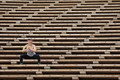
Work Outby RefocusedComment: Ack! You've brought back memories of bleacher runs after school before tennis practice. I'm not sure everyone will see the geometric lines as negative space but I hope they do. This is a brilliantly composed shot. |
 Photographer found comment helpful. Photographer found comment helpful. |
| 05/24/2018 10:03:40 PM |
The Solitary King by Alex_PetriniComment: Absolutely gorgeous! I love the warm yellows and cool whites. I really want to go visit that little spot of land back behind the tree. I'm convinced that fairies live there. |
| Photographer found comment helpful. |
| 05/24/2018 10:00:12 PM |
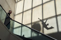
Fallingby hstegComment: Greetings from the Critique Club!
The challenge was a free study so your entry was definitely on point. ;) I love the creativity shown here. My eye was drawn straight to that weird shadow and it definitely looks like a falling person. Nice use of leading lines to bring attention to the shadow. I also like that your live person is looking in the direction of the shadow ... although if someone was falling maybe he'd actually be looking the other way? But I digress. The geometric, repeated patterns bring interest and height to the picture that add to your "falling" concept. The colors and tone convey a touch of sadness and mystery that works well with your theme.
I do wish the man's face was more clear and that he had some sort of emotion showing (shock, sadness). I agree with previous comments regarding a need for context. I have to wonder what that blob the falling person is about to smack into actually is. Of course making the viewer think and look harder at an image is a tricky job. One that you accomplished quite well here. |
| Photographer found comment helpful. |
| 05/24/2018 09:41:33 PM |
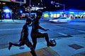
Night gameby gminkComment: Greetings from the Critique Club!
The challenge was a free study so anything goes ... mission accomplished! ;) I like that you were trying to capture movement and stillness in the same frame. Unfortunately, there is a lot going on in this scene and there are so many distractions (i.e., lights, shapes, lines) that pull the eye from the artwork and the car. (Did you notice that the car looks like its kinda floating? Neat trick.) Eliminating some of the partial signs or extra shapes, especially along the edges of the frame, would help the viewer focus their attention.
More detail in the statue might have helped ground the image... although that is difficult to accomplish in a hand held situation. In some ways I think not having the car in the frame could have made the statue look alive instead of frozen. The slightly off center placement of the statue in the frame is nice as it gives the boys room to "run" ahead. All-in-all a fun click. |
| 05/24/2018 09:25:50 PM |
innocence • purity • beauty • cheerfulness by Ja-9Comment: Greetings from the Critique Club!
You absolutely captured the essence of the Sherpet Tribute. (As reinforced by that shiny new yellow ribbon. Congrats!!) The colors are vivid and the details of the flower are a mix of sharpness and softness that add depth and wonder to the image. I'm torn about the minimal contrast between the flower and the background. On one hand it creates a seamless image where the flower tends to melt right into it's surroundings. On the other I would love to see more of those beautiful petals. But that's just me. Your submission is gorgeous and aptly named, as others have mentioned in their comments. You've said so much with a simple flower and wealth of vibrant color. |
| Photographer found comment helpful. |
| 05/24/2018 09:13:51 PM |
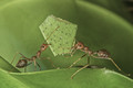
Hey humans! We are doing our part, how about you? by Chris_AngComment: Greetings from the Critique Club!
What a wonderful image for an earth-friendly challenge. You've got green representing the environment, insects that play a huge role, and collaboration in getting the work done. It's no surprise to me at all that this image received a ribbon.
The details on the bugs are sharp and I love how the colors work together to soften the overall feel of the scene. The ribbon-like waves of the leaf add depth and interest. As I stare at the scene I can almost hear two co-workers bickering back and forth over the idiot humans who are always disrupting their progress by trying to step on them. Beautiful! |
| Photographer found comment helpful. |
| 04/13/2018 02:40:57 PM |
|
| 02/19/2018 09:25:26 PM |
|
| Photographer found comment helpful. |
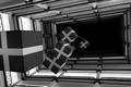
| 02/02/2018 10:03:55 AM |
Christmas Abyssby jeroweComment: Greetings from the Critique Club!
Challenge: Black and white? Yep! Abstract? Yes. I recognized the railings as such but it took me a bit to figure out the boxes. I guess the holidays are well and truly over in my mind. Voting landed you about middle of the pack ... probably as the railings and boxes are a little too recognizable for a true abstract.
Image: I love how the railings are not square in the composition. The extra angles add interest and increase the abstract nature. The support beams, along with the dangling boxes help to add depth and draw the eye. My favorite piece is that there is nothing at the end of the line. Just a rectangular abyss (as you aptly named it) that allows the viewer to imagine what might be found in its depths. Details and contrasts are very nice. The depth you captured, as the railings fade away into darkness, is terrific.
In terms of constructive feedback ... You have a bit of a blow out (hot spot) on the left of the image. This may have messed with your ability to get a bit more white in the mix. The intensity of that area tends to capture attention though so something to watch out for in the future. All in all ... very creative! |
| Photographer found comment helpful. |
| 01/29/2018 11:31:48 AM |
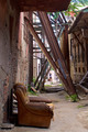
Street Architectureby PangurbanComment: Greetings from the Critique Club!
First things first ... I'm glad you did eventually get that beer. :)
Theme: In terms or architecture, your image definitely covers a lot of bases. From steel girders to the crumbling brick you've captured the mix of old and new. That being said this is a tough picture to compete with the classic shots of buildings and bridges submitted in this challenge.
Image: I love the earthy colors of this image and how you've shown the steel supports holding up the older failing walls of the previous age. The bits of green popping out add contrast and the soccer players at the end draw the eye. You've framed them perfectly between the supports and the depth creates interest. Lots of detail shown in the textures of the various materials and the neglect of the chair offsets the life in the children.
All in all this is a great image and I am struggling to offer constructive feedback. Forced to pick something I would say its possibly a bit busy (there is a lot going on) but again I like it so ... |
| Photographer found comment helpful. |
Home -
Challenges -
Community -
League -
Photos -
Cameras -
Lenses -
Learn -
Help -
Terms of Use -
Privacy -
Top ^
DPChallenge, and website content and design, Copyright © 2001-2026 Challenging Technologies, LLC.
All digital photo copyrights belong to the photographers and may not be used without permission.
Current Server Time: 04/01/2026 04:49:03 PM EDT.