|
|
|
Showing 331 - 340 of ~498 |
| Image |
Comment |
| 02/05/2004 08:16:18 PM | Year of the "Three Little Pigs"by bjallenComment: *Greetings From the Critique Club*
This is a very unique and enjoyable shot. I am excited to be able to critique this shot because I feel there are a few things that you could fix that could make this shot absolutely stellar.
Composition:
Okay, first things first, I would crop off the bottom of the shot right where the shade starts on the left side of the shot about 1/3 the way up from the bottom right at that point for several different reasons: First off, like most everyone else mentioned, just a little bit too much foreground, it kind of distracts from the rest of the shot, leaving your eyes wandering around a bit. Secondly, I feel the shade itself distracts from the shot as well because the difference in the shade and the lighted ground is way too much of a contrast. Third, I'm not sure if anyone else said this, but if you notice the snow line in the shaded part on the bottom runs in a completely different direction than the rest of the shot, leading your eyes completely away from what's important in the shot. Finally, it makes it to where the pigs are in the center of the shot. It would make it look like it were split into thirds from top to bottom, as I see it, it would put the fence part on top, the pigs in the center, and then the foreground. I feel this would add a lot of strength to this shot.
The pigs are really great. One interesting thing I noticed is the color of the pigs, in succesion from the first to the last, you have a white, a mixed, and a black pig. To me, that just really caught my attention. I love the positions they are in, very enjoyable.
Like other people have said, it is shame that the pigs aren't in focus, because if that were the case, I believe it would have been a very solid photo. I realize this isn't always the easiest thing to do and I commend you efforts because you caught a perfect moment, sometimes they turn out, sometimes they don't, it kind of the luck of the draw.
Other Comments:
This is a great shot, I just feel that a few minor things editing-wise could have made it a little bit stronger such as cropping and contrast (Iwould add just a tad bit more). It is a fun shot and I am glad I was able to critique it. Best of wishes to ya in future challenges!
~Matthew (goinskiing)
If you have any comments, questions, or concerns, feel free to PM me.
|  Photographer found comment helpful. Photographer found comment helpful. |
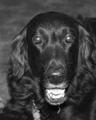
| 02/05/2004 07:38:44 PM | "2006 The Year of the Dog"by ladpupmoeComment: *Greetings From the Critique Club*
Nice dog! :)
Composition:
One thing that I personally would have helped this shot is a tighter crop. I feel that there is just a little bit too much space to the left and on the top. A crop that would work would be to make the crop on the left side as the same as the right by making both sides of the picture touching the ear on the dog. This would add a more balanced feel. As for the top and bottom, I wouls shave a little off both to give more emphasis on the dogs face.
I personally enjoy the black and white treatment, seems to work quite well here. I really like the looks of your dog, good, strong, and healthy looking.
Lighting:
Overall, I feel the lighting is good here, maybe a tad bit harsh. I can see a little bit of over-exposure in the mouth and a little bit on the nose. Again, good choice using black and white. I say this because I can see I wide scale of darks and lights.
Other Comments/Feelings:
I did also notice a couple of things about this shot. A few minor clean-up issues (small things that make a huge difference): the hair hanging from his chin distracts from the quality of the picture and also the hair on the nose. Like I said, just small little nit-picky things that make a huge difference in the over-all feel of a shot. One thing though that I really thought was interesting was the dog's eyes, very interesting adn mystifying.
*Matthew
If you have any questions, just PM me and best of wishes to ya in future challenges. | | Photographer found comment helpful. |
| 02/02/2004 11:29:31 PM | | | Photographer found comment helpful. |
| 01/25/2004 10:31:08 AM | | | Photographer found comment helpful. |
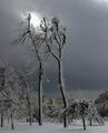
| 01/20/2004 10:59:30 PM | Cold, snow-blown trees of Goat Island, Niagara Falls, NYby lwkimagesComment: I have had this shot on my mind a lot lately. It is an extrmely unique shot, which fits the NG theme extremely well. It must have been extremely windy for the snow to be piled up on the trees in that way. There's just something to this shot, I can't quite put my finger on it, but it is truly marvelous. Good luck! | | Photographer found comment helpful. |
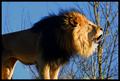
| 01/20/2004 10:57:18 PM | Greeting the Sunby YellowpeepComment: I love this shot! I particularly enjoy the contrast between the shadow cast on the lion and the sunlight in it's face (this is due to your wonderful lighting). I also believe that the trees in the background enhance this photo tremendously seems to fill the frame quite nicely. One thing that would add more strength IMO, is to equalize and balance the shot. I feel that the tree on the right mixed with the lion's head tend to overdominate the shot. It just feels ever so slightly heavy on the right. But this is a very, very minor thing and the rest of the elements more than make up for that fact. |
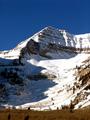
| 01/20/2004 10:53:32 PM | Rocky Mountain Morningby mhamiltonComment: When I first saw this one I said WOW. The lighting is absolutely marvelous and the exposure near-flawless. I love the sky, a very strong and solid blue, love it, good luck! | | Photographer found comment helpful. |
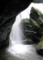
| 01/20/2004 10:52:03 PM | The Waterfallby robbiehComment: I absolutely love this shot, very beautiful! The exposure is wonderful and the compostion near-flawless! Good luck on this very fine image! | | Photographer found comment helpful. |
| 01/19/2004 06:27:27 PM | |
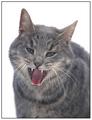
| 01/19/2004 06:26:36 PM | Snow Catby buzzrockComment: One of the cooler cat shots for sure! It works quite well honestly. |
|
Showing 331 - 340 of ~498 |
Home -
Challenges -
Community -
League -
Photos -
Cameras -
Lenses -
Learn -
Help -
Terms of Use -
Privacy -
Top ^
DPChallenge, and website content and design, Copyright © 2001-2026 Challenging Technologies, LLC.
All digital photo copyrights belong to the photographers and may not be used without permission.
Current Server Time: 07/17/2026 03:07:23 PM EDT.
|