| Image |
Comment |
| 11/17/2007 10:39:10 PM |
|
 Photographer found comment helpful. Photographer found comment helpful. |
| 11/17/2007 10:38:13 PM |
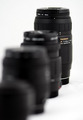
Jelly Totsby OddfrogComment: I like the idea. Shots like this are tricky to execute, the main reason being is you want to eliminate shadows, especially on white boards where it will pickup the slightest shadow, usually several strategically placed (at least one sort of diffused light for evenness) lights. This shot is slightly overexposed as well. Good luck! |
| Photographer found comment helpful. |
| 11/17/2007 10:30:55 PM |
Natures Beautyby psartComment: I'm not seeing any foreground bokeh. The exposure is good, maybe a different perspective that included some sort of bokeh to really make the subject pop out |
| Photographer found comment helpful. |
| 11/17/2007 10:28:11 PM |
solitudeby shoggyComment: I think the mixture of foreground and background bokeh really enhance this shot, well done, also, very pleasing to look at |
| Photographer found comment helpful. |
| 11/17/2007 10:25:19 PM |
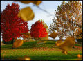
November Windsby lkn4truthComment: I really like this one. I like the bright reds and I am curious to see how the "foreground bokeh purists" rate this one, good luck. |
| Photographer found comment helpful. |
| 11/17/2007 10:22:49 PM |
|
| Photographer found comment helpful. |
| 11/17/2007 10:21:47 PM |
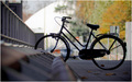
Where's the screwdriver?by marcusvdtComment: I like the entry and the lighting is really good, except the foreground is dark and distracts from rest of image, i think it may have worked better with the bottom cropped a bit and the foreground a little brighter. Good luck! =) |
| Photographer found comment helpful. |
| 11/14/2007 11:08:48 AM |
|
| 11/14/2007 11:06:53 AM |
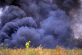
The Lone Firemanby JudiComment: I can tell you were trying to use the grass as the foreground bokeh, but there isn't enough to make an impact on the picture |
| Photographer found comment helpful. |
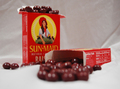
| 11/14/2007 11:05:14 AM |
skittle raisinsby raeComment: Not as clear as I would like, it may have done better in a smaller crop with the back box sharper and no wrinkles in the sheet. |
| Photographer found comment helpful. |
Home -
Challenges -
Community -
League -
Photos -
Cameras -
Lenses -
Learn -
Help -
Terms of Use -
Privacy -
Top ^
DPChallenge, and website content and design, Copyright © 2001-2026 Challenging Technologies, LLC.
All digital photo copyrights belong to the photographers and may not be used without permission.
Current Server Time: 07/18/2026 01:49:28 AM EDT.