| Image |
Comment |
| 05/14/2004 10:50:18 PM |
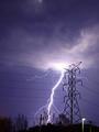
Glitter and Shadowby ajacoubComment: Ok idea, but I think it could be more interesting. All I see here is the sun and a smoke stack. What's to interest the viewer? Perhaps back off further and crop in closer so the sun and smoke stack are all there is instead of so much empty sky. 6 |
| 05/14/2004 10:47:46 PM |
Opposites attractby johnmComment: I like your idea, the only problem is her shoes almost exactly match the background, Differentiate a little more or change to a different background. 7 |
| 05/14/2004 10:45:22 PM |
Simple Choiceby FirstyComment: I like the way you think. There is something not quite right about this pic, but I can't put my finger on it. Perhaps the blue cast? Try correcting the color/exposure, it might improve. Nice shot 8 |
 Photographer found comment helpful. Photographer found comment helpful. |
| 05/14/2004 10:42:47 PM |
|
| Photographer found comment helpful. |
| 05/14/2004 10:41:59 PM |
|
| Photographer found comment helpful. |
| 05/14/2004 10:39:40 PM |
Unbridled versus Restrained by BikeRacerComment: Awesome shot! Only minor problem, I think I might have cropped out the street light near the bottom. It would still be a pretty dramatic shot. 10 |
| Photographer found comment helpful. |
| 05/14/2004 10:38:29 PM |
When a MAN loves a WOMANby UNCLEBROComment: Good shot on the challenge. To make this really have impact, the people need to be completly in shadow. Either a stronger light behind, or perhaps move the sheet/curtain between them and the camera. There's just enough detail that it distracts from the opposites theme. 9 |
| Photographer found comment helpful. |
| 05/14/2004 10:34:31 PM |
S & P in B & Wby KylieComment: Very nice on the challenge. I think it would be more effective if the shakers were closer to the intersection of the colors and then crop in closer. Good Effort. 8 |
| Photographer found comment helpful. |
| 05/14/2004 10:33:08 PM |
Light and Shadow. A Kiss.by la magaComment: Different. I think the pic would have more impact if the shadows were darker/smoother or if the view were up much closer, maybe crop it down to just about the center 30%. Your border is ok, but I think more effort on the pic would be more effective. 7 |
| 05/14/2004 10:29:57 PM |
Ancient and Modern by e301Comment: Excellent comparison. Would have more meaning if you had included an old Bible. 9 |
| Photographer found comment helpful. |
Home -
Challenges -
Community -
League -
Photos -
Cameras -
Lenses -
Learn -
Help -
Terms of Use -
Privacy -
Top ^
DPChallenge, and website content and design, Copyright © 2001-2026 Challenging Technologies, LLC.
All digital photo copyrights belong to the photographers and may not be used without permission.
Current Server Time: 07/18/2026 07:54:32 AM EDT.