| Image |
Comment |
| 02/18/2006 10:21:24 AM |
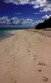
Looking for Paulby TuckersmomComment: great texture and color shades of green and blue. It might be nicer without the footprints, but hey we can't unscrew the lightbulb. |
 Photographer found comment helpful. Photographer found comment helpful. |
| 02/17/2006 08:15:10 PM |
|
| 02/17/2006 07:59:39 PM |
|
| Photographer found comment helpful. |
| 02/17/2006 07:57:34 PM |
lustful intentionsby leahmommyComment: she doesn't look into it all tight lipped. I like the blur though. very interesting. lusty enough though? |
| Photographer found comment helpful. |
| 02/17/2006 07:56:29 PM |
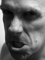
Seethingby dahvedComment: I like it, I want more contrast and some eyeball detail. good lighting on the brow. |
| Photographer found comment helpful. |
| 02/17/2006 07:55:01 PM |
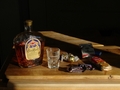
Blood Moneyby mferg265Comment: great shading on the money; weird tight grip makes odd skin tones. nice compo though |
| 02/17/2006 07:53:25 PM |
LITTLE MISS PIGGYby corrieComment: Nicw ahot great pose; could be tonally more neutral and less purple; but better than average. |
| Photographer found comment helpful. |
| 02/16/2006 05:51:58 AM |
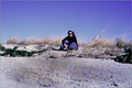
Desertedby gurlwithapenComment: such a great feel; all road and sky ; great self portrait in a landscape. |
| Photographer found comment helpful. |
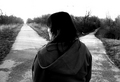
| 02/15/2006 08:00:49 AM |
The High Road & The Low Roadby Sparky9001Comment: In theory, this is nice; however, it really doesn't work well with this crop/composition. The focus is all on the area of sweatshirt hood; which dominates the frame; the true focus should be on the paths behind, and they should at least be intentionally obscured, and not randomly darkened or lightened. perhaps a crop along shoulder level, or a little less contrast would work here. |
| Photographer found comment helpful. |
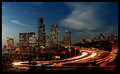
| 02/15/2006 07:49:27 AM |
Lifebloodby DrAchooComment: such great flow and movement here/ terrific composition paired with the motion blur of lights. there is a real sense of excitement upon entering a new city type feel, all coupled with an intimacy that makes the shot feel intimate. well done. |
| Photographer found comment helpful. |
Home -
Challenges -
Community -
League -
Photos -
Cameras -
Lenses -
Learn -
Help -
Terms of Use -
Privacy -
Top ^
DPChallenge, and website content and design, Copyright © 2001-2026 Challenging Technologies, LLC.
All digital photo copyrights belong to the photographers and may not be used without permission.
Current Server Time: 07/18/2026 05:58:31 AM EDT.