| Image |
Comment |
| 12/20/2003 10:14:32 AM |
Good to the Last Dropby K-RobComment: I like the slight curve in the stream- the picture is technically good but compositionally a bit too symmetrical. Where the light is is perfect though. |
 Photographer found comment helpful. Photographer found comment helpful. |
| 12/20/2003 10:12:59 AM |
A Pretty Pitcherby ScottKComment: The red looks a bit unnatural here. I love the colors but youve got jaggies. This is a really good composition though. |
| Photographer found comment helpful. |
| 12/20/2003 10:06:22 AM |
Country Club Water Serviceby EmerauldeComment: I like the clarity of the rim of the glass here. I'm not sure I'm feeling the whole read glass bead reflected as a brownish lump in the glass. |
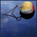
| 12/20/2003 10:05:02 AM |
Three Trillion Gallons Below Normalby JasonComment: Great colors and midnight blue water. The clay and salt colors of the stone really create a stark feeling about the shot. There is a somewhat excessive amount of water in the foreground when the most interesting parts seem to disappear up out of the shot- but given the title it works fine. |
| Photographer found comment helpful. |
| 12/20/2003 09:59:32 AM |
Water Colors by jjbeguinComment: I love this shot. Beautiful colors and great negative space. Maybe a little too much water below or it would be a ten+ I would say if there were clouds relfected in the water below you could leave that much- but hell its a great shot- you have my vote for a ribbon. |
| Photographer found comment helpful. |
| 12/20/2003 09:56:52 AM |
. _ . _ Morse Code?by ladpupmoeComment: THis looks a bit too much like digital art to me. the colors are over equalized and there is an unnatural look to the drops and the edges of the water. Nice creative shot and title, though./ |
| Photographer found comment helpful. |
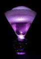
| 12/20/2003 09:53:35 AM |
Purple Bubblesby md8speedComment: Very interesting. the bleow part of the vase, the starry spotted white part is distracting- but I like how the background is a perfect black. |
| 12/20/2003 09:52:14 AM |
Quabbin Resevoirby amsmythComment: Nice shot but the blue seems a little too primary. I like the inclusion of the weeds, and perhaps that mountain in the back needs a bit more definition/ needs to be darker. |
| Photographer found comment helpful. |
| 12/20/2003 09:50:44 AM |
Leaping Lotusby shareinncComment: I love the black and orange, but the black lines look a bit unnatural. Altogether, the composition is interesting- but the background seems a bit too digitally blurred. |
| 12/19/2003 08:00:32 AM |
Vancouver Nightby NeilComment: This is really nice- its got that great pacific glow to it. nice shot |
| Photographer found comment helpful. |
Home -
Challenges -
Community -
League -
Photos -
Cameras -
Lenses -
Learn -
Help -
Terms of Use -
Privacy -
Top ^
DPChallenge, and website content and design, Copyright © 2001-2026 Challenging Technologies, LLC.
All digital photo copyrights belong to the photographers and may not be used without permission.
Current Server Time: 06/23/2026 02:26:18 PM EDT.