| Image |
Comment |
| 10/06/2011 11:52:14 PM |
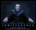
I N D I F F E R E N C Eby njsabsComment: He he, this reminds me of a line from a book:
"he was not talking but one could tell that he entertained stupid thoughts" |
 Photographer found comment helpful. Photographer found comment helpful. |
| 10/06/2011 11:51:59 PM |
|
| Photographer found comment helpful. |
| 10/06/2011 11:51:41 PM |
|
| Photographer found comment helpful. |
| 10/06/2011 11:51:37 PM |
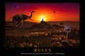
Rules by gyabanComment: This must be Christophe or admirer who made an image to accompany Debussy's "Prélude à l'après-midi des elephants"
or
"Et la lune descend sur le temple qui fut"
Well done illustration, like always; in a book for children would be sheer delight but for a motivational poster the graphic design should have been a touch more ambitious and daring. (No italics in white, for instance; a better marriage between illustration and text.) The thin border gives a dated look for an image that is meant to be timeless.
I have to take back my comment regarding the formatting. Sheer ignorance from my part. You created a true motivational poster, formatting and all. Should have done my homework. Oh boy, who invented this design for motivational posters? Got me thouroughly demotivated. |
| Photographer found comment helpful. |
| 10/06/2011 11:50:29 PM |
Hammer Timeby BrennanOBComment: Ha! The antiseptic blue border is not bad here. Good adage, good image.
No need though for the bigger S and N. It's so deja vu in this challenge that I wonder if it was not required. Also, a plain font (such as even the ubiquitous "Helvetica") would have been so much more appropriate.
I have to take back my comment regarding the formatting. Sheer ignorance on my part. You certainly stayed within the set formatting for these types of posters.
And, (within this mighty boring format that got me so "demotivated") you created a strong image. |
| Photographer found comment helpful. |
| 10/06/2011 11:50:24 PM |
|
| Photographer found comment helpful. |
| 10/06/2011 11:41:19 PM |
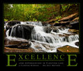
Excellenceby dswannComment: This is such a classic calendar page. No incentive here to read the text. Just to glance at a pretty picture.
I wonder why so many of the submissions used this type of graphic design. Big caps for the first and last letter of the slogan, the middle underlined for no apparent reason, the punch line ducked under ...
voted earlier
Sorry for my ignorance. You certainly stayed within the boundaries of a classic motivational poster. |
| Photographer found comment helpful. |
| 10/05/2011 10:35:29 PM |
Me and catsby MelethiaComment: Deb, I am totally taken by this picture. I don't know what I like the most: you hiding behind the cat, the other one being so supportive, your eye looking joyfully but oh, timidly ...
Thank you for posting it. One my favorites. |
| Photographer found comment helpful. |
| 10/04/2011 09:02:48 AM |
|
| Photographer found comment helpful. |
| 10/04/2011 09:02:02 AM |
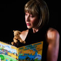
"Which is Me"by sfmorrisComment: Now how many times can I look at these pics - and I mean BOTH of them?!
I am fascinated by the subject!
Still unable to give a mark. And by the warmth of the fire. |
| Photographer found comment helpful. |
Home -
Challenges -
Community -
League -
Photos -
Cameras -
Lenses -
Learn -
Help -
Terms of Use -
Privacy -
Top ^
DPChallenge, and website content and design, Copyright © 2001-2026 Challenging Technologies, LLC.
All digital photo copyrights belong to the photographers and may not be used without permission.
Current Server Time: 05/11/2026 12:24:50 AM EDT.