| Image |
Comment |
| 10/08/2011 09:27:18 PM |
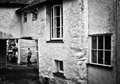
Hawkshead village by jagarComment: I was looking forward so much for some image from your old country. Thanks. |
 Photographer found comment helpful. Photographer found comment helpful. |
| 10/06/2011 11:54:11 PM |
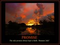
p r o m i s eby FourPointXComment: The message would have been more powerful IMO without red border. A large black area would have made it clear. With only red lettering. |
| Photographer found comment helpful. |
| 10/06/2011 11:54:05 PM |
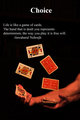
Play your Cardsby OzComment: Isn't it Nehru?
I appreciate that you did not mess up with borders and ditsy things but the text is totally randomly placed. |
| Photographer found comment helpful. |
| 10/06/2011 11:53:54 PM |
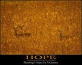
Hopeby BastaComment: A good one.
I wish that HOPE was not underlined and the text would have been ocher also. |
| Photographer found comment helpful. |
| 10/06/2011 11:53:45 PM |
Curiosityby BenstedComment: Comes as a nice breeze after all the borders and T extS
(Should have centered the text) |
| Photographer found comment helpful. |
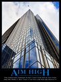
| 10/06/2011 11:53:36 PM |
AIM HIGHby Brent_SComment: Who said that was damn right. Good image.
Why is it that so many people used the same type of fonts, same large caps at the beginning and end of the slogan, same line below the rest of the letters without any reason ... Was it a requirement?
It turns out that I was plain ignorant and this is the formatting of these posters. So much for ignorance. You created a true motivational poster! |
| Photographer found comment helpful. |
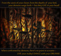
| 10/06/2011 11:53:21 PM |
Dance with your Demonsby Bear_MusicComment: Nice shot. This poster does not need the white lines and using a simple font such as the "American typewriter" in a small size would benefit it. |
| Photographer found comment helpful. |
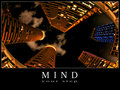
| 10/06/2011 11:53:14 PM |
mindby mitalapoComment: Not bad! Well thought.
The lettering should have been more modern, smaller, NOT white, no (white) border. Details that count.
How wrong was I! the formatting is typical for these posters. My ignorance. Your poster is what it should be. |
| Photographer found comment helpful. |
| 10/06/2011 11:52:27 PM |
Resourcefulnessby HipychikComment: Nice tree and , yes, resourceful. It looks though more like a dated calendar page because of the choice of font and borders. The idea begs for a more audacious approach
So much for my ignorance concerning the formatting of these posters. You certainly stayed within the set look. |
| Photographer found comment helpful. |
| 10/06/2011 11:52:18 PM |
|
| Photographer found comment helpful. |
Home -
Challenges -
Community -
League -
Photos -
Cameras -
Lenses -
Learn -
Help -
Terms of Use -
Privacy -
Top ^
DPChallenge, and website content and design, Copyright © 2001-2026 Challenging Technologies, LLC.
All digital photo copyrights belong to the photographers and may not be used without permission.
Current Server Time: 05/11/2026 12:24:48 AM EDT.