| Image |
Comment |
| 05/03/2004 11:42:55 AM |
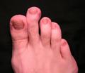
It's really hard to find shoesby indianzfanComment: I bet it is. Wow, um, not really sure what to say here, LOL! I see the lack of proportion so it fits the challenge but the picture does nothing for me except want to get you a pedicure! ;) Slightly out of focus and just not very interesting overall. A 3, sorry :( |
| 05/03/2004 09:09:45 AM |
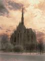
THE CHURCH IS BIGGER THAN THE TREES, THE SKY IS BIGGER THAN THE CHURCHby pookey83Comment: Yes, the church is bigger than the trees, as it should be and the sky is bigger than the church, as it should be and the shot is very well proportioned and well balanced. But it seems a bit small and the post processing leaves me wanting. Not sure if that is a natural color sky behind the church but from he color of the snow/street in the bottom of the shot, I'm guessing not. The trees on the left seem almost surreal while the ones on the right seem very realistic. The size of the shot seems rather small also and the lack of sharpness and contrast really throw me off here. Perhaps if you were a bit closer, cut out the bottom part of the shot and put yourself down further to add a larger than life feel to the shot? A 4 as is |
 Photographer found comment helpful. Photographer found comment helpful. |
| 05/03/2004 09:06:00 AM |
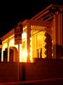
Big house, small house ...by mandypComment: Took me a moment to find the small house. The idea is there but a sign doesn't really pull it off for me. The lack of focus is also very hurtful to this shot. Night shots are so hard, I know, I've been working on mine for the past week and it can be soooooooooooo fustrating, even with a tripod. The glaring light really makes me want to look away. It looks like this house might be on a slight hill, maybe you could go down the street and try to get a different angle with a couple of different houses to see if you could get a more forces proportion shot? A 3 |
| Photographer found comment helpful. |
| 05/03/2004 09:03:00 AM |
Confusingby Rusch24Comment: This would have been almost perfect for the abstract challenge. Not really sure how it fits into this challenge. The size of the shot really hurts, if you could bump the size up, that would really help. Also the red cloth is wrinkled and pulls my eye away from from the main subject. The subject looks more brown and white than black and white (I'm guessing you were going for black and white) and yes, my monitor is calibrated. The overall composition and croppping of the shot is well done. A 3 |
| 05/03/2004 09:00:38 AM |
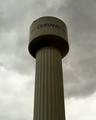
Gigantic Drum Stickby dirtkahunaComment: A good idea but without the title it really doesn't make sense for the challenge overall. Also the lettering on the water tower (it is a water tower, right?) also takes away from the illustion you were trying to create. The duotone in the shot is also a bit dark and forbidding, I'm guessing you went with that because of the cloudy day. I think black and white might have worked better with this shot and if you could have had a hand in there holding the base of the tower that would have really made this shot and fit the title better. Contrast is also lacking to me, it seems flat and doesn't really grab my attention. Started at a 4 but am raising to a 5 |
| Photographer found comment helpful. |
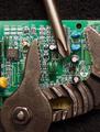
| 05/03/2004 08:57:48 AM |
Bigger isn't always better....by BradComment: I like the way this shot really comes off the screen to me and the lack of proportion of the tools to the computer board is very well done. A tighter crop on the top and bottom to take out the black space would really emphasize the lack of proportion to me though and a touch more sharpness. An 8 |
| Photographer found comment helpful. |
| 05/03/2004 08:56:08 AM |
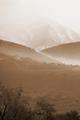
At the Edge of the Mistby milleniummikeComment: I love this shot, the overall feel of it just reminds me of home in Montana. Can't wait to get back there in August! This is a great shot and the coloration is close to perfect for it. The way the mountain disappears towards the top is awesome yet a bit fustrating at the same time, you know? The trees in the front help add a bit of perspective to the shot but at the same time almost end up being distracting. A very excellent shot overall, really makes you stop and look. Started at an 8 but am moving to a 9, a touch more contrast would have garnished you a 10 from me. Good Luck! |
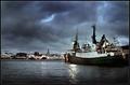
| 05/03/2004 12:14:42 AM |
My city by the seaby heidaComment: Excellent shot, congrats on 4th place but it should have been first! This is a fantastic shot, so much emotion, life and feeling.
Deannda |
| Photographer found comment helpful. |
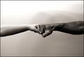
| 05/01/2004 04:32:27 PM |
disproportional strengthby theodor38Comment: I really like the tone and feel of this shot and the concept is wonderful but the fact that the arems are in the shot equally, both cut off at the elbows bothers me for some reason, maybe if the title was different, I don' t know, I think to have the shot show more of one arm or the other would somehow make this more dynamic for me. Also the background lighting is too bright on the top, maybe a tighter crop? An 8 |
| Photographer found comment helpful. |
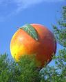
| 05/01/2004 04:30:27 PM |
Eat a Peachby fisheyeComment: Reminds me of James and the Giant Peach! :) A great shot and the trees help add to the illusion of out of proportion except for the ones on the right, they tend to be a bit distracting overall. The colors are very good but a touch more contrast to really bring out the orange on the peach would really make this shot pop for me. An 8 |
| Photographer found comment helpful. |
Home -
Challenges -
Community -
League -
Photos -
Cameras -
Lenses -
Learn -
Help -
Terms of Use -
Privacy -
Top ^
DPChallenge, and website content and design, Copyright © 2001-2026 Challenging Technologies, LLC.
All digital photo copyrights belong to the photographers and may not be used without permission.
Current Server Time: 06/18/2026 09:55:41 AM EDT.