| Image |
Comment |
| 05/03/2004 09:49:09 PM |
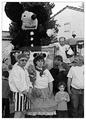
Mice...by jjbeguinComment: Not sure how this fits the challenge unless you are going for the size of the mouse compared to the people? The woman in the front looks really tired and not happy at all, neither does the pirate and all the other people are just confusing and there are so many things competing for my attention. The black and white might work if there was more contrast to the shot. A 3 |
 Photographer found comment helpful. Photographer found comment helpful. |
| 05/03/2004 09:36:56 PM |
A Toast to Texasby tdjohn12Comment: I'm not familier what this shot has to do with proportion and I confess to having no idea where this was taken so maybe that has something to do with the shot and the t-shirt? As it stand, it's a great shot of an older building ruined by a man standing in front of it, turning it into a snapshot type photo for me. A 3 |
| 05/03/2004 09:34:52 PM |
twigs of lifeby bry1Comment: I like the idea behind this shot, if I'm not mistaken you were going for the size of the limbs to the small valley behind? Not quite sure but that is the feeling I get from the shot. More clarity and focus would help this a great deal and a bit more brightness and contrast. A 3 |
| 05/03/2004 12:07:00 PM |
Rustic Wheelby candycornComment: This is a great shot and since I just did the critique on your Serendipity challenge entry I thought I might make some comments on this one as well. I love this shot. One of the best in your portfolio without a doubt. The overall composition is very well done and the cropping is perfect to me.
What it is lacking is contrast or something that really makes it pop out of the screen to me. The colors look flat and boring, a touch of post processing to help bring them out just a touch more could really make a difference. Hope this helps!
Deannda |
| Photographer found comment helpful. |
| 05/03/2004 12:04:20 PM |
Serendipitious Signby candycornComment: Greetings from the Critique Club!
Hi! This is an interesting catch, how serendipitous that this sign is there for the challenge, LOL!
It's a good idea but the execution of the shot and post processing or lack of is probably what did you in for the challenge. I looked at your profile and really like some of the ideas you have but it's the pulling of them off that is probably a bit fustrating to you. I know, it still fustrates the heck out of me when I can see the shot I want in my head but when it's on the screen it's not even close!
This shot has great potential and if you ever get a chance to reshoot it may I first suggest getting closer to the sign. Too much background and other items distracting you from the sign itself. For the challenge a much tighter crop on all sides would have probably helped a great deal, really making the sign the main focus of the shot. As it is right now there are trees, fences, house and all manner of things competing for my attention. Even cropping closer on the sides (putting my trusty envelopes up to the screen) makes a HUGE difference in the shot. You don't have the blow out light on the left and the darker shadow side on the right competing for your attention.
Also a touch more contrast in the shot would really make the sign pop out and bring out the colors.
If you make changes I would love to see them.
Good Luck In Future Challenges!
Deannda
DNeufer@stny.rr.com if you have any questions or want to discuss this further! |
| Photographer found comment helpful. |
| 05/03/2004 11:54:48 AM |
David's Sunsetby tdjohn12Comment: Greetings from the Critique Club!
Hello and first let me say this a very pretty sunset. I love the colors and the hues in the shot on that side of the shot. I see this is your first challenge that you've entered and you did finish in the top 100! First time out, not bad!
I have the same camera you have, the Olympus D-380 and I have passed it on to my daughter and it has potential to take some really great shots. But I found sunsets and afterdark to be the hardest ones to make it work well. You did well with the sunset part but the statues left me wanting. They were out of focus and in the end of my study ended up being more of a distraction than an asset to the shot for me personally.
I think the reason they did is because of the horizon on the bottom. Taking my trusty and handy dandy envelopes and putting them up to the shot to try some other cropping if you take off just the bottom of the shot, take the line to just under the sun and get rid of the bottom horizon line and also bring the crop in just a bit on the right to get rid of tree in the lower right corner it really makes a difference on the shot for me. The statues don't end up being distracting but seem to work in better harmony with the sunset.
A touch more sharpness would really make the shot pop overall for me as well. If you decide to try any of these suggestions I would love to see the redone work.
Good Luck In Future Challenges!
Deannda
DNeufer@stny.rr.com if you have any questions or want to discuss this further!
|
| 05/03/2004 11:48:04 AM |
very large buildingby hugoComment: Yes, it might well be but it's hard to tell from this picture. I have nothing to compare it to and it's out of focus and the reflection on the glass, especially towards the top is very distracting. A 3 |
| 05/03/2004 11:46:46 AM |
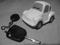
let's goby DebohComment: A good idea, wrong model for the car. A die cast car, one more realistic might have really helped pull this shot off, especially if it was in a driveway and taken more from the ground angle, making the key look as big as the car either side by side or in front of the car. a 4 |
| Photographer found comment helpful. |
| 05/03/2004 11:45:22 AM |
Phallic Proportionsby sixgunwoodyComment: Okay! Well, took me a moment to figure out where the title came from and then I saw it and got it. Interesting idea but not very appealing overall and the post processing really hurt this shot to me. I hope you didn't draw that on the side just for this shot! ;) A 3 |
| 05/03/2004 11:43:56 AM |
Mother how I've grownby ClangdonComment: A good idea, bad execution :( Too out of focus, no contrast and the size of the shot really leave me wanting something more. A 3 |
Home -
Challenges -
Community -
League -
Photos -
Cameras -
Lenses -
Learn -
Help -
Terms of Use -
Privacy -
Top ^
DPChallenge, and website content and design, Copyright © 2001-2026 Challenging Technologies, LLC.
All digital photo copyrights belong to the photographers and may not be used without permission.
Current Server Time: 06/18/2026 01:58:31 AM EDT.