| Image |
Comment |
| 05/14/2004 11:37:07 AM |
a beach dinnerby xburnerxComment: Not really sure what the opposite is here. The post processing, if that is what caused the effect, really hurt this shot for me. It's blown out and the rug or material under the dish doesn't really come off as sand to me. The cropping seems a bit tight, maybe line up the fork and knife so they cross and crop the ends at the corners? A 3 |
| 05/14/2004 11:35:22 AM |
Lines And Curvesby rockhopperComment: Yeah, you could say lines but the curves is questionable :) The outfit really hides the curves and the wind blowing on her face is distracting. A much tighter crop, leaving just her and maybe lining up the poles, coming more from in front of the subject? Also the lighting is a bit harsh, maybe tone it down a bit in PS? A 3 |
| 05/14/2004 11:32:22 AM |
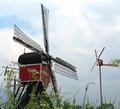
Said the big mill to the little mill.....by TedvandenBerghComment: Large and small, okay, that works. he shot has potential but as is, leaves me wanting more clarity and less distractions. The flowers and grass in the foreground is very distracting and the angle gives the illusion that the size of these are rather small, amost like a miniture golf course size, not sure why. The sky is dull, nothing much you could do about the overcast sky :( A 3 |
| 05/14/2004 11:28:26 AM |
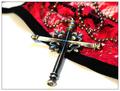
Opposite Agendas: Sinner or Saint?by mocabelaComment: It took me three looks at this shot to figure out the opposite parts. The lingerie is not very well defined. At first I thought it was just a lacy hankerchief or doily. I thought the opposite was the Catholic church thing, you can sin, confess and all is well. Anyway, the DOF of this shot doesn't work for me personally, I would like to see more the the opposite side of the cross and see more focus overall. The white is almost blown out also. A 3 |
 Photographer found comment helpful. Photographer found comment helpful. |
| 05/14/2004 11:25:51 AM |
Genius in Black and Whiteby TiNComment: The glare on the glass is very distracting, maybe a tighter crop from the bottom? Also the top part and the foam seems out of focus and it's not really appearing black and white on my screen, more rust and white. A 3 |
| 05/14/2004 11:24:43 AM |
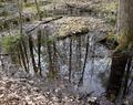
Otherworldby KaDiComment: Not really sure how this meets the challenge, maybe if you had included the trees in this world as well to show the opposite reflection? Not a bad shot but nothing to really hold my interest. I'm thinking this would look good in black and white or sepia, not sure why, maybe the different textures and such? As is, a 3 |
| Photographer found comment helpful. |
| 05/14/2004 11:22:39 AM |
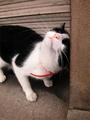
Crazy Yin-Yangby svellutComment: Im guessing you are going with the black/white opposite? A more posed or head on shot of the cat would score much higher with me. I love cat shots but this is just a snapshot, nice to look at but nothing to really hold my interest overall. Also the angle of the shot makes his/her head seem rather large compared to the feet. A 3 |
| 05/14/2004 11:20:47 AM |
Friendsby Hemant ModhComment: Not sure how this meets the challenge, don't really see too much opposites here. The lighting is dull in this shot and the contrast is just a tad short for my taste. The dolls could be in sharper focus and maybe if the crop was so that all the hair was included or just on the faces, cutting off at the chins, offering more balance to the shot? A 3 |
| 05/14/2004 11:18:48 AM |
Fire and Iceby CountComment: Really kind of boring and the hand ends up being very distracting. A 3 |
| Photographer found comment helpful. |
| 05/14/2004 11:18:08 AM |
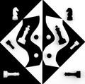
Some Things Are Just Black and Whiteby bruskiComment: Wow, you really put some time into setting this up. I actually makes my eyes hurt a little to look at it for very long. You took some real time to cut out the black and white curves and while everything else is perfectly lined up, those two peices seem off because they aren't touching all the edges of the opposite color and on the bottom curve they are overlapping. I had to look at this in spurts, it really hurts my eyes, not sure why. I would say more contrast but that would make it hurt even more. I like the idea, maybe different lighting would help? The black is great but the white seems rather dull. A 3 |
Home -
Challenges -
Community -
League -
Photos -
Cameras -
Lenses -
Learn -
Help -
Terms of Use -
Privacy -
Top ^
DPChallenge, and website content and design, Copyright © 2001-2026 Challenging Technologies, LLC.
All digital photo copyrights belong to the photographers and may not be used without permission.
Current Server Time: 06/17/2026 08:07:38 PM EDT.